Tuesday, August 17, 2010

Simple Eye Masks - Progress

I've taken a number of simple eyemask commissions. These are fashioned to be a simple, solid color mask with a design on one side. These are three examples:


The commissions I received were for a magpie, a snowy owl, and a rat design. After doing a number of sketches and having the client's approval, I started work on the masks. Here they are at the tooled stage:


...and shaped...


...and dyed.


I try to choose a dye color that will be closest to the color I will be painting the mask. In this case, the magpie will be dark and the background will be very dark blue. For the rats, the background will be black and the rats themselves will be light blue. Sometimes I will use a complimentary color for the dye, such as with leaf masks. I feel having a reddish-brown base gives a better and more natural green.

I will post final photos of these masks once they are painted. Painting them is the best part!

Tuesday, May 18, 2010

Lieutenant progress and masks

Edit 5/24/2010: This entry contains a revision of a painting, based on some helpful suggestions by Linda, who commented on some anatomical issues. Thanks!

I am going to put more effort to be active in my blog. There's lots going on artistically and I haven't been posting any of it!

As many of you know, I paint mostly birds, or winged creatures. My 'people drawing skills' are at a different level (lower) than my avian abilities, which I waffle between "ughhh I need to practice more figure drawing!" and "ughhh I don't care I'll just crawl into my safe cave and keep painting birds." Of course, we all know the second choice is not acceptable! My problem, I believe, is one with perception. I'm not quite sure why, but I just have the hardest time understanding the human form, despite years of figure drawing.

I've read books on bone and muscle structure, drawn nude models, studied references, but when it comes time to put pencil to paper, it's all warped - out of proportion. I know the 'rules' but it's difficult for me to actually put it on paper. That is of course no excuse to simply give up! And so I am trying to work more with the human form, even if it feels like pulling teeth sometimes.

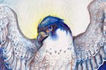
Below is a progress image of my latest painting, Lieutenant. Consider the giant gryphon a support mechanism for the trauma that came with drawing a human! (I kid, I kid...sort of):


And the final image (revised per a suggestion from Linda):


I am well aware that there are still some 'distortions' with the figure, though I think it's a step forward compared to my previous work. You would think Connecticut would be full of figure drawing opportunities, though a search left me with very few, with the closest being about 50 miles away! Hopefully I will find some so I can get back to practice.

I have also been working on more leather masks. This one is another 'tribute' mask to a tree species that fell due to an introduced disease. The American Chestnut used to be one of the most plentiful trees in the eastern United States. By the 1940s, they had been virtually wiped out by a blight introduced earlier in the century. Now, the only American Chestnuts that exist are in the western United States, and efforts to introduce blight-resistant chestnuts to the eastern part of the country are underway.


My most recently created mask was based on a painting I did for Hayley Lavik (which you can see in her banner), of a mask based on a celebration in her story. Below you can see the original painting (set with a stone) that I completed several months back, and the completed, 3-dimensional mask, set with a sodalite cabochon, and adorned with rice pearls:


It was a challenge to translate a 2-dimensional image into a 3-dimensional mask. I had to change a few elements, such as the thin curls (as they would have been near impossible to create in thick leather), but I think it retains the feeling of the original design.

Thursday, May 6, 2010

A Day at the Caprilands

With spring here, I decided to make a trip to the Caprilands Herb Farm in Coventry, Connecticut (their main page is still in progress). It's only a few towns away, and the drive and destination is rather beautiful and relaxing.

I won't bore you with the tons of flower, plant, and tree photos I took, but below is one rather lovely butterfly I found, and two quick drawings and a watercolor study I did to loosen myself up.

A butterfly I have yet to identify:


A sketch of what I believe are irises, not yet blossomed:


Sketch of a tree with some rather interesting, twisty trunks. Also a pair of guinea hens that served as the resident tick control:


Lastly, some painting practice based on a reference photo I took of an unidentified flowering bush. This is watercolor on illustration board:


A lot of what I see here serves as inspiration for my paintings. Once more flowers start growing, I'm sure I will 'discover' some more Nectarbirds...

Monday, March 22, 2010

Courtship - WIP

This is a bit of a spontaneous painting. I'm still experimenting a lot with watercolor techniques and wanted to try out mixing white gouache with my watercolors. I've always liked the creamy consistency you get when you mix watercolor with white gouache.


I'm still deciding on what colors I'll paint the gryphons. Perhaps yellows and reds to contrast with the greens. Maybe some dulled purples for the snow leopard part of the gryphon on the right.

Here is the pencil drawing, pre-paint:

Monday, February 22, 2010

Conjure

As sometimes happens, I decided on a different title for this painting about halfway through. "Conjure" seemed to fit better for the purpose...


I've been having a bit of an inspiration block, partially due to the inability to find the right paper for watercolor. I know, it sounds odd for someone who has been using watercolor for years to suddenly have a 'paper crisis' but as you evolve as an artist, often your technique calls for different media.

This painting represents my muse in a way. I realize I've probably broken a hundred different 'rules' of color, but this piece was meant to relax and 'reset'. I went from a bundle of nerves to relaxed as soon as paint hit paper with this one. Sometimes it's good to just get all that color frustration out!

Saturday, February 20, 2010

Sun Dreams - WIP

I'm going back to an old method for watercolor. I also decided to do this on some 'lesser quality watercolor paper' (i.e. "not Arches") and was a bit taken aback to find that I was able to use this paper (Windsor and Newton Watercolor Paper) better than the Arches cold-press I usually use. While the Arches is great for holding onto vibrant color, that's also a bit of a drawback - it holds onto pigment and doesn't let go. Ever. I find I work best if I'm lifting up pigment, and it's near impossible to do that with Arches.


More spirit falcons! Yay!

I also got a temporary replacement monitor. It's a 19 inch CRT, but the colors are spot-on. I spent about 3 days off and on adjusting the brightness, contrast, and gamma until it was just right. One of the drawbacks of using a monitor that's dying to the point where you can't adjust it anymore is you get used to poor brightness and inaccurate color. I knew something was off, but I didn't realize how 'monitor blind' I had been until I got this new one! Once I'm able to save up enough, I plan on buying a good LCD monitor. While this CRT is good and accurate, it's a huge electricity hog and the natural refresh flicker (60 Hz) is just noticeable enough to annoy me. Still, it's better than what I had before!

Sunday, January 31, 2010

Wisdom - Sketches and Line

Lately I've been inspired by the lovely ink and watercolor work of a number of artists. Paired with experimenting with anatomy, I've started a painting utilizing ink and watercolor:


And the sketch:


I'm aiming for more control with my watercolors. Previously I was putting watercolor over detailed graphite drawings, but I also like the effect of watercolor over black ink. The line drawing was done with a G-nib and Holbein black ink.

Friday, January 22, 2010

Goshawk in the Pines

Here is the second of the pair of paintings based on an inspiring quote by Helen Macdonald on her blog Fretmarks, which reads- "And then I thought, decidedly, yes. Goshawks are water. Falcons are air and hot stone. Goshawks are water and wood."


Below is the graphite drawing. Rick Lovell, an illustrator and an instructor of mine at SCAD-Atlanta, pointed out a confusing 'connection' of tail with branch which you can see below. I fixed this previous to starting the finished painting.


I'll admit, although falcons are my favorite raptors, I like this painting more. The falcon painting, which can be seen in my previous post, was on hot-press watercolor paper, whereas the goshawk painting is on cold-press. Hot-press is much smoother and thus is wonderful for tight details, but it comes at a price; paint seems to 'slide' on the surface and doesn't soak in as well. Perhaps I simply need more practice using it. Regardless, I like the way I was able to control the pigment in the goshawk painting better.

Sunday, January 3, 2010

Sepia watercolor practice, two watercolor paintings

From most recent to oldest, here are two paintings and a watercolor study I've completed within the past month:

Sky Painter
Watercolor on hot press arches, 4X9 inches


This painting was partially inspired by a quote I read on Helen Macdonald's blog, Fretmarks. The entire blog is quite interesting, though the post linked above, containing the quote, is one of my favorites.

"And then I thought, decidedly, yes. Goshawks are water. Falcons are air and hot stone. Goshawks are water and wood."

The next painting will be the same dimensions, but will feature the goshawk, with water and wood.


Ambition's Flaw
Watercolor and white gouache on cold-press Arches, 8X11 inches


Looking back on the palettes I commonly use, purple and pink are two colors that are definitely lacking. This seemed like as good an excuse as any to experiment with those poor, neglected colors.


Harris and Girl
Sepia watercolor on cold-press arches, about 9X12 inches


Using only one color is a good way to focus on control of the medium and light and dark without having to concentrate on colors. This was an exercise mainly in value in watercolor.