Showing posts with label fantasy art. Show all posts

Friday, July 19, 2013

Akhraiiu - Gryphon Portrait Process

I'm trying to work more in acrylic, so for the upcoming Dragon Con Art Show, I planned on having a number of acrylic pieces.  Below are three process shots of an 8X10 inch acrylic on board painting of a gryphon portrait.

Underpainting:
Basic values in gray, with a greenish gray background.  At this point I am to find the light and shadow.


Basic Details:
Details, still in grays.  I start to tighten the detail on the feathers and face.


Color:
Here I start putting in glazes of color, going thicker where I want more vibrant color.  Since I already have my shadows established, I can simply concentrate on color.  I also deepen the shadows that went dull with the glazes with more color, for example adding a bit of green and black with the burnt sienna to make a deep, rich shadow for the feathers.  I'm only using a few colors at this point - burnt sienna and green gold for the feathers, with black and white. 


Final Details:
I add a bit of green and raw umber to the background to really make the reds of the gryphon pop.  To make the palette even more interesting, I add just a touch of permanent rose and dioxazine purple to the rearmost feathers.  All in all the colors I used were:

Burnt Sienna
Hooker's Green
Green Gold
Burnt Ochre
Permanent Rose
Dioxazine Purple
Raw Umber
Mars Black
Titanium White
Unbleached Titanium (for some areas where I wanted a less stark white)
Phthalocyanine Green (for the jewel details)
Colbalt Blue (just a touch for the cool gray of the beak)

Thursday, January 24, 2013

Sylvan - Work in Progress 1

Part 1: Washes
To preserve the 'gems' on the falcon's feathers, I cover them with masking fluid.  This will allow me to paint washes over them and not have to worry about painting around them, so when it comes time to paint them I have the white of the paper.  Based on the color sketch, I start putting in wet-on-wet washes to make sure they blend well.  The important part here is to make sure you only wet areas that are NOT touching other wet sections...otherwise the colors from the first section will bleed into the other section!  For example, I waited until the falcon's wing was completely dry before wetting the hawk's head and back.

It's important not to go too dark at this stage, and this is more of an underpainting basis for the other layers.


Part 2: Adding Color
 

In the falcon's wing, you can see how I started adding color to individual feathers.  I wanted a bit of a gradient, so I started at the top, with aureolin yellow, then going lower with cadmium orange, then using quinacridone rose and finally Thio violet.  Even here, I made sure to use wet-on-wet to encourage the colors to blend cleanly, while using a brush very heavy with pigment.  When the paper is wet, if your brush doesn't have a lot of pigment, you're going to end up with a very weak wash.

I continued down the wing, combining Thio Violet with cerulean blue.  Right now the whole thing looks very oversaturated, but adding shadows and value in the next step will balance some of the color, and make the colors seem even more brilliant, when contrasted with the dull shadows.  I've also started to add detail to the leaves of the willows.

Tuesday, May 1, 2012

Allegiance - Sketches

I was looking through an old sketchbook and found a little sketch I'd done while at my table at DragonCon. DragonCon happens to be the highlight of the year for me, because I get to see friends, and because the art show just floods me with inspiration! I also received a lot of feedback about my work, and made it a goal to try more complex poses and compositions.

Thumbnail:
The sketch just kind of came out. I had an image of a gryphon bowing, and instantly the word 'allegiance' came out with the sketch. Now, several months later, I finally got around to proceeding with doing something with the sketch.

First Sketch:
I scanned the sketch and brought it into Photoshop to figure out the composition.  Eventually I started to put in columns...and banners...and suddenly what was just meant to be a single gryphon turned into scene with perspective!

Perspective Sketch:
Though I cropped it out, I originally extended the canvas far to the left so I could find a vanishing point for the lines.  The image was starting to go in a direction I hadn't planned on, but I went along to see how far I could push the composition.  Finally, I transferred it to my illustration board, and finalized the drawing.

Final Drawing:
I didn't want the gryphon to be indoors - it seems any king or queen a gryphon would pledge his or her allegiance to would be one who doesn't cage themselves inside walls.  Then what would the banners hang on?  Trees, of course.  Wild oaks with twisting, unruly roots.  I found there was a problem with the expanse of negative space in that lower left triangle, so I thought of what should go there.

My thinking process began to mingle with the story that was brewing in my head, eventually pushing the composition to be structured (with the columns and straight edges of the banners), with wildness added.  The winding trees, the woodland designs on the banners...perhaps this is a faean 'hall'?  Even still, a gryphon is a wild creature, not a being of straight lines and carved angles.  The gryphon here is a little out of his element with the columns...bowing down but still with a wary eye.

Color Sketch:
I recently received some feedback from a group of very skilled, professional fantasy artists who pointed out that my skies are consistently too dark.  Reading their comments was like light suddenly flicking on - it was something I couldn't quite figure out on my own until someone pointed it out!  Although in this piece the horizon line is almost off the paper (you can see it just barely in the upper left of the background), I had to keep in mind the background would also need to be of low contrast and low saturation.

I am also trying to use less saturated colors overall, and I plan on painting this mostly with watercolor, and using washes of acrylic to really push the values.  I hope the acrylic will also help me achieve the smoothness I usually lack with watercolor.

Tuesday, August 23, 2011

Swamp Milkweed Nectarbird

As shown in my previous post, I went with a variation of the grisaille technique for my most recent painting. Here is the completed painting, acrylic on cold-press illustration board, 8 X 10 inches:


To start where I left off with the process, I experimented with color in Photoshop to see exactly how things would look before I started putting the glazes over the gray painting.


What I suspected was that the tonal painting was too gray for the glaze technique to be successful, and I was right. The way I was taught to do this technique was to create a tonal painting with a grayed color, meaning not pure gray, but grayed green, for example. As I started putting down glazes, I saw that the gray showing through beneath was not what I wanted for certain sections of the painting, particularly those with higher saturation. Therefore, I had to add a bit more opacity to what were supposed to be glazes.


Although I had to deviate from my original plan with technique, I do not consider this to be a failure of a project. On the contrary, I learned quite a bit on what to do (and what not to do), and ended up with, what I feel, is a good painting. For future paintings using this technique, I will make sure my tonal painting is not so gray. I also found, once I started putting glazes down, that the overall contrast was too dark. I ended up lightening a lot of the composition during the color phase, when it should have been light enough at the tonal stage. All in all, a good learning experience!

Monday, August 22, 2011

Swamp Milkweed Nectarbird - Work in Progress

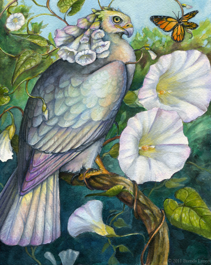
Back in 2007 I painted a bird with daffodils for plumage, as part of a personal project to create a bird for each month, mirroring the month's birthflower and birthstone. These birds, which I called "Birdflowers," later morphed into "Nectarbirds." Nectarbirds were birds with the plumage of the flowers on which they fed. Whenever I go exploring and find interesting-looking flowers, I try to get good photographs and create a Nectarbird from that, which usually involves me doing some research to try to figure out exactly what flower I've found!

For DragonCon, I try to paint new Nectarbirds each year. Last year was the exception, but this year I will have two new Nectarbirds. One based on the Hedge Bindweed, and one (currently in progress), based on the Swamp Milkweed. For the Hedge Bindweed Nectarbird, I tried a technique of using acrylic on cold-press watercolor paper in a very watered-down way, more like watercolor. I can't say I really enjoyed this technique, and decided for my next Nectarbird, to try a more traditional approach with acrylic. More specifically, a medium tinted canvas, and then introducing darks and lights.


I learned a bit about the grisaille technique at SCAD, where a grayish painting is overlaid by layers of colored glazes. The technique, traditionally used with oils, works exceptionally well with acrylic also. I try to put a bit of color in my gray, but the foreground elements ended up being pure gray in the end. I am excited about adding the glazes, which to me is the most fun part of this technique.

Tuesday, March 22, 2011

Owl Women of Vaethiniel


In the deep forests of Vaethiniel there live three women - one very young, one very old, and one between the valleys of age.

Once twenty winters have passed, the greatest and brightest moon rises over the sleeping trees. In this night, the old magic is at its most powerful. It is said the three women, with their ancient gifts, gather around a cauldron that mirrors the sky. In this, the secrets of the next twenty winters are stirred, and the three women peer forth with the wise faces of owls, for only owls can read the words of the moon.


The story was in part inspired by the Perigee Moon we had on March 19th. The moon truly was blindingly bright, and we had the good fortune in Connecticut of having a cloudless night, so the true brilliance of this rare moon was at its peak. I couldn't help but wonder what ancient cultures thought when the moon suddenly appeared bigger and brighter every 18 years.

Monday, March 21, 2011

Owl Women - Progress 2

This painting is taking me much longer than I imagined, which is good! I'm spending more time thinking about color choices before jumping in. Although I have a color comp, I still need to decide how to create the colors I want, and what shadow combinations will be suitable.


Here I have put in another layer of shadow in the foreground wings, and put the first layer down for color. The great horned owl's hood is going to be a rich brown, so I used a layer of yellow ochre as a base layer. Since the barred owl's cloak will be a rich green, I used cadmium yellow. I find layering watercolor creates a tone that blends better than putting down one simple layer of thick mixed color.


Again, I found myself in such concentration I went a long stretch without scanning! Lots of detail in the feathers at this point. For the great horned owl's wing, I created a mask with tracing paper around the entire painting except that wing, then used a toothbrush to splatter white gouache and payne's gray watercolor to get the speckled appearance that great horned owls have on their wings and back.

For the sky, I mixed color with white gouache to make the color more opaque. I find this works well when I want a very rich, smooth color. At this point, I also removed the masking fluid from the moon, and painted in the branches.

Tuesday, March 15, 2011

Owl Women - Final Drawing and Shadow Stages

As seen in the previous post, I've completed the color comp, meaning it's time to transfer the drawing and start painting! Below is the drawing transferred to the illustration board, with a few last things fixed:


When adding the shadows, I try to think about what colors will work best when the main color layer is applied. I never shade with gray or black, and always use a color or combination of colors for my shadows. Since this is a night scene, I try to use a lot of blue and violet-dominated shadows.


The shadows on the barn owl's clothing are a mixture of dioxazine violet and van dyk brown, which makes it a warm, yet dark shadow, which will work well with the red of her cloak. The wings of the barred owl have a layer of ultramarine violet, indigo, and just a touch of sepia - I used this very neutral color as her wings are much more of a grayish brown than the more intense brown of the great horned owl's wings.

As feathers are translucent, the 'light gaps' are where the light of the fire will illuminate the feathers. Where the feathers overlap, not as much light gets through. This is a hard concept at first to wrap your mind around when drawing birds' wings, but inclusion of this with back-lit wings results in a much more believable wing.

A note - the pink you see on the moon is not paint, but rather masking fluid. I used masking fluid so I could apply washes freely to the sky without worrying about going over the perfect white and circle of the moon. Once I am ready to paint the branches, I will remove it.

Friday, March 11, 2011

Owl Women

I seem to have owls on the brain, lately! Much inspiration is thanks to the live owls I work with at Horizon Wings Raptor Rehabilitation and Education Center, of which I am lucky enough to see up close. You really get a better understanding of birds of prey when you see them in real life. Their movements and mannerisms are simply impossible to discover through photographs alone.

There's something so enjoyable about drawing owls. Perhaps it is because of their incredible softness and roundness. If you enjoy drawing fluffy feathers, then an owl is the perfect subject. I also associate these birds with (no surprise here) the night and the mysteries of the world when the sun goes down and the moon comes up. Owls are creatures that live with a perfect harmony with the night. Their hearing is unlike that of any bird - some owls hunt in practically complete darkness, using their asymmetrical ears to pinpoint a creature's location on the ground. Their wings have a fringe to allow them to fly with complete silence.

Below are sketches for a painting I am about to begin. Three owl women gather around a cauldron of starlight. One holds a sphere of perfect crystal, which reflects all light and allows her to see beyond the dark of night. Another carries a staff, which still grows living oak leaves and acorns.


And the finished sketch. I didn't put in as much detail, here, as I planned to incorporate the values with the color sketch:


As before, with Celebration, I used Corel Painter to create my color sketch:


Painting this will be tricky, as I have two main light sources: the moon above and the fire below. The crystal ball also gives a little light to the face of the barred owl, allowing the eye that would normally be in shadow to have a highlight.

The shadows were easy in Painter, but with a translucent medium like watercolor, it's going to be a bit more challenging. I may end up using colored pencil to really pop the highlights.

Tuesday, March 8, 2011

Ceremony

I meant to post work in progress scans as I painted this, but I got so caught up I forgot! Here is the finished painting:


The main difference between this and all my older paintings is the inclusion of two important colors I never used before: Aureolin Yellow and Rose Madder Genuine. After recently reading A Watercolor Artist's Guide to Exceptional Color by Jan Hart, I learned that the yellow I had been using previously - Cadmium Yellow - was closer to a yellow-orange instead of a pure yellow, as Aureolin is. Therefore, my 'yellows' were always darker and redder. I also had never really had a true magenta, which I now have with Rose Madder Genuine. Adding these two colors has expanded my palette immensely and solved many of the color issues I was having before.

I also discovered that Rose Madder smells just like Froot Loops. I am completely serious.

Sunday, March 6, 2011

Ceremony - works in progress

Many apologies for the long hiatus! It is a bit fitting, in a way, that my first post in a while is to show progress on a work that I had put away for a long while. I reopen a neglected art blog with a neglected painting!


I started this drawing on an 8 X 10 piece of illustration board, late in 2010 when I was struggling with technique and wanted to create a piece to experiment with. Other projects got in the way, and this got tucked away in a drawer 'for later.' Well, later is today, and I pulled it out to finish the drawing, and get started with painting.

Below is a color sketch - I'm usually very bad about doing color sketches, but I think this may help the issues I have of plopping down color on a final piece before thinking it through.


I used Painter IX to put in some color ideas and establish the lighting. The 'smoke' will be a bit more challenging with watercolor, but it will be a good opportunity to experiment with technique...which was the initial purpose of this piece to begin with!

Tuesday, May 18, 2010

Lieutenant progress and masks

Edit 5/24/2010: This entry contains a revision of a painting, based on some helpful suggestions by Linda, who commented on some anatomical issues. Thanks!

I am going to put more effort to be active in my blog. There's lots going on artistically and I haven't been posting any of it!

As many of you know, I paint mostly birds, or winged creatures. My 'people drawing skills' are at a different level (lower) than my avian abilities, which I waffle between "ughhh I need to practice more figure drawing!" and "ughhh I don't care I'll just crawl into my safe cave and keep painting birds." Of course, we all know the second choice is not acceptable! My problem, I believe, is one with perception. I'm not quite sure why, but I just have the hardest time understanding the human form, despite years of figure drawing.

I've read books on bone and muscle structure, drawn nude models, studied references, but when it comes time to put pencil to paper, it's all warped - out of proportion. I know the 'rules' but it's difficult for me to actually put it on paper. That is of course no excuse to simply give up! And so I am trying to work more with the human form, even if it feels like pulling teeth sometimes.

Below is a progress image of my latest painting, Lieutenant. Consider the giant gryphon a support mechanism for the trauma that came with drawing a human! (I kid, I kid...sort of):


And the final image (revised per a suggestion from Linda):


I am well aware that there are still some 'distortions' with the figure, though I think it's a step forward compared to my previous work. You would think Connecticut would be full of figure drawing opportunities, though a search left me with very few, with the closest being about 50 miles away! Hopefully I will find some so I can get back to practice.

I have also been working on more leather masks. This one is another 'tribute' mask to a tree species that fell due to an introduced disease. The American Chestnut used to be one of the most plentiful trees in the eastern United States. By the 1940s, they had been virtually wiped out by a blight introduced earlier in the century. Now, the only American Chestnuts that exist are in the western United States, and efforts to introduce blight-resistant chestnuts to the eastern part of the country are underway.


My most recently created mask was based on a painting I did for Hayley Lavik (which you can see in her banner), of a mask based on a celebration in her story. Below you can see the original painting (set with a stone) that I completed several months back, and the completed, 3-dimensional mask, set with a sodalite cabochon, and adorned with rice pearls:


It was a challenge to translate a 2-dimensional image into a 3-dimensional mask. I had to change a few elements, such as the thin curls (as they would have been near impossible to create in thick leather), but I think it retains the feeling of the original design.

Monday, March 22, 2010

Courtship - WIP

This is a bit of a spontaneous painting. I'm still experimenting a lot with watercolor techniques and wanted to try out mixing white gouache with my watercolors. I've always liked the creamy consistency you get when you mix watercolor with white gouache.


I'm still deciding on what colors I'll paint the gryphons. Perhaps yellows and reds to contrast with the greens. Maybe some dulled purples for the snow leopard part of the gryphon on the right.

Here is the pencil drawing, pre-paint:

Sunday, January 3, 2010

Sepia watercolor practice, two watercolor paintings

From most recent to oldest, here are two paintings and a watercolor study I've completed within the past month:

Sky Painter
Watercolor on hot press arches, 4X9 inches


This painting was partially inspired by a quote I read on Helen Macdonald's blog, Fretmarks. The entire blog is quite interesting, though the post linked above, containing the quote, is one of my favorites.

"And then I thought, decidedly, yes. Goshawks are water. Falcons are air and hot stone. Goshawks are water and wood."

The next painting will be the same dimensions, but will feature the goshawk, with water and wood.


Ambition's Flaw
Watercolor and white gouache on cold-press Arches, 8X11 inches


Looking back on the palettes I commonly use, purple and pink are two colors that are definitely lacking. This seemed like as good an excuse as any to experiment with those poor, neglected colors.


Harris and Girl
Sepia watercolor on cold-press arches, about 9X12 inches


Using only one color is a good way to focus on control of the medium and light and dark without having to concentrate on colors. This was an exercise mainly in value in watercolor.

Wednesday, December 23, 2009

To the Sky - Finished painting and progress images

As can be seen in my previous entry, I posted four progress steps for a painting titled "To the Sky." This is the completed painting:


This was primarily an exercise to push contrast. I noticed much of my previous work was lacking in contrast, falling either too light or too dark with not much variation between. While I definitely still see room for improvement, I was able to iron out some difficulties and definitely have ideas on how to improve for next time.

Although I included them in a previous post, I think it's worth posting the progress images here to show the steps leading up to this painting.

Thumbnail sketch:


This is where I figured out my composition and the basic figures. This was not my first thumbnail, as I did quite a few before settling on the composition and poses.

High contrast study:


Before even putting paint to paper, I wanted to determine the areas of light and dark. Anything below 50% is black, and anything above 50% is white. I still need practice on this, but I was able to figure out the basic areas of shadow.

Final pencil drawing:


This is where I fleshed out figures, forms, and details. The full tones will come with watercolor and not with graphite, so this is why this version is so low-contrast. There are many areas where I do not want graphite showing through the watercolor, and some areas where it's desirable.

Color comp:


A bit of digital color over the pencil drawing helps me decide my colors and detail the contrast a bit. For this, I wanted the vibrant blue of the sky to compliment the yellow and orange tones of the gryphon and cloak. These colors aren't meant to be a set in stone, however. Often I deviate slightly from the color comp if I find certain colors work better with the watercolor; digital color never quite works the same as watercolor.

Monday, October 5, 2009

Falcon With Blue Eyes - Work in Progress 2

Here's a work in progress of the painting I'm working on. I finally found a title after it became apparent this was becoming a metaphorical self-portrait.


Per the suggestion of one of my professors at SCAD-Atlanta (Rick), I moved the ear straighter as it looked like it was sliding off her head before. I also need to move it back a bit. I also changed the bird closest to the face to a falcon since it was necessary with the change in meaning of this painting.

Sunday, October 4, 2009

Hawk Woman Painting Progress

Here is a work in progress of a painting I'm working on, which is yet untitled. Usually I don't discover the title until I'm nearing the end of a painting.


I drew this while at DragonCon last month. It's incredible how strong inspiration hits me after seeing all the incredible work in the art show. It's so important for me to experience it every year...it's a recharging of the creative battery, in a way.

Tuesday, April 14, 2009

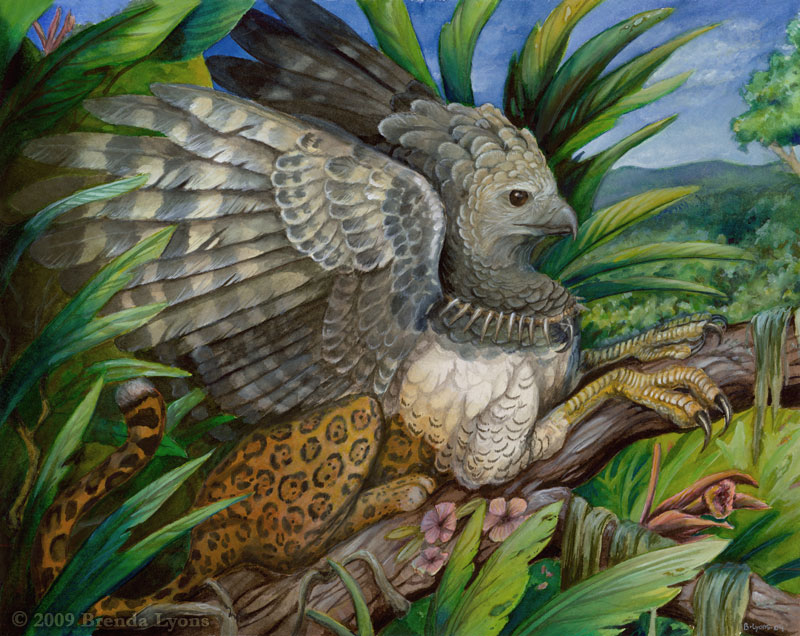
Jaguar Kamathawa

Although this blog is meant primarily to show the process of my thesis paintings, I felt this one piece of personal work was relevant enough, in a way, to post here.


As mentioned before when posting the works in progress of the harpy eagle painting, I mentioned Kamathawa, the divine harpy eagle of Baniwa belief. Kamathawa is thought to bring summer and end the rains, and its feathers are considered to have power to those who possess them. According to Guardians of the Cosmos: Baniwa Shamans and Prophets by Robin M. Wright, "its predatory quality is enhanced by the title "Jaguar" Kamathawa."

This, of course, is not a portrayal of the Kamathawa of the Baniwa people, but rather an inspiration from their legends and descriptions. And, of course, the term "Jaguar Kamathawa" served as a springboard for inspiration for this particular gryphon.

This watercolor and white gouache painting is 11X14 inches on Arches cold-press watercolor paper.