Showing posts with label hawk. Show all posts

Thursday, January 24, 2013

Sylvan - Work in Progress 1

Part 1: Washes
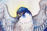
To preserve the 'gems' on the falcon's feathers, I cover them with masking fluid.  This will allow me to paint washes over them and not have to worry about painting around them, so when it comes time to paint them I have the white of the paper.  Based on the color sketch, I start putting in wet-on-wet washes to make sure they blend well.  The important part here is to make sure you only wet areas that are NOT touching other wet sections...otherwise the colors from the first section will bleed into the other section!  For example, I waited until the falcon's wing was completely dry before wetting the hawk's head and back.

It's important not to go too dark at this stage, and this is more of an underpainting basis for the other layers.


Part 2: Adding Color
 

In the falcon's wing, you can see how I started adding color to individual feathers.  I wanted a bit of a gradient, so I started at the top, with aureolin yellow, then going lower with cadmium orange, then using quinacridone rose and finally Thio violet.  Even here, I made sure to use wet-on-wet to encourage the colors to blend cleanly, while using a brush very heavy with pigment.  When the paper is wet, if your brush doesn't have a lot of pigment, you're going to end up with a very weak wash.

I continued down the wing, combining Thio Violet with cerulean blue.  Right now the whole thing looks very oversaturated, but adding shadows and value in the next step will balance some of the color, and make the colors seem even more brilliant, when contrasted with the dull shadows.  I've also started to add detail to the leaves of the willows.

Saturday, January 19, 2013

Sylvan - Sketch and Color Sketch

I've been so busy with leatherwork lately that I've barely had time to paint!  Thankfully I've made time to work on things between projects, and here is one 'just for me' painting I'm starting.

For this, I'm incorporating two techniques I'm aiming for in my work - larger paper size, and experimenting with different paper proportions.  I tend to work around 8X10 or smaller,  but this piece is 12 inches long.  I also find that working in a more 'slender' paper size helps me pay closer attention to composition.

I also aimed to experiment with different angles.  The viewer is looking up at the falcon, but down at the hawk.  The hawk is also mostly facing away from the viewer, while the falcon is looking at the viewer.  I wanted to have a push-and-pull interaction: looking up and down, being looked at and looking away.


I experimented with different colors before settling on this color sketch.  The previous sketches were too 'rainbow', but I want to have a balance between saturation and dull color - that's what truly makes color pop.  The painting itself will be a bit brighter - I find I work too dark digitally most of the time!

Here, I'm aiming for compliments - the orange and green of the hawk and leaves, with blue and purple next to the yellow and orange of the hawk's plumage.  I'm also working on carrying color around the composition - the brilliant green of the leaves on the falcon carry to the background, and to the hawk's eye, and finally there's a hint of it in the hawk's secondary feathers.

The real test here will be if I can stick mostly to the color sketch...or if my watercolors take me in a whole new direction!