Showing posts with label process. Show all posts

Sunday, August 17, 2014

"Winged Fantasy" Video and Frequently Asked Questions

I'm excited to announce that my book, "Winged Fantasy: Draw and Paint Magical and Mythical Creatures" is available!  You can find it bookstores such as Barnes and Noble, as well as in art and craft stores such as Michaels and Jo Ann Fabrics.  It's also available through North Light Shop and Amazon, where you can also look at several pages inside the book.

I've also posted a video as a bit of a 'walkthrough', giving a short summary of each chapter and section:


A few questions I've received online and in person about the book:

Q: What age group and skill level is this book intended for?
A: This book is suitable for kids to adults.  I've had people tell me that their younger children, who can't quite read the text yet, still love the illustrations and enjoy trying their hand at the step-by-steps.  I explain the basics of graphite and ink drawing, and show several techniques for watercolor painting, so even beginner artists can learn from this book.  The techniques I cover are designed to teach the reader, regardless of skill level, about how to create believable shading, highlights and a variety of effects with watercolor, so in addition to being able to create a finished painting from the step-by-steps, the reader will also be able to use what they learn to paint their own creations.

Q: I have a lot of trouble drawing wings, will this book help me specifically with wings?
A: I've had a lot of people throughout the years asking me to write a wing-drawing instructional book, and I've finally had the opportunity to include that here!  This book has an entire chapter dedicated to wing construction and anatomy.  Most of the chapter covers bird and bat wing anatomy, with a small section on insect wing anatomy.  The instruction covers feather structure, bones and joints, and general rules of movement and flexibility.  Below you can see a sample from the bird section:

Q: I can't find the exact colors or brands of watercolor you use. Can I use different paints?
A: Absolutely! You're not required to use the specific colors or paint brands I use in the book.  I personally use several brands, mostly Windsor and Newton, Holbein and Daniel Smith, however there are many different brands of good-quality watercolors out there. There may also be different colors you wish to use.  For example, if you dislike Pthalo Blue, you certainly do not have to use it - you may find a different blue suits your style much better.  Many readers have paints already at home, and may feel overwhelmed by the wide palette I use - don't be discouraged!  Some of the best artists have created incredible paintings using only a few colors.  A good painting doesn't rely on how many paints you have or how much they cost, it's how you use them.

Q: All these watercolor surfaces confuse me! Hot press, cold press, illustration board...in the step-by-steps, do I have to use the same surface you used?
A: Not at all. I used a variety of surfaces because certain surfaces handle paint differently, and wanted to show the reader how texture and surface can affect a painting.  In "The Winged Wolf" step-by-step, I used cold-pressed watercolor paper, which you can see the texture of in the sky. Cold-press paper is also good if you wish to use colored pencil, because of the tooth of the paper.

Many artists have a preference for a specific type of paper.  Experiment with different surfaces to see what works best for you. You may find you dislike hot-press paper, or find one brand too 'slippery' and another brand perfect.  Paper sizing (surface treatment and how water is absorbed) differs between brands as well.  All papers and boards are a little different, and can give different life to your painting.

Q: Where did you learn so much about birds? And why do you draw and paint so many birds and fantasy avian creatures?
A:  Birds have been the earliest passion I can remember (the second earliest passion was to be a Pokemon master...).  I remember spending hours in the library, pouring over the paintings of John James Audubon.  My favorite book as a child was "The Daywatchers" by Peter Parnall, who was the first artist I ever saw who portrayed naturalistic raptors with a touch of fantasy.  When I was 12 years old, I began volunteering at a children's museum at town, where I fed and cleaned raptor enclosures and learned about animals from the resident animal curator, a wonderful man named Brad Case who loved animals and education.

After going to college and then graduate school for illustration, I returned to Connecticut and began volunteering with Horizon Wings, a raptor rehabilitation and education center. There, I gained the sort of observation you can only get from being close to raptors.  Learning about birds isn't just about seeing them, it's about observing their mannerisms and characteristics.  It's about seeing how a hawk can twist its head around or how the feathers on the back of its head slightly flare up when its alarmed.  It's being able to see the tiny baffles in a falcon's nostrils, or the scaling on its feet.  It's feeling first hand just how stiff a falcon's flight feathers are compared to the soft, barely tactile primaries of an owl.  All this, even the non-visual, translates into art.

I always encourage artists, if possible, to observe their subjects first-hand.  Zoos and aviaries are incredible places where you can sit and observe animals.  You'll instantly notice anatomical oddities you never knew about, and watching them move will teach you about their behavior, which in turn will enter your art.

As for why I paint birds?  I still have the same passion for birds that I did when I was a child.  I also find they are the best subject for the emotions and messages I try to portray with my art.  Wings are my preferred medium of expression.

Sunday, December 1, 2013

Smaug - Sketches and Studies

Lately I have been working on larger canvases and in acrylic - quite a change from my preference of painting small and with watercolor.  After returning from IlluxCon in September, I have decided to try and focus on the basics - better composition, greater value, and a better handle on color.  I also decided to strengthen my portfolio with non-avians, since I love to paint fantasy creatures of all types, but you wouldn't know it from my bird-centric portfolio!

I came across the Harper Collins Smaug Art Competition a month ago and decided it would be a good exercise to add a dragon to my portfolio.  Though I read The Hobbit back in middle school, I wanted the vision of Smaug to be fresh in my mind, so I re-read it before beginning my sketches.

Thumbnail Sketch:
To me, Smaug was his most terrifying when laying on his treasure, just rising to speak with the 'thief' he couldn't see.  Not only massive and powerful, but cunning as well - even the strongest and most clever could fall prey to his 'dragon-spell' if he spoke to them for too long.  I wanted to show him just rising, peering in the direction where he knew Bilbo to be hiding, but even his sharp eyes could not spot the invisible hobbit.

Second Sketch:
There were a few things in the thumbnail sketch I wanted to change, such as the size and placement of Smaug's head, and the position of his forelegs. I scanned the thumbnail sketch in and repositioned and resized things in Photoshop, then printed it out and refined the sketch with pen.  Here I began adding the details, such as a 'crown' of spines and horns.

Transfer:
 Since I will be painting this on a piece of gessoed Masonite, I transfered the final sketch onto the 11X14 primed board with red transfer paper, since the dragon will be mostly red and gold.

Value Study:

 In Photoshop, I painted a grayscale value study over the final sketch to figure out where my shadows and highlights would be.  I wanted the main light source to be the reflective gold he is laying on.  In the book, it seemed to me that there was very little light in the great hall where the gold was, save for from the gold itself.  Obviously gold does not emit its own light, but does reflect light very nicely.  Here, for the sake of the illustration, I made the gold glow more than it would, and made it the main source of light.  There is also a bit of light coming from Smaug's fiery throat, and from his glowing eyes.

Friday, July 19, 2013

Akhraiiu - Gryphon Portrait Process

I'm trying to work more in acrylic, so for the upcoming Dragon Con Art Show, I planned on having a number of acrylic pieces.  Below are three process shots of an 8X10 inch acrylic on board painting of a gryphon portrait.

Underpainting:
Basic values in gray, with a greenish gray background.  At this point I am to find the light and shadow.


Basic Details:
Details, still in grays.  I start to tighten the detail on the feathers and face.


Color:
Here I start putting in glazes of color, going thicker where I want more vibrant color.  Since I already have my shadows established, I can simply concentrate on color.  I also deepen the shadows that went dull with the glazes with more color, for example adding a bit of green and black with the burnt sienna to make a deep, rich shadow for the feathers.  I'm only using a few colors at this point - burnt sienna and green gold for the feathers, with black and white. 


Final Details:
I add a bit of green and raw umber to the background to really make the reds of the gryphon pop.  To make the palette even more interesting, I add just a touch of permanent rose and dioxazine purple to the rearmost feathers.  All in all the colors I used were:

Burnt Sienna
Hooker's Green
Green Gold
Burnt Ochre
Permanent Rose
Dioxazine Purple
Raw Umber
Mars Black
Titanium White
Unbleached Titanium (for some areas where I wanted a less stark white)
Phthalocyanine Green (for the jewel details)
Colbalt Blue (just a touch for the cool gray of the beak)

Wednesday, June 12, 2013

Signal - Sketches

With summer conventions coming up, I'm always inspired by the huge paintings I see in the art shows.  It reminds me that I want to work bigger, instead of squishing all the detail into an 8X10 or 9X12 painting!  I've wanted to paint another large (11X14 for me is large!) acrylic painting for a while, featuring gryphons, so after doing some sketches, I came up with the idea of a gryphon holding a flag as a signal for other gryphons to fly into battle.

Final Sketch:

I am trying to pay closer attention to composition lately.  As I learned long ago, the eye automatically tends to travel from top left to bottom right, so you want to catch the viewer's eye and move it around the composition while breaking that straight 'dive' to the bottom right.  I aimed to create movement from the gryphon in the foreground, to the middleground gryphon, all the way to the group in the background.

For colors, I didn't want to go with the same plain blue sky.  I looked through some photos I took of sunset skies and found some inspiration in the yellows, oranges and deep purples there.  It also gives a yellow glow for the highlights, with cooler blues for the shadows.

Color Sketch:
I may add another brown/red gryphon down below just above the trees so there isn't a large expanse of 'dead' space.  It will also allow me to bring some of the red of the flag and jewels to more of the composition. 

Thursday, January 24, 2013

Sylvan - Work in Progress 1

Part 1: Washes
To preserve the 'gems' on the falcon's feathers, I cover them with masking fluid.  This will allow me to paint washes over them and not have to worry about painting around them, so when it comes time to paint them I have the white of the paper.  Based on the color sketch, I start putting in wet-on-wet washes to make sure they blend well.  The important part here is to make sure you only wet areas that are NOT touching other wet sections...otherwise the colors from the first section will bleed into the other section!  For example, I waited until the falcon's wing was completely dry before wetting the hawk's head and back.

It's important not to go too dark at this stage, and this is more of an underpainting basis for the other layers.


Part 2: Adding Color
 

In the falcon's wing, you can see how I started adding color to individual feathers.  I wanted a bit of a gradient, so I started at the top, with aureolin yellow, then going lower with cadmium orange, then using quinacridone rose and finally Thio violet.  Even here, I made sure to use wet-on-wet to encourage the colors to blend cleanly, while using a brush very heavy with pigment.  When the paper is wet, if your brush doesn't have a lot of pigment, you're going to end up with a very weak wash.

I continued down the wing, combining Thio Violet with cerulean blue.  Right now the whole thing looks very oversaturated, but adding shadows and value in the next step will balance some of the color, and make the colors seem even more brilliant, when contrasted with the dull shadows.  I've also started to add detail to the leaves of the willows.

Wednesday, May 9, 2012

Allegiance - Work in Progress Part 1

First Shadows:


With my preliminary sketches complete, I start by painting in the shadows.  I will go back and refine the shadows, but this is a good way for me to establish the figure.  The light source is bright sun, situated high in the sky, but casting its light on the gryphon's back.  I have to keep in mind how each object will cast shadows, such as the banners on the trees, and the wings of the gryphon.

I use a mixture of dioxazine violet and sepia for the feathers, and a mixture of Payne's gray and sepia for the trees and stones.  The shadows of the columns are a combination of ultramarine violet and raw umber, mixed with a little white gouache.  I also put down a light wash to give the grass some shadow, to avoid flatness when I add color later.


First Washes
For the primary and secondary feathers, I mix ultramarine violet, sepia, and just a touch of ultramarine blue.  At this point, my main focus is to get a smooth was over everything - I'll go back later and work on shadows and details.  The grass is a wet-on-wet combination of green gold, sap green and viridian, with ultramarine violet in the shadows. I went back to give the columns some more definition, with a raw umber/white gouache wash, and more ultramarine violet/raw umber/white gouache for the shadows.

White gouache allows me to keep a color smooth and 'milky'.  This is especially helpful for very low-opacity colors, or colors that granulate.  Certain blues, for example, will look blotchy no matter how careful you are, and that's just the nature of the pigment.  For the background, I'm careful to use just a little pigment with white gouache, to keep the illusion of atmospheric perspective.  This is likely as dark as I will go with the background, with just a few details added later.


Building up Color
I notice the shadows are a bit lacking (particularly on the ground under the gryphon) so I begin to build them up.  It's important to keep an eye on your contrast and how dark you're pushing your pigments.  With watercolor, it's always easier to go from light to dark, instead of trying to lighten after you've gone too dark.  You might think that white gouache, for example, can fix that, but white gouache often fails to get a section as light as if you simply used a light watercolor wash!  White gouache will never be as light as the paper.

The shadows on the ground are mostly a combination of ultramarine violet and sepia, with some Payne's gray (a blueish gray) closer to the gryphon's paws.  Since the sun is so bright, the shadows will be darker and sharper closer to the gryphon's limbs, and fade as they go out.

The next post will look at the rest of the process, and include the final painting.

Tuesday, May 1, 2012

Allegiance - Sketches

I was looking through an old sketchbook and found a little sketch I'd done while at my table at DragonCon. DragonCon happens to be the highlight of the year for me, because I get to see friends, and because the art show just floods me with inspiration! I also received a lot of feedback about my work, and made it a goal to try more complex poses and compositions.

Thumbnail:
The sketch just kind of came out. I had an image of a gryphon bowing, and instantly the word 'allegiance' came out with the sketch. Now, several months later, I finally got around to proceeding with doing something with the sketch.

First Sketch:
I scanned the sketch and brought it into Photoshop to figure out the composition.  Eventually I started to put in columns...and banners...and suddenly what was just meant to be a single gryphon turned into scene with perspective!

Perspective Sketch:
Though I cropped it out, I originally extended the canvas far to the left so I could find a vanishing point for the lines.  The image was starting to go in a direction I hadn't planned on, but I went along to see how far I could push the composition.  Finally, I transferred it to my illustration board, and finalized the drawing.

Final Drawing:
I didn't want the gryphon to be indoors - it seems any king or queen a gryphon would pledge his or her allegiance to would be one who doesn't cage themselves inside walls.  Then what would the banners hang on?  Trees, of course.  Wild oaks with twisting, unruly roots.  I found there was a problem with the expanse of negative space in that lower left triangle, so I thought of what should go there.

My thinking process began to mingle with the story that was brewing in my head, eventually pushing the composition to be structured (with the columns and straight edges of the banners), with wildness added.  The winding trees, the woodland designs on the banners...perhaps this is a faean 'hall'?  Even still, a gryphon is a wild creature, not a being of straight lines and carved angles.  The gryphon here is a little out of his element with the columns...bowing down but still with a wary eye.

Color Sketch:
I recently received some feedback from a group of very skilled, professional fantasy artists who pointed out that my skies are consistently too dark.  Reading their comments was like light suddenly flicking on - it was something I couldn't quite figure out on my own until someone pointed it out!  Although in this piece the horizon line is almost off the paper (you can see it just barely in the upper left of the background), I had to keep in mind the background would also need to be of low contrast and low saturation.

I am also trying to use less saturated colors overall, and I plan on painting this mostly with watercolor, and using washes of acrylic to really push the values.  I hope the acrylic will also help me achieve the smoothness I usually lack with watercolor.

Wednesday, April 4, 2012

Piebald Peacock - Process Part 2

If you haven't seen it, you can find part one of this process post here: http://featherseeds.blogspot.com/2012/04/piebald-peacock-process-part-1.html

And a note: in this post when I refer to the 'tail', I am referring to the long feathers that grow from a peacock's back, which are often referred to as its 'tail'. For the sake of layman's clarity, I have used the word 'tail', but please note that they are not part of a peacock's true tail!

As I was still working on the tail, the client requested the wings have less white and more natural plumage, as seen in the leftmost color sketch as seen in the previous post. This was no problem, as I hadn't started any of the wing detail, and with the feathers that needed color being white, it was an easy addition.

Adding Detail:


I studied quite a bit of piebald peacock reference to figure out how the white feathers of the tail should look. The feathers behind the white ones would be a mixture of natural and white, so I made the area behind the white feathers the same dark brown as behind the natural feathers. Since I will be painting the details with white acrylic, there is no need to paint in the negative space - the white acrylic will be opaque over the watercolor.

At this point, I started to paint in the detail of the peacock's body and wings, bringing shadows to the primary and secondary feathers, and dark edges to the brilliant back feathers peacocks have. The head and neck are of particular focus, since the brilliant blues and greens are part of what makes these birds' plumage so impressive.

Final Details:


With white acrylic, I painted in the feather shafts and the loose vanes for the white feathers. Overlapping and steering away from a uniform direction for the feathers is important here - this 'wispiness' is part of what makes peacock tail feathers so iconic. I also took a bit of artistic liberty with the white feathers. There is no 'ghost' of the eye or other markings that the naturally-colored tail feathers have, but without it, the feathers looked blank and too bright.

I added even more detail to the back feathers, which is what really made them pop. These feathers are not simply green with black, but they have an 'arrow' of blue surrounded by reddish brown. Little details like this are what makes the difference between the feathers looking 'drawn on', and actually being part of the bird. It may be tempting at times to omit certain details, but having patience and painting them in (such as the barred patterns on the tertial and scapular feathers) really helps bring the bird together. When we look at a peacock, we may be tempted to see them just as their beautiful tails, but there's so much more than just the tail that makes a peacock.

At this point I am ready to put in the background, which will be a simple blending of colors. As you can see, the white of the wings and the neck really don't pop with the current white background.

Finished Painting:


I used washes of raw umber, Van Dyk brown, and sepia, with a little phtalo green here and there to bring the whole composition together, then went over the dried washes with a layer of white gouache. Compared to the previous image, you can see how the white of the wings pops out and unifies the figure. All in all, this painting is about 95% watercolor, with the only acrylic used being the white acrylic for the white feather vanes and shafts of the white tail feathers. It's 8 X 11 inches on hot-press Fabriano watercolor paper.

Sunday, April 1, 2012

Piebald Peacock - Process Part 1

My favorite commissions are those involving birds I've never painted before. Not only does it present an opportunity to paint a new subject, but it's also a challenge. I was asked to paint a piebald peacock, which is a peacock with both regular coloration, as well as patches of white plumage.

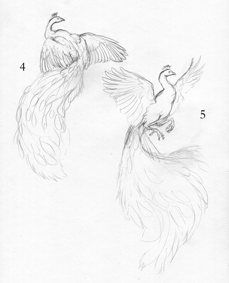
To start, I did a number of sketches for the client, who said she wanted the wings to be spread. Obviously the tail also needed to be a focal point, which meant the poses needed to be from the back.

Note: For the sake of biological accuracy, I must point out that a peacock's 'tail' feathers are not actually part of the tail at all! They are very, very long feathers that grow from its back. You can see a peacock's true tail, spread in the back while it displays here: http://www.flickr.com/photos/anulalv/2722509521/

Sketches:


The client chose pose #2, with a partially-spread tail and spread wings. I refined the sketch, and did two color sketches:

Finished Sketch:


Color Sketches:


The client was specific in where she wanted the white - a few patches in the primary feathers, and some of the white feathers with regular 'eyes'. Since the colors were so specific, I only had to do two color sketches to determine where to put the white. As a note - the client requested a 'spontaneous watercolor splash' background, but I used a temporary purplish-pink background simply to show the colors in the color sketch. The final painting will not have that background. #2 was chosen for its symmetry, so I started on the painting.

First Washes:


Since the colors are so tricky in this piece, I put down a very simple wash of the base colors, before starting on any shadow or detail. The tail will be especially challenging because of the nature of peacock feathers - the vane is loose and 'flowy'. To show an example of what I'm talking about, look at this fanned peacock tail. Note how you have bright green feather over the dark shadow of the feathers behind. With watercolor, you can't paint thin, light details on top of dark shadow, so I would have to paint in each thin strand of shadow in individually. With watercolor, it's important to focus on both the positive and negative space and plan what you will do with highlights and shadows.

Note how the brilliant blues of the eyes look pretty dull. Although I used a very brilliant shade of Turquoise (Holbein), it looks fairly drab when surrounded by such low-contrast yellows. But take a look at the one eye where I put in the detail of dark brown, and you can see how that blue starts to pop.

Tail Detail (Part 1):


Here you can see a bit of the progress from right to left. On the right, I've only started painting in the feather vane with Pthalo Green. The 'sword' feathers are Turquoise. On the left, you can see how I went in with a dark mixture of Van Dyk Brown and Payne's Gray to paint in the shadows. With acrylic, this would have been much easier - I would have painted a layer of dark brown, and then simply gone over the brown with the lighter green. With watercolor, it's very difficult to go dark back to light, so if you want to preserve a brilliant and bright color, you must paint your darks around it.

The feathers at the base of the tail have a wash of Turquoise, gradually blending to washes of Sap Green as they approach the ends. I will be using white acrylic to paint in the feather vane of the white tail feathers, mostly to achieve the brilliant white and fine detail of those feathers.

Tuesday, January 10, 2012

Barred Owl - Omar

After a lengthy gap due to the untimely death of my computer, I am now able to scan and post artwork again! Hurray! The laptop I was using in the meantime had a very poor screen, so it was several months before I could scan any work. Here is a continuation of the previous post, finishing the painting of Omar, the barred owl.

Shadows and Details:


At this point, I really started pushing the shadows, particularly in the left of the image. Unlike with opaque media (acrylic, oils) where you generally work dark to light, with watercolor you work light to dark. Lifting color is possible, but difficult, and you can never go back to the pure white of the paper once the paint is down.

I also put in the detail of the wings with a wash of sepia, and darkened the eyes with a mixture of van dyk brown and payne's gray. At this point, I've only used a handful of colors. If you add too many colors, you tend to get mud, and the painting can fall 'off key'. The colors I've used so far have been sepia, van dyk brown, raw umber, payne's gray, dioxazine violet, ultramarine violet, and naples yellow. White gouache is what I used to pop out some of the feathers in the shadows.

Finished Painting:


A loose wash of sap green, cadmium yellow, and viridian green helps pop the grayish-brown figure out. I used a mixture of van dyk brown and payne's gray for the feather shadows on the wing, with a dab of white gouache for the highlights on the eyes.

Tuesday, May 3, 2011

A Glimpse of Sky - Progress 2


Here is further progress on "A Glimpse of Sky." At this point, I have painted the midtones for the vines, and started putting in detail in the feathers. I am using a mixture of payne's gray and sepia as a nice neutral tone for the shadows.


More contrast for the vines, including some texture. I use a white Sakura Gelly Roll pen in places I want to lighten. The Gelly Roll pens are excellent for watercolor as they are water soluble, and can be moved around much like paint with a wet brush. They also tend to resist darkening as they dry, as white gouache does.

Here, I've started laying down layers for the falcon's coloring. Peregrines have a beautiful slate-blue coloration for their plumage. However, since only using shades of blue would keep the overall color scheme too analogous (greens and blues), I decided to introduce some purples. The wings closest to the sky are tinted with cerulean blue, blending closer to purple as the wings get darker at the bottom.

You can see where I have started detailing the markings on the feathers, using a mixture of payne's gray and indigo. The tricky part here is darkening the markings on the wings without darkening the overall wing! If I'm not careful, I'll end up losing all my contrast with the detail.

Monday, October 26, 2009

Autumn's Turn Process

I thought it might be fun to show the progress of a painting, from sketch to ink to finished painting. Here are the process shots, from beginning to end:


And a larger version of the finished piece:

Tuesday, October 13, 2009

Firebird Mask - Works in Progress 2

I only got a little work done on the firebird mask today, but here's the progress so far.


Since the mask is primarily going to be painted in yellows and oranges, I dyed it with a yellow dye. Think of it as tinting your canvas - it unifies your colors and makes everything look more natural.


If you look back on the post containing the color sketch, you'll see that there are feathers going around the outer edge of the mask. Originally these were going to be all real feathers, but after contacting the person commissioning the mask, we decided to go with leather feathers. This will end up giving the mask a 'sturdier' look, as well adding more interesting texture and dimensionality to the existing base leather mask. Real feathers (the curving variety) will be added later. As seen in the image above, I cut out feathers from scrap pieces of leather. The lines in the feathers are done with a swivel knife. These feathers are also dyed, and shaped while still wet with the dye. Once dry, they will keep their shape.

Although this was a sheet of 'error' feathers (I drew them curving in the wrong direction by mistake), it shows the first step in creating pieces out of leather. And I never really waste anything - these feathers will find a home in another project. Perhaps I'll make pendants or keypulls out of them?


And one last note - I've finally come to accept that my studio will never, ever remain clean. After every project I clean it, and it always ends up cluttering up again. Oh well.

Monday, October 12, 2009

Firebird Mask - Works in Progress

I thought it may be mildly interesting to show the progress of one of the masks I'm working on. I was commissioned to create a firebird-inspired mask, and decided this would be an excellent opportunity to test out the new, higher-quality leather I was recommended to use.

First some sketches:


As with any commission, I create a number of sketches to get some ideas on the table. Depending on what the person wants, it may take only a few sketches, or a lot. In this case, the person was quite clear on what she wanted, which is good for me - good communication always makes a job easier.


We ended up using a mixture of several sketch designs to come up with one final sketch. Then it was time for color sketches, and after a couple of revisions for those, this was the color scheme chosen.

Again, I am very new at mask making, so I am still ironing out my own methods. I've learned quite a lot from a mask maker whose work is on DeviantART and Etsy, who was kind enough to post a very helpful tutorial on how to make leather masks. In case you're curious, you can find her tutorial here. However, I've done a good number of drawing and painting commissions, so the commission process is pretty much the same even if it's a medium I'm still learning. Once I have the sketch and color sketch done, then it's time to start on the final piece.


I didn't take photos of actually tooling the leather, but at this point in the process, the mask has been tooled, cut, and shaped. Shaping involves wetting the entire mask and molding it around your face until you get the desired shape. Once you have a basic shape, you put it in the oven at around 250 degrees F to let it dry. I take it out multiple times to make sure I get the shape right. I've messed up a few masks mostly due to my own inexperience, but I think I got this one shaped just the way I wanted.

You may also notice the beak is a bit longer than in the sketch. Since I am still learning how to make a 2-D sketch that will match the physics of a 3-D mask, sometimes once I cut out a full-sized paper version of the mask to transfer onto the leather, I spot some things I need to fix. If I had left the beak as it was in the sketch, it would be nothing but a nub! And a graceful firebird needs a much more elegant beak.

More progress shots will come! Coming up will be dyeing the mask, painting it, and then putting the feathers on.