Showing posts with label watercolor. Show all posts

Sunday, August 17, 2014

"Winged Fantasy" Video and Frequently Asked Questions

I'm excited to announce that my book, "Winged Fantasy: Draw and Paint Magical and Mythical Creatures" is available!  You can find it bookstores such as Barnes and Noble, as well as in art and craft stores such as Michaels and Jo Ann Fabrics.  It's also available through North Light Shop and Amazon, where you can also look at several pages inside the book.

I've also posted a video as a bit of a 'walkthrough', giving a short summary of each chapter and section:


A few questions I've received online and in person about the book:

Q: What age group and skill level is this book intended for?
A: This book is suitable for kids to adults.  I've had people tell me that their younger children, who can't quite read the text yet, still love the illustrations and enjoy trying their hand at the step-by-steps.  I explain the basics of graphite and ink drawing, and show several techniques for watercolor painting, so even beginner artists can learn from this book.  The techniques I cover are designed to teach the reader, regardless of skill level, about how to create believable shading, highlights and a variety of effects with watercolor, so in addition to being able to create a finished painting from the step-by-steps, the reader will also be able to use what they learn to paint their own creations.

Q: I have a lot of trouble drawing wings, will this book help me specifically with wings?
A: I've had a lot of people throughout the years asking me to write a wing-drawing instructional book, and I've finally had the opportunity to include that here!  This book has an entire chapter dedicated to wing construction and anatomy.  Most of the chapter covers bird and bat wing anatomy, with a small section on insect wing anatomy.  The instruction covers feather structure, bones and joints, and general rules of movement and flexibility.  Below you can see a sample from the bird section:

Q: I can't find the exact colors or brands of watercolor you use. Can I use different paints?
A: Absolutely! You're not required to use the specific colors or paint brands I use in the book.  I personally use several brands, mostly Windsor and Newton, Holbein and Daniel Smith, however there are many different brands of good-quality watercolors out there. There may also be different colors you wish to use.  For example, if you dislike Pthalo Blue, you certainly do not have to use it - you may find a different blue suits your style much better.  Many readers have paints already at home, and may feel overwhelmed by the wide palette I use - don't be discouraged!  Some of the best artists have created incredible paintings using only a few colors.  A good painting doesn't rely on how many paints you have or how much they cost, it's how you use them.

Q: All these watercolor surfaces confuse me! Hot press, cold press, illustration board...in the step-by-steps, do I have to use the same surface you used?
A: Not at all. I used a variety of surfaces because certain surfaces handle paint differently, and wanted to show the reader how texture and surface can affect a painting.  In "The Winged Wolf" step-by-step, I used cold-pressed watercolor paper, which you can see the texture of in the sky. Cold-press paper is also good if you wish to use colored pencil, because of the tooth of the paper.

Many artists have a preference for a specific type of paper.  Experiment with different surfaces to see what works best for you. You may find you dislike hot-press paper, or find one brand too 'slippery' and another brand perfect.  Paper sizing (surface treatment and how water is absorbed) differs between brands as well.  All papers and boards are a little different, and can give different life to your painting.

Q: Where did you learn so much about birds? And why do you draw and paint so many birds and fantasy avian creatures?
A:  Birds have been the earliest passion I can remember (the second earliest passion was to be a Pokemon master...).  I remember spending hours in the library, pouring over the paintings of John James Audubon.  My favorite book as a child was "The Daywatchers" by Peter Parnall, who was the first artist I ever saw who portrayed naturalistic raptors with a touch of fantasy.  When I was 12 years old, I began volunteering at a children's museum at town, where I fed and cleaned raptor enclosures and learned about animals from the resident animal curator, a wonderful man named Brad Case who loved animals and education.

After going to college and then graduate school for illustration, I returned to Connecticut and began volunteering with Horizon Wings, a raptor rehabilitation and education center. There, I gained the sort of observation you can only get from being close to raptors.  Learning about birds isn't just about seeing them, it's about observing their mannerisms and characteristics.  It's about seeing how a hawk can twist its head around or how the feathers on the back of its head slightly flare up when its alarmed.  It's being able to see the tiny baffles in a falcon's nostrils, or the scaling on its feet.  It's feeling first hand just how stiff a falcon's flight feathers are compared to the soft, barely tactile primaries of an owl.  All this, even the non-visual, translates into art.

I always encourage artists, if possible, to observe their subjects first-hand.  Zoos and aviaries are incredible places where you can sit and observe animals.  You'll instantly notice anatomical oddities you never knew about, and watching them move will teach you about their behavior, which in turn will enter your art.

As for why I paint birds?  I still have the same passion for birds that I did when I was a child.  I also find they are the best subject for the emotions and messages I try to portray with my art.  Wings are my preferred medium of expression.

Sunday, September 8, 2013

Sizing Matters - Why Paper Manufacturers Changing Watercolor Sizing is a Bad Move

About two years ago, I bought a watercolor sketchbook for field sketches.  I discovered I loved how the paper took my paint, so I decided to buy a pad of the paper it was made from - this paper was Canson Montval Watercolor Paper.  Now, any watercolor artist will tell you that the surface you paint on affects everything.  Illustration board takes paint differently than cold-press watercolor paper, for example, and hot-press takes it differently than rough-press.  Watercolor paper surfaces are treated, and this treatment is known as 'sizing'.  The term 'sizing' has nothing to do with the dimensions of the paper, but rather how it absorbs and accepts paint.  Regular sizing is essential for successful painting, and a poorly-sized paper can destroy a painting.

For the past year, I have been painting with this paper, and recently (after going through the rest of my 15X20 pad during a massive project), purchased another pad.  The pad was identical in markings, appearance and labeling, so naturally I assumed it was the same exact paper.  I transferred my drawing to the paper, and after a few washes discovered it was not acting anything like my beloved Montval paper from before.  In fact, previous washes were coming up.  The surface was closer to a rough-press than a cold-press.  Washes seemed blotchy and rough, and the colors were not blending as they used to.  I was distraught!  I had already started three paintings with this paper and was on a tight deadline - I could not restart them.  I tried to work with the paper as best I could, but the quality was lacking.

The purpose of this post isn't to call out a particular paper manufacturer (though I am quite steamed at this company for selling me what turned out to be, essentially, a bait-and-switch in terms of quality).  It is to ask - or rather plead - with watercolor paper manufacturers to not switch their sizing without warning the consumers.  In what way could they do this?  A simple change in labeling on the cover of the pad or block of paper would suffice.  Something as simple as "new sizing from our 2012 paper" would help artists immensely.  We would know to test the paper first before leaping right into extensive projects that are a terrible waste of time and money if the paper ends up not performing as expected.  For watercolor artists, we rely on our paper to act the same, each time, every time.  We purchase specific paper because we know exactly how our techniques will meld with that paper.  When the paper doesn't perform as expected, that hurts the artist.

Here is a simple test I did to show how three different watercolor papers performed with what I call the "tree bark test".  Each paper is labeled - I used the new pad of Canson Montval Paper (140 lbs, cold-press), a pad of 'student grade' Canson XL Pad Watercolor Paper (140 lbs, cold-press), and Fabriano Artistico Watercolor Paper (140 lbs, hot-press).

Step 1:


The first step is using a concentrated mixture of Indigo and Sepia watercolor with a #2 round to paint in bark details.  The paint is thick in places, so I of course expect a little lifting and bleeding when I put the next layer down.  I let this layer dry completely before the next step


Step 2:


With a #6 round and a light wash of Raw Umber and Colbalt Blue, I painted over each branch.  Here is where you can see the catastrophic failure of the Montval paper.  Although the first layer was completely dry, a simple, gentle wash brought up most of the paint beneath, creating a muddy, dark mess.  Even the 'student grade' Canson XL paper performs better, and the Fabriano performs best with minimal bleeding.

This is not an isolated problem.  Other watercolor artists have experienced sudden changes in watercolor paper sizing, resulting in problems with their paintings.  Of course art supply companies should be free to change their product to create improved products for their customers, but it seems these sizing changes are resulting in a decrease of quality of the paper.  This is unacceptable, and for those of us who make a living by painting, we need to have a steady, quality product.  We cannot spend time and money guessing which paper will work and which will result in a muddy, awful mess.

In closing, I have two requests for watercolor paper manufacturers.  The first is this: if you must change the sizing on your papers, please make it known on your labeling so your customers can be prepared and test the paper appropriately.  Otherwise, you are harming your consumers and we will leave your product for a different one.  The second request is not to change the sizing in your paper unless it has been thoroughly tested as a positive change.  If it is becoming too costly to produce paper with the original quality, it is better to raise the price of your paper than to lower the quality.  I, and many artists, would much rather pay more for the same quality paper we have come to rely on, than to pay the same as before for an unusuable product.


And this product is, in a word, unusuable.

Thursday, January 24, 2013

Sylvan - Work in Progress 1

Part 1: Washes
To preserve the 'gems' on the falcon's feathers, I cover them with masking fluid.  This will allow me to paint washes over them and not have to worry about painting around them, so when it comes time to paint them I have the white of the paper.  Based on the color sketch, I start putting in wet-on-wet washes to make sure they blend well.  The important part here is to make sure you only wet areas that are NOT touching other wet sections...otherwise the colors from the first section will bleed into the other section!  For example, I waited until the falcon's wing was completely dry before wetting the hawk's head and back.

It's important not to go too dark at this stage, and this is more of an underpainting basis for the other layers.


Part 2: Adding Color
 

In the falcon's wing, you can see how I started adding color to individual feathers.  I wanted a bit of a gradient, so I started at the top, with aureolin yellow, then going lower with cadmium orange, then using quinacridone rose and finally Thio violet.  Even here, I made sure to use wet-on-wet to encourage the colors to blend cleanly, while using a brush very heavy with pigment.  When the paper is wet, if your brush doesn't have a lot of pigment, you're going to end up with a very weak wash.

I continued down the wing, combining Thio Violet with cerulean blue.  Right now the whole thing looks very oversaturated, but adding shadows and value in the next step will balance some of the color, and make the colors seem even more brilliant, when contrasted with the dull shadows.  I've also started to add detail to the leaves of the willows.

Saturday, September 22, 2012

Portrait practice and nature studies

Lately I've been in a mood to practice digital portraits.  I adore seeing the color and value artists achieve with skintones digitally, and I suppose the final push was when I got a bunch of brushes from my friend Sam Hogg, whose digital (and traditional) work is incredible.  She also pointed out something that should have been obvious to a friend and I that we never knew was possible in Photoshop - brush opacity controlled by pen pressure.  I'd long been controlling brush size with pen pressure, but never knew you could control opacity that way as well - I always thought if you wanted your pen to control opacity, you had to use a program such as Corel Painter.

You'll probably think that I've posted these two digital portraits out of order, since the first is much better than the second, but the first portrait is with photo reference, and the second is without.  For my second sketch I wanted to see how much I could 'remember' about facial anatomy and color/shadow without consulting a reference.


Referenced from this photo by Faestock on DeviantART:

Primarily I'm trying to improve my facial anatomy.  My biggest problem spots are noses - even in this sketch, when I finished, I realized the nose was actually too far to the left (her right) and I had to move it over.  Even using a reference, I tend to go 'blind' when it comes to the human face (and body).  This is something I hope to improve upon by practice.


No reference (and it shows!)


Here my weakness with noses is pretty apparent, as well as an all-around unfamiliarity with the human face.  You'd think that being a human myself, I'd be pretty familiar with the features, but it's amazingly difficult to 'remember' all the subtleties to a nose, or the flaps of skin around the eye.  The colors are also weaker compared to the first.

Today, I decided to have lunch on my favorite rock at a nearby wooded area that surrounds the town reservoir.  On my way back, I found a stunning red maple leaf with bright green veins - a leaf that was probably just starting to turn but fell off the tree prematurely.  I took it home with the intention to paint it, and noticed that by the time it was in my house, it had already started to darken and dull!  It's as if autumn leaves have a built-in 'leave me outside' mechanism.

Autumn Leaf Study (watercolor on paper) :

 Even with all its imperfections, I still like this study.  Somehow, the roughness and looseness of nature studies seem more forgiving than human anatomy - perhaps because we, as humans, are more familiar with the appearance of our own species than the world around us.  Or perhaps it's nothing so complex and there's just something beautiful about loose nature studies!

Wednesday, May 9, 2012

Allegiance - Work in Progress Part 1

First Shadows:


With my preliminary sketches complete, I start by painting in the shadows.  I will go back and refine the shadows, but this is a good way for me to establish the figure.  The light source is bright sun, situated high in the sky, but casting its light on the gryphon's back.  I have to keep in mind how each object will cast shadows, such as the banners on the trees, and the wings of the gryphon.

I use a mixture of dioxazine violet and sepia for the feathers, and a mixture of Payne's gray and sepia for the trees and stones.  The shadows of the columns are a combination of ultramarine violet and raw umber, mixed with a little white gouache.  I also put down a light wash to give the grass some shadow, to avoid flatness when I add color later.


First Washes
For the primary and secondary feathers, I mix ultramarine violet, sepia, and just a touch of ultramarine blue.  At this point, my main focus is to get a smooth was over everything - I'll go back later and work on shadows and details.  The grass is a wet-on-wet combination of green gold, sap green and viridian, with ultramarine violet in the shadows. I went back to give the columns some more definition, with a raw umber/white gouache wash, and more ultramarine violet/raw umber/white gouache for the shadows.

White gouache allows me to keep a color smooth and 'milky'.  This is especially helpful for very low-opacity colors, or colors that granulate.  Certain blues, for example, will look blotchy no matter how careful you are, and that's just the nature of the pigment.  For the background, I'm careful to use just a little pigment with white gouache, to keep the illusion of atmospheric perspective.  This is likely as dark as I will go with the background, with just a few details added later.


Building up Color
I notice the shadows are a bit lacking (particularly on the ground under the gryphon) so I begin to build them up.  It's important to keep an eye on your contrast and how dark you're pushing your pigments.  With watercolor, it's always easier to go from light to dark, instead of trying to lighten after you've gone too dark.  You might think that white gouache, for example, can fix that, but white gouache often fails to get a section as light as if you simply used a light watercolor wash!  White gouache will never be as light as the paper.

The shadows on the ground are mostly a combination of ultramarine violet and sepia, with some Payne's gray (a blueish gray) closer to the gryphon's paws.  Since the sun is so bright, the shadows will be darker and sharper closer to the gryphon's limbs, and fade as they go out.

The next post will look at the rest of the process, and include the final painting.

Wednesday, April 4, 2012

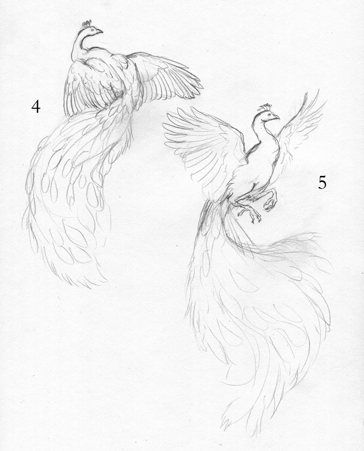
Piebald Peacock - Process Part 2

If you haven't seen it, you can find part one of this process post here: http://featherseeds.blogspot.com/2012/04/piebald-peacock-process-part-1.html

And a note: in this post when I refer to the 'tail', I am referring to the long feathers that grow from a peacock's back, which are often referred to as its 'tail'. For the sake of layman's clarity, I have used the word 'tail', but please note that they are not part of a peacock's true tail!

As I was still working on the tail, the client requested the wings have less white and more natural plumage, as seen in the leftmost color sketch as seen in the previous post. This was no problem, as I hadn't started any of the wing detail, and with the feathers that needed color being white, it was an easy addition.

Adding Detail:


I studied quite a bit of piebald peacock reference to figure out how the white feathers of the tail should look. The feathers behind the white ones would be a mixture of natural and white, so I made the area behind the white feathers the same dark brown as behind the natural feathers. Since I will be painting the details with white acrylic, there is no need to paint in the negative space - the white acrylic will be opaque over the watercolor.

At this point, I started to paint in the detail of the peacock's body and wings, bringing shadows to the primary and secondary feathers, and dark edges to the brilliant back feathers peacocks have. The head and neck are of particular focus, since the brilliant blues and greens are part of what makes these birds' plumage so impressive.

Final Details:


With white acrylic, I painted in the feather shafts and the loose vanes for the white feathers. Overlapping and steering away from a uniform direction for the feathers is important here - this 'wispiness' is part of what makes peacock tail feathers so iconic. I also took a bit of artistic liberty with the white feathers. There is no 'ghost' of the eye or other markings that the naturally-colored tail feathers have, but without it, the feathers looked blank and too bright.

I added even more detail to the back feathers, which is what really made them pop. These feathers are not simply green with black, but they have an 'arrow' of blue surrounded by reddish brown. Little details like this are what makes the difference between the feathers looking 'drawn on', and actually being part of the bird. It may be tempting at times to omit certain details, but having patience and painting them in (such as the barred patterns on the tertial and scapular feathers) really helps bring the bird together. When we look at a peacock, we may be tempted to see them just as their beautiful tails, but there's so much more than just the tail that makes a peacock.

At this point I am ready to put in the background, which will be a simple blending of colors. As you can see, the white of the wings and the neck really don't pop with the current white background.

Finished Painting:


I used washes of raw umber, Van Dyk brown, and sepia, with a little phtalo green here and there to bring the whole composition together, then went over the dried washes with a layer of white gouache. Compared to the previous image, you can see how the white of the wings pops out and unifies the figure. All in all, this painting is about 95% watercolor, with the only acrylic used being the white acrylic for the white feather vanes and shafts of the white tail feathers. It's 8 X 11 inches on hot-press Fabriano watercolor paper.

Sunday, April 1, 2012

Piebald Peacock - Process Part 1

My favorite commissions are those involving birds I've never painted before. Not only does it present an opportunity to paint a new subject, but it's also a challenge. I was asked to paint a piebald peacock, which is a peacock with both regular coloration, as well as patches of white plumage.

To start, I did a number of sketches for the client, who said she wanted the wings to be spread. Obviously the tail also needed to be a focal point, which meant the poses needed to be from the back.

Note: For the sake of biological accuracy, I must point out that a peacock's 'tail' feathers are not actually part of the tail at all! They are very, very long feathers that grow from its back. You can see a peacock's true tail, spread in the back while it displays here: http://www.flickr.com/photos/anulalv/2722509521/

Sketches:


The client chose pose #2, with a partially-spread tail and spread wings. I refined the sketch, and did two color sketches:

Finished Sketch:


Color Sketches:


The client was specific in where she wanted the white - a few patches in the primary feathers, and some of the white feathers with regular 'eyes'. Since the colors were so specific, I only had to do two color sketches to determine where to put the white. As a note - the client requested a 'spontaneous watercolor splash' background, but I used a temporary purplish-pink background simply to show the colors in the color sketch. The final painting will not have that background. #2 was chosen for its symmetry, so I started on the painting.

First Washes:


Since the colors are so tricky in this piece, I put down a very simple wash of the base colors, before starting on any shadow or detail. The tail will be especially challenging because of the nature of peacock feathers - the vane is loose and 'flowy'. To show an example of what I'm talking about, look at this fanned peacock tail. Note how you have bright green feather over the dark shadow of the feathers behind. With watercolor, you can't paint thin, light details on top of dark shadow, so I would have to paint in each thin strand of shadow in individually. With watercolor, it's important to focus on both the positive and negative space and plan what you will do with highlights and shadows.

Note how the brilliant blues of the eyes look pretty dull. Although I used a very brilliant shade of Turquoise (Holbein), it looks fairly drab when surrounded by such low-contrast yellows. But take a look at the one eye where I put in the detail of dark brown, and you can see how that blue starts to pop.

Tail Detail (Part 1):


Here you can see a bit of the progress from right to left. On the right, I've only started painting in the feather vane with Pthalo Green. The 'sword' feathers are Turquoise. On the left, you can see how I went in with a dark mixture of Van Dyk Brown and Payne's Gray to paint in the shadows. With acrylic, this would have been much easier - I would have painted a layer of dark brown, and then simply gone over the brown with the lighter green. With watercolor, it's very difficult to go dark back to light, so if you want to preserve a brilliant and bright color, you must paint your darks around it.

The feathers at the base of the tail have a wash of Turquoise, gradually blending to washes of Sap Green as they approach the ends. I will be using white acrylic to paint in the feather vane of the white tail feathers, mostly to achieve the brilliant white and fine detail of those feathers.

Tuesday, January 17, 2012

Radiance - Final Progress and Finished Piece

At this point, it's mostly details I'm adding to the painting. These are the steps of adding more and more layers, and slowly pushing colors and value.

Color and Value:


To really bring out the vibrant purples in the falcon's lower wings, I use Quinacridone Rose. This is a vibrant shade of magenta, but when used in light washes, can really make the difference between a cool blue-violet and a warmer red-violet. I used to be very shy of transparent washes, especially if the color I was using as a wash was extremely vibrant. I feared using a little magenta over blue would suddenly turn the whole thing bright pink! However, with transparent mediums, this is not as much a danger, especially when the base layer is so dark.

I did the same in the eagle, using washes of Cadmium Orange. Unlike Quinacridone Rose, Cadmium Orange CAN overpower the layer beneath quite easily. It is a slightly opaque color - not opaque in the acrylic sense where it can be used to completely cover a layer, but opaque in that the pigment can 'cloud' the color beneath. Therefore, I was careful to use little pigment and more water, and simply use more layers to slowly push the feathers towards orange. Once dry, I put a wash of Aureolin Yellow over the entire eagle (except for the bottom-most feathers). Washes like this are important to bring the colors together.

To brighten the blue on the falcon, I alternated between washes of Turquoise and Cerulean Blue. I switched to Colbalt Blue the lower I went, to keep the cyan-blue-violet color flow. At this point, I put more details in the gems and 'gem feathers' on both birds, as well as on the smaller feathers on the heads and neck.

Details:


Peregrine falcon plumage is recognizable by the beautiful barred patterns on the feathers. This is where I ran into a bit of a dilemma. If I painted the feather bars, it would ruin the symmetrical effect of falcon and eagle, as golden eagles do not (typically) have barring on the wings. If I left the barring off, I felt the falcon would be lacking in part of its 'plumage identity'. After thinking about it a bit and discussing with a friend and fellow artist, I decided to paint just the hint of bars on the wings, but taking liberties to still keep it 'in sync' with the eagle.

Peregrines also have a lovely effect on the ends of their feathers where the tips are lighter than the rest of the feather. This gives their feathers a lovely layered effect. To achieve this, I used a bit of concentrated white gouache on the longer feathers, and white gel pen on the smaller feathers. Below, you can see how white gel pen can be blended using water. It's almost like white gouache in pen form!


The feathers on the left are pure gel pen, whereas the feathers on the right have been softly blended with a wet brush.

Finished Piece:


Most of the work at this stage was in acrylic washes. One of the advantages of using acrylic is its opacity. This allows me to push the colors even further, and even go lighter in places. An example of this is the Cerulean Blue on the left-most feathers on the falcon. It pushes the value a little lighter, thus creating a brighter blue. To get an even deeper shade of orange, I combined Cadmium Red and Cadmium Yellow acrylic and used a very watered-down wash. One of the risks of using acrylic over watercolor is going too thick, and unlike watercolor, there's no 'lifting'! However, when used in light washes, it's possible to meld the medium with watercolor, without getting an obvious mixed-media effect.

To see the previous two posts on this project, please see Radiance - Work in Progress Part 1 and Part 2

Friday, January 13, 2012

Radiance - Work in Progress Part 2

First Washes:


Using a mixture of Van Dyk Brown and Payne's Gray, I laid a wash for the eagle. For the falcon, I used a wash of Thio Violet (a Quinacridone/Perylene mix) and Payne's Gray. Since everything was so wet, I had to wait before painting anything else (to avoid bleed). The area surrounding the 'gems' were dry, so I put a light wash of Quinacridone Rose for the bottom gems, and Green Gold for the top.


More Washes and Value:


Next I started to work on value. Once the first wash was dry, I layered additional, light washes of Thio Violet+Van Dyk Brown (eagle) and Thio Violet/Payne's Gray (falcon). Using a concentrated mixture of these colors, I went back once the washes were dry and put in the overlap shadows of each feather. Closer to the head of the falcon, I switched to just Payne's gray, since the color shifts from violet-blue at the bottom, to a cyan at the top. I did the same for the eagle, switching to just Van Dyk Brown as I went closer to the head, as the color will shift from shades of red, to yellow.


Color Layers and Value:


With my main shadows in, now I continue with even more layers. Instead of value, however, the purpose of these layers is to build color. Over the falcon, I still use the combination of Thio Violet with Payne's Gray, but with more violet. As I gradually paint the layers, I use a bit of Colbalt Blue, and then a very light mixture of Turquoise Blue and Cerulean Blue as I go up. Using the dark mixture for the shadows, I water it down a bit and start painting in some texture on the feathers.

For the eagle, I build up the color with Thio Violet/Van Dyk Brown, and as I go closer to the head, start using Cadmium Orange, and then Aureolin Yellow. Keep in mind I am painting many, many light layers! It's very hard to go lighter without getting a blotchy mess, so to build up your colors and value, it's important to gradually build up your layers. This results in rich, blended color and value.

Also at this step, I start building up the color in the gems. I may end up using acrylic to really make those gems vibrant. For both birds, I start putting in a bit more feather detail, particularly in the head.


To see the beginning of this project, please see: Radiance - Work in Progress Part 1

Tuesday, January 10, 2012

Barred Owl - Omar

After a lengthy gap due to the untimely death of my computer, I am now able to scan and post artwork again! Hurray! The laptop I was using in the meantime had a very poor screen, so it was several months before I could scan any work. Here is a continuation of the previous post, finishing the painting of Omar, the barred owl.

Shadows and Details:


At this point, I really started pushing the shadows, particularly in the left of the image. Unlike with opaque media (acrylic, oils) where you generally work dark to light, with watercolor you work light to dark. Lifting color is possible, but difficult, and you can never go back to the pure white of the paper once the paint is down.

I also put in the detail of the wings with a wash of sepia, and darkened the eyes with a mixture of van dyk brown and payne's gray. At this point, I've only used a handful of colors. If you add too many colors, you tend to get mud, and the painting can fall 'off key'. The colors I've used so far have been sepia, van dyk brown, raw umber, payne's gray, dioxazine violet, ultramarine violet, and naples yellow. White gouache is what I used to pop out some of the feathers in the shadows.

Finished Painting:


A loose wash of sap green, cadmium yellow, and viridian green helps pop the grayish-brown figure out. I used a mixture of van dyk brown and payne's gray for the feather shadows on the wing, with a dab of white gouache for the highlights on the eyes.

Thursday, September 29, 2011

Omar - Barred Owl Work in Progress

I was asked to paint a watercolor portrait of Omar, a barred owl who was a long-time resident of the , and sadly died recently. After receiving several reference photos to capture Omar's personal appearance and a description of the bird to capture his personality, I started work on a portrait of this wonderful bird.

Sketch


Omar was described to always be looking at his handler, or whomever was speaking to him. The client explained that it was strange seeing photos of him from the side, because she usually only saw him from the front. This is why I chose to paint him from the front, to show him in a way everyone was familiar with - looking right at you. Two of Omar's personal characteristics include a diamond shape on his forehead, and the right side of his facial disk is higher than the left.

Basic Shadows


At this phase, I wanted to establish where the light would be coming from. I felt a dramatic light from the side would be much more interesting than a more global light. I used a combination of sepia, payne's gray, and dioxazine violet.

Markings and Deeper Shadow


Barred owls are a bit complex in their markings, although one wouldn't think it compared to barn owls and great horned owls. However, their chest feathers vary from vertical bars to horizontal - these markings are what gave the barred owl its name. In addition, the texture of the belly feathers are different than those on the chest. Painting these correctly are essential to capturing the appearance of the barred owl.

Here, I deepen the shadows and just barely begin the detail on the belly. I also put in a flat shade of brown for the eyes, which I will darken and add highlights to later. Note how the texture of the feathers differ from the tiny feathers beneath the beak, to the long, slender feathers around the beak, to the scalloped feathers on the chest. Feathers change depending on the location of the bird - the tiny feathers around the eyes would look abnormal on the chest, and vice versa. The chest at this point looks unusual because it has the most detail so far - once I begin work on the surrounding areas, the painting will start to come together as a whole.

The next post will show the next steps, and most likely include the finished painting.

Tuesday, May 3, 2011

A Glimpse of Sky


At times the binds of the world are too strong. They pull and cut and hold your wings to the earth. But just as you feel ready to surrender to those biting vines, a sliver of blue pierces through the tangle above. And you find just a little strength left to pull and reach, and try to find the freedom you were certain you would never have.

Here is the finished painting, 8 X 10 inches on hot-press Fabriano. I ended up using a bit of colored pencil at the end, to really push the contrast. Since watercolor dries matte, it's difficult to get a truly dark black. Colored pencil leaves a bit of a sheen, and ends up allowing you to push your darks darker.

I took a new direction with this piece in terms of contrast and color. Looking at my previous paintings, I always used a lot of saturated colors, and very rarely actual black. I've always had it in my head that black is never to be used in watercolor, and that's simply not an accurate 'rule' to follow! Black dulls and deadens color when used in watercolor, but sometimes that's exactly what you want to achieve. Here, there's a lot of grayed color, which lends to the dark and helpless feeling. This piece would not have worked with my regular saturated palette.

In terms of contrast, I think I'm starting to get a bit more comfortable and confident with pushing values. Using the 'desaturation test,' I found the piece reads well in graytones as well as color. This is not usually the case with my work, as it often turns to a midtone mess when desaturated. I suppose what I learned with this piece is - don't be afraid to use black!

A Glimpse of Sky - Progress 2


Here is further progress on "A Glimpse of Sky." At this point, I have painted the midtones for the vines, and started putting in detail in the feathers. I am using a mixture of payne's gray and sepia as a nice neutral tone for the shadows.


More contrast for the vines, including some texture. I use a white Sakura Gelly Roll pen in places I want to lighten. The Gelly Roll pens are excellent for watercolor as they are water soluble, and can be moved around much like paint with a wet brush. They also tend to resist darkening as they dry, as white gouache does.

Here, I've started laying down layers for the falcon's coloring. Peregrines have a beautiful slate-blue coloration for their plumage. However, since only using shades of blue would keep the overall color scheme too analogous (greens and blues), I decided to introduce some purples. The wings closest to the sky are tinted with cerulean blue, blending closer to purple as the wings get darker at the bottom.

You can see where I have started detailing the markings on the feathers, using a mixture of payne's gray and indigo. The tricky part here is darkening the markings on the wings without darkening the overall wing! If I'm not careful, I'll end up losing all my contrast with the detail.

Monday, May 2, 2011

A Glimpse of Sky - Progress

As requested by a few people, I will be posting progress scans of a painting I am working on. The finished pencil drawing:


I wanted to capture a dark feeling of constriction. I decided on a muted color scheme, with the only source of vibrant color being the sky above.


I started by filling in the background with a wash of payne's gray. The midtone of the vines is a mixture of davy's gray and just a little payne's gray.

Next, I pushed the background even darker, with a layer of ivory black, and then a very concentrated mixture of payne's gray and sepia.


Once that was dry, I went over with a glaze of davy's gray mixed with just a touch of raw umber. The background will have faint vines crossing over and tangling, so I wanted the background closest to the sky to have the color of the vines. For the falcon, I created a gradated wash of payne's gray and sepia from the bottom to the top to capture the contrast of bright light and extreme dark within the vine 'cave'. As seen on three of the vines, they will be a mixture of chromium oxide green and raw sienna.

Tuesday, March 22, 2011

Owl Women of Vaethiniel


In the deep forests of Vaethiniel there live three women - one very young, one very old, and one between the valleys of age.

Once twenty winters have passed, the greatest and brightest moon rises over the sleeping trees. In this night, the old magic is at its most powerful. It is said the three women, with their ancient gifts, gather around a cauldron that mirrors the sky. In this, the secrets of the next twenty winters are stirred, and the three women peer forth with the wise faces of owls, for only owls can read the words of the moon.


The story was in part inspired by the Perigee Moon we had on March 19th. The moon truly was blindingly bright, and we had the good fortune in Connecticut of having a cloudless night, so the true brilliance of this rare moon was at its peak. I couldn't help but wonder what ancient cultures thought when the moon suddenly appeared bigger and brighter every 18 years.

Monday, March 21, 2011

Owl Women - Progress 2

This painting is taking me much longer than I imagined, which is good! I'm spending more time thinking about color choices before jumping in. Although I have a color comp, I still need to decide how to create the colors I want, and what shadow combinations will be suitable.


Here I have put in another layer of shadow in the foreground wings, and put the first layer down for color. The great horned owl's hood is going to be a rich brown, so I used a layer of yellow ochre as a base layer. Since the barred owl's cloak will be a rich green, I used cadmium yellow. I find layering watercolor creates a tone that blends better than putting down one simple layer of thick mixed color.


Again, I found myself in such concentration I went a long stretch without scanning! Lots of detail in the feathers at this point. For the great horned owl's wing, I created a mask with tracing paper around the entire painting except that wing, then used a toothbrush to splatter white gouache and payne's gray watercolor to get the speckled appearance that great horned owls have on their wings and back.

For the sky, I mixed color with white gouache to make the color more opaque. I find this works well when I want a very rich, smooth color. At this point, I also removed the masking fluid from the moon, and painted in the branches.

Thursday, March 17, 2011

Bridge Study

It was such a beautiful day today that I got the urge to paint outdoors! My field watercolor book is woefully empty, and the last time I even touched it was early summer of 2009. Today, I went to the same place, the Oak Grove Nature Center.

The nature center has a nice pond in the center that is fed by and empties into a creek. I originally planned to paint the pond, but was drawn instead by the covered bridge that goes over the creek.


I didn't aim for completely accurate perspective, and drew the lines freehand instead of using vanishing points. The aim, however, was to practice with watercolor. I find it is much easier for me to discover proper mixtures for shadows when I am painting from life, rather than painting from imagination. It is also easier for me to 'loosen up' and allow natural mixing and flowing paint when I am not aiming for a tight illustration. I would love to be able to capture some of this ease in my tighter, illustrative work.

Also, as I painted, this red-bellied woodpecker decided to come by and see what I was up to. I must not have impressed him, since he didn't stick around for long.

Tuesday, March 15, 2011

Owl Women - Final Drawing and Shadow Stages

As seen in the previous post, I've completed the color comp, meaning it's time to transfer the drawing and start painting! Below is the drawing transferred to the illustration board, with a few last things fixed:


When adding the shadows, I try to think about what colors will work best when the main color layer is applied. I never shade with gray or black, and always use a color or combination of colors for my shadows. Since this is a night scene, I try to use a lot of blue and violet-dominated shadows.


The shadows on the barn owl's clothing are a mixture of dioxazine violet and van dyk brown, which makes it a warm, yet dark shadow, which will work well with the red of her cloak. The wings of the barred owl have a layer of ultramarine violet, indigo, and just a touch of sepia - I used this very neutral color as her wings are much more of a grayish brown than the more intense brown of the great horned owl's wings.

As feathers are translucent, the 'light gaps' are where the light of the fire will illuminate the feathers. Where the feathers overlap, not as much light gets through. This is a hard concept at first to wrap your mind around when drawing birds' wings, but inclusion of this with back-lit wings results in a much more believable wing.

A note - the pink you see on the moon is not paint, but rather masking fluid. I used masking fluid so I could apply washes freely to the sky without worrying about going over the perfect white and circle of the moon. Once I am ready to paint the branches, I will remove it.