I've been so busy with leatherwork lately that I've barely had time to paint! Thankfully I've made time to work on things between projects, and here is one 'just for me' painting I'm starting.
For this, I'm incorporating two techniques I'm aiming for in my work - larger paper size, and experimenting with different paper proportions. I tend to work around 8X10 or smaller, but this piece is 12 inches long. I also find that working in a more 'slender' paper size helps me pay closer attention to composition.
I also aimed to experiment with different angles. The viewer is looking up at the falcon, but down at the hawk. The hawk is also mostly facing away from the viewer, while the falcon is looking at the viewer. I wanted to have a push-and-pull interaction: looking up and down, being looked at and looking away.
I experimented with different colors before settling on this color sketch. The previous sketches were too 'rainbow', but I want to have a balance between saturation and dull color - that's what truly makes color pop. The painting itself will be a bit brighter - I find I work too dark digitally most of the time!
Here, I'm aiming for compliments - the orange and green of the hawk and leaves, with blue and purple next to the yellow and orange of the hawk's plumage. I'm also working on carrying color around the composition - the brilliant green of the leaves on the falcon carry to the background, and to the hawk's eye, and finally there's a hint of it in the hawk's secondary feathers.
The real test here will be if I can stick mostly to the color sketch...or if my watercolors take me in a whole new direction!
Showing posts with label progress. Show all posts
Saturday, January 19, 2013
Friday, January 13, 2012
Radiance - Work in Progress Part 2
First Washes:

Using a mixture of Van Dyk Brown and Payne's Gray, I laid a wash for the eagle. For the falcon, I used a wash of Thio Violet (a Quinacridone/Perylene mix) and Payne's Gray. Since everything was so wet, I had to wait before painting anything else (to avoid bleed). The area surrounding the 'gems' were dry, so I put a light wash of Quinacridone Rose for the bottom gems, and Green Gold for the top.
More Washes and Value:

Next I started to work on value. Once the first wash was dry, I layered additional, light washes of Thio Violet+Van Dyk Brown (eagle) and Thio Violet/Payne's Gray (falcon). Using a concentrated mixture of these colors, I went back once the washes were dry and put in the overlap shadows of each feather. Closer to the head of the falcon, I switched to just Payne's gray, since the color shifts from violet-blue at the bottom, to a cyan at the top. I did the same for the eagle, switching to just Van Dyk Brown as I went closer to the head, as the color will shift from shades of red, to yellow.
Color Layers and Value:

With my main shadows in, now I continue with even more layers. Instead of value, however, the purpose of these layers is to build color. Over the falcon, I still use the combination of Thio Violet with Payne's Gray, but with more violet. As I gradually paint the layers, I use a bit of Colbalt Blue, and then a very light mixture of Turquoise Blue and Cerulean Blue as I go up. Using the dark mixture for the shadows, I water it down a bit and start painting in some texture on the feathers.
For the eagle, I build up the color with Thio Violet/Van Dyk Brown, and as I go closer to the head, start using Cadmium Orange, and then Aureolin Yellow. Keep in mind I am painting many, many light layers! It's very hard to go lighter without getting a blotchy mess, so to build up your colors and value, it's important to gradually build up your layers. This results in rich, blended color and value.
Also at this step, I start building up the color in the gems. I may end up using acrylic to really make those gems vibrant. For both birds, I start putting in a bit more feather detail, particularly in the head.
To see the beginning of this project, please see: Radiance - Work in Progress Part 1

Using a mixture of Van Dyk Brown and Payne's Gray, I laid a wash for the eagle. For the falcon, I used a wash of Thio Violet (a Quinacridone/Perylene mix) and Payne's Gray. Since everything was so wet, I had to wait before painting anything else (to avoid bleed). The area surrounding the 'gems' were dry, so I put a light wash of Quinacridone Rose for the bottom gems, and Green Gold for the top.
More Washes and Value:

Next I started to work on value. Once the first wash was dry, I layered additional, light washes of Thio Violet+Van Dyk Brown (eagle) and Thio Violet/Payne's Gray (falcon). Using a concentrated mixture of these colors, I went back once the washes were dry and put in the overlap shadows of each feather. Closer to the head of the falcon, I switched to just Payne's gray, since the color shifts from violet-blue at the bottom, to a cyan at the top. I did the same for the eagle, switching to just Van Dyk Brown as I went closer to the head, as the color will shift from shades of red, to yellow.
Color Layers and Value:

With my main shadows in, now I continue with even more layers. Instead of value, however, the purpose of these layers is to build color. Over the falcon, I still use the combination of Thio Violet with Payne's Gray, but with more violet. As I gradually paint the layers, I use a bit of Colbalt Blue, and then a very light mixture of Turquoise Blue and Cerulean Blue as I go up. Using the dark mixture for the shadows, I water it down a bit and start painting in some texture on the feathers.
For the eagle, I build up the color with Thio Violet/Van Dyk Brown, and as I go closer to the head, start using Cadmium Orange, and then Aureolin Yellow. Keep in mind I am painting many, many light layers! It's very hard to go lighter without getting a blotchy mess, so to build up your colors and value, it's important to gradually build up your layers. This results in rich, blended color and value.
Also at this step, I start building up the color in the gems. I may end up using acrylic to really make those gems vibrant. For both birds, I start putting in a bit more feather detail, particularly in the head.
To see the beginning of this project, please see: Radiance - Work in Progress Part 1
Wednesday, January 11, 2012
Radiance - Work in Progress Part 1
Currently I'm working on a large (11 X 14 is 'large' for me!) acrylic painting. I'm just about done with building up the value, and when I'm working on a lengthy project, I have to have something else to do on the side. Otherwise I get restless!
Rough Sketch:

To find a 'side project' idea, I ended up going through my sketchbook for inspiration and found a few thumbnail doodles I'd done, one of which was a spiraling bird design. I solidified the design a bit.
Final Drawing:

After resizing the design, I transferred it to a sheet of 7.6 X 12 inch illustration board, and cleaned up the drawing.
One way I'm trying to improve my work this year is to spend more time in the sketch and planning stages. Looking back, I noticed I tried doing this earlier in 2011, but gradually fell back into my bad habits of immediately jumping into painting! I'm especially happy with how this piece is starting out, so I decided to do some value studies, and a color sketch.
Value Study:

I did two value studies. The first had fairly steady light throughout the piece (and was quite dark), and the second (seen above) features light radiating from the orb in the center.
Color Sketch:

For color, I had the idea to use the two birds' natural plumage as a springboard for more 'fantasy' colors. The peregrine is mostly slate blue and the golden eagle is mostly shades of brown, which I used as a basis for a more colorful palette. The colors will not be as saturated in the final painting - this is simply a color sketch for me to see how the colors will work beside one another.
I'm torn as to whether to paint this mostly in watercolor, or to plan on using the watercolor as an underpainting, and then using glazes of acrylic over it. I love watercolor, but there are limitations, specifically when you want opaque effects. I love using white gouache, but I've started falling in love with the effects you get with acrylic glazes. Any suggestions are welcome!
Rough Sketch:

To find a 'side project' idea, I ended up going through my sketchbook for inspiration and found a few thumbnail doodles I'd done, one of which was a spiraling bird design. I solidified the design a bit.
Final Drawing:

After resizing the design, I transferred it to a sheet of 7.6 X 12 inch illustration board, and cleaned up the drawing.
One way I'm trying to improve my work this year is to spend more time in the sketch and planning stages. Looking back, I noticed I tried doing this earlier in 2011, but gradually fell back into my bad habits of immediately jumping into painting! I'm especially happy with how this piece is starting out, so I decided to do some value studies, and a color sketch.
Value Study:

I did two value studies. The first had fairly steady light throughout the piece (and was quite dark), and the second (seen above) features light radiating from the orb in the center.
Color Sketch:

For color, I had the idea to use the two birds' natural plumage as a springboard for more 'fantasy' colors. The peregrine is mostly slate blue and the golden eagle is mostly shades of brown, which I used as a basis for a more colorful palette. The colors will not be as saturated in the final painting - this is simply a color sketch for me to see how the colors will work beside one another.
I'm torn as to whether to paint this mostly in watercolor, or to plan on using the watercolor as an underpainting, and then using glazes of acrylic over it. I love watercolor, but there are limitations, specifically when you want opaque effects. I love using white gouache, but I've started falling in love with the effects you get with acrylic glazes. Any suggestions are welcome!
Sunday, June 12, 2011
Wind Spirit Starling Mask - From Start to Finish
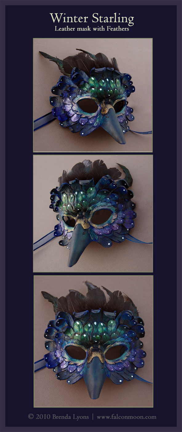
The second mask I was commissioned to do was a variation on my Wind Spirit mask, but with Winter Starling mask colors.
This mask looks huge when tooling, as it takes a rather large piece of leather. However, the wings wrap around the head, so it is not as 'huge' as one might think by looking at it at the tooling stage. Below, you can see the mask fully tooled and cut out:

Once shaped, you can see how it loses a lot of its volume, but becomes a very well-fitted mask:

I use blue dye, because this will be a dark mask. Although in my previous post I mentioned using a compliment as the base dye color (as with the Summer Bird Mask), in this case, I felt using blue would work better. There are no set-in-stone 'rules' when I work. If I feel something will work better, I generally follow my instincts:

I try to use the base color of blue as a springboard for my other colors. This mask will vary between green, blue, and purple, so I use thin layers mixed with a pearlescent white to create an iridescent effect:

Since punching holes for the ribbons would ruin the winged effect of this mask, I instead glued a piece of leather with a hole on each side, and threaded the ribbon through. Since the adhesive is extremely strong, I do not worry about it pulling loose. One 'test' I do whenever I glue something that will be tugged on a lot (such as ribbon) is I pull it firmly. If I feel or see any give, I reglue it. Both sides passed the 'tug test', and after varnishing, this mask was complete, and was sent on its way to the client.
This mask looks huge when tooling, as it takes a rather large piece of leather. However, the wings wrap around the head, so it is not as 'huge' as one might think by looking at it at the tooling stage. Below, you can see the mask fully tooled and cut out:

Once shaped, you can see how it loses a lot of its volume, but becomes a very well-fitted mask:

I use blue dye, because this will be a dark mask. Although in my previous post I mentioned using a compliment as the base dye color (as with the Summer Bird Mask), in this case, I felt using blue would work better. There are no set-in-stone 'rules' when I work. If I feel something will work better, I generally follow my instincts:

I try to use the base color of blue as a springboard for my other colors. This mask will vary between green, blue, and purple, so I use thin layers mixed with a pearlescent white to create an iridescent effect:

Since punching holes for the ribbons would ruin the winged effect of this mask, I instead glued a piece of leather with a hole on each side, and threaded the ribbon through. Since the adhesive is extremely strong, I do not worry about it pulling loose. One 'test' I do whenever I glue something that will be tugged on a lot (such as ribbon) is I pull it firmly. If I feel or see any give, I reglue it. Both sides passed the 'tug test', and after varnishing, this mask was complete, and was sent on its way to the client.
Summer Bird Mask Completion
While I finished this mask a while ago, I still want to post the second part of the progress post for the Summer Bird mask, as well as a look at creating my Wind Spirit mask (which will appear in a separate blog post).
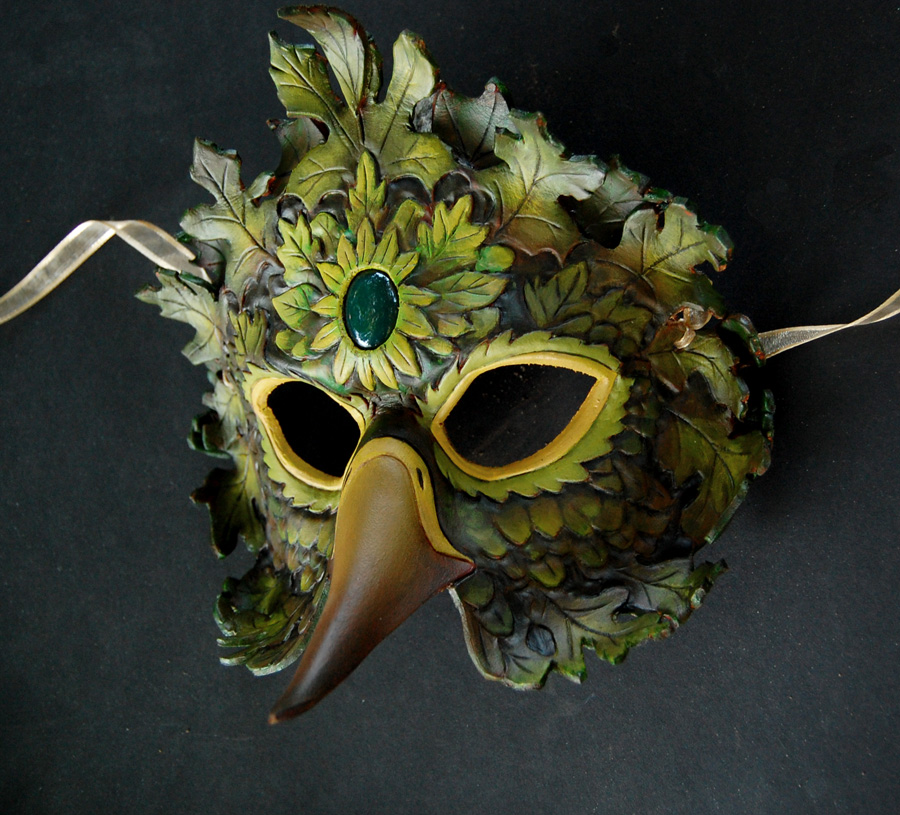
After shaping the Summer Bird mask, I applied a layer of leather dye. The dye I use is alcohol-based, and also stiffens the leather a little bit more. Using scrap bits of leather, I cut out additional leaves, dyed and shaped them, and once dry, glued them onto the mask. Once the glue and dye is dried, I go over it with a water-based sealer (Mod Podge), to create an acid-free barrier between the dyed leather and acrylic paint. Since the dye goes on with variation, I painted a layer of burnt sienna as a 'base layer.'

You may ask, "well if this mask is going to be mostly green and yellow, why did you put a reddish base down?" I find using a color's compliment as a base serves to make that color more vibrant, as well as make its shadows more solid. As most of this mask will be shades of green, I used its compliment - red - as a base. You can see the first layer of paint, with the reddish base showing through:

At this point, I usually work pretty fast, and my painting style isn't 'step by step' enough for me to take a lot of photos. Instead of adding shadows all at the same time and then highlights later, sometimes I go back and forth. Here is the mask completely painted, minus the stone:

As you may remember from the first version of this mask I created in 2009, I simply glued the stone on the mask without a bezel of any kind. I didn't like this for two reasons. For one, I don't feel the 'stuck on' look has a very 'clean' appearance. On the forehead, the leather is still slightly curved, and the flat back of the cabochon does not sit perfectly flat, and thus you get gaps. The second reason is stability. Although the adhesive I use (Incredible Goop) is extremely strong, a stone that is simply stuck on is not as secure as one that is 'set' in the mask. Because of this, I decided to take a different approach.
I must thank Andrea Masse-Tognetti, known more widely as Merimask, for her tips on how to set a stone in leather. During the tooling stage, I traced the base of the stone on the leather, and then drew a second, identical oval about 1/16 of an inch in, so the hole would be slightly smaller than the base of the cabochon. After cutting out the hole, I beveled the hole inversely, meaning it would be wider on the bottom and narrower on the top. This way, it would act as a bezel over the stone.
Once the mask was shaped, painted, and ready for varnishing, I placed the stone in the hole and cut out a very thin piece of split leather. The leather I buy is regularly 11 ounces (leather thickness is measured in ounces), which is a little under 3/16 of an inch. This is very thick for leather, so for my masks, I ask the tannery where I buy my leather to cut it down to 7 oz. (a little less than 1/8 inch). By request, they sent me the thin split side, which comes in useful for things such as backing stones, as seen below:

I cut this piece big enough so I could glue it (with the Goop, again) to the back of the mask. I made sure the Goop covered both the piece of leather, and the stone, so once it dried, the stone would be set without wiggling.

I also placed sticky-backed felt over the glued-on leaves, so they wouldn't dig in or scratch the wearer's face. After a day of drying, I varnished the mask, front and back, twice, and tied on the ribbons.
After shaping the Summer Bird mask, I applied a layer of leather dye. The dye I use is alcohol-based, and also stiffens the leather a little bit more. Using scrap bits of leather, I cut out additional leaves, dyed and shaped them, and once dry, glued them onto the mask. Once the glue and dye is dried, I go over it with a water-based sealer (Mod Podge), to create an acid-free barrier between the dyed leather and acrylic paint. Since the dye goes on with variation, I painted a layer of burnt sienna as a 'base layer.'

You may ask, "well if this mask is going to be mostly green and yellow, why did you put a reddish base down?" I find using a color's compliment as a base serves to make that color more vibrant, as well as make its shadows more solid. As most of this mask will be shades of green, I used its compliment - red - as a base. You can see the first layer of paint, with the reddish base showing through:

At this point, I usually work pretty fast, and my painting style isn't 'step by step' enough for me to take a lot of photos. Instead of adding shadows all at the same time and then highlights later, sometimes I go back and forth. Here is the mask completely painted, minus the stone:

As you may remember from the first version of this mask I created in 2009, I simply glued the stone on the mask without a bezel of any kind. I didn't like this for two reasons. For one, I don't feel the 'stuck on' look has a very 'clean' appearance. On the forehead, the leather is still slightly curved, and the flat back of the cabochon does not sit perfectly flat, and thus you get gaps. The second reason is stability. Although the adhesive I use (Incredible Goop) is extremely strong, a stone that is simply stuck on is not as secure as one that is 'set' in the mask. Because of this, I decided to take a different approach.
I must thank Andrea Masse-Tognetti, known more widely as Merimask, for her tips on how to set a stone in leather. During the tooling stage, I traced the base of the stone on the leather, and then drew a second, identical oval about 1/16 of an inch in, so the hole would be slightly smaller than the base of the cabochon. After cutting out the hole, I beveled the hole inversely, meaning it would be wider on the bottom and narrower on the top. This way, it would act as a bezel over the stone.
Once the mask was shaped, painted, and ready for varnishing, I placed the stone in the hole and cut out a very thin piece of split leather. The leather I buy is regularly 11 ounces (leather thickness is measured in ounces), which is a little under 3/16 of an inch. This is very thick for leather, so for my masks, I ask the tannery where I buy my leather to cut it down to 7 oz. (a little less than 1/8 inch). By request, they sent me the thin split side, which comes in useful for things such as backing stones, as seen below:

I cut this piece big enough so I could glue it (with the Goop, again) to the back of the mask. I made sure the Goop covered both the piece of leather, and the stone, so once it dried, the stone would be set without wiggling.

I also placed sticky-backed felt over the glued-on leaves, so they wouldn't dig in or scratch the wearer's face. After a day of drying, I varnished the mask, front and back, twice, and tied on the ribbons.
Tuesday, May 31, 2011
Summer Bird Mask - Progress
I will be posting the progress of two masks, as requested by a client. The two masks I am making are the Summer Bird Mask, and the Wind Spirit Mask (the Wind Spirit Mask will be in the colors of the Starling Mask).
Here is the Summer Bird mask, at the stage where I cut in the lines with a swivel knife. Despite its name, the swivel knife is not a true knife, but rather a very sharp 'chisel' that digs a smooth line into wet leather.

Once the lines are in, I use beveling tools. The whole procedure up to this point is called "tooling," in which leather tools are used to shape the surface of the leather dimensionally. This is what gives feathers and leaves their depth. When working with leather, you can go to either extreme with tooling. I try to keep my tooling medium, as the painting stage also gives the illusion of depth.
Once I'm done with tooling, I cut out the edges, eyes, and in this case, the hole where the stone will be. In this photo, the mask is also partially shaped, and ready to go in the oven for final shaping and drying:

Shaping the mask is tricky, and I usually open the oven about 4 to 5 times to remove the mask and reshape it, as it can 'sag' as it dries. Here is the shaped mask, ready for dyeing, and then painting:
Here is the Summer Bird mask, at the stage where I cut in the lines with a swivel knife. Despite its name, the swivel knife is not a true knife, but rather a very sharp 'chisel' that digs a smooth line into wet leather.

Once the lines are in, I use beveling tools. The whole procedure up to this point is called "tooling," in which leather tools are used to shape the surface of the leather dimensionally. This is what gives feathers and leaves their depth. When working with leather, you can go to either extreme with tooling. I try to keep my tooling medium, as the painting stage also gives the illusion of depth.
Once I'm done with tooling, I cut out the edges, eyes, and in this case, the hole where the stone will be. In this photo, the mask is also partially shaped, and ready to go in the oven for final shaping and drying:

Shaping the mask is tricky, and I usually open the oven about 4 to 5 times to remove the mask and reshape it, as it can 'sag' as it dries. Here is the shaped mask, ready for dyeing, and then painting:
Monday, May 2, 2011
A Glimpse of Sky - Progress
As requested by a few people, I will be posting progress scans of a painting I am working on. The finished pencil drawing:

I wanted to capture a dark feeling of constriction. I decided on a muted color scheme, with the only source of vibrant color being the sky above.

I started by filling in the background with a wash of payne's gray. The midtone of the vines is a mixture of davy's gray and just a little payne's gray.
Next, I pushed the background even darker, with a layer of ivory black, and then a very concentrated mixture of payne's gray and sepia.

Once that was dry, I went over with a glaze of davy's gray mixed with just a touch of raw umber. The background will have faint vines crossing over and tangling, so I wanted the background closest to the sky to have the color of the vines. For the falcon, I created a gradated wash of payne's gray and sepia from the bottom to the top to capture the contrast of bright light and extreme dark within the vine 'cave'. As seen on three of the vines, they will be a mixture of chromium oxide green and raw sienna.

I wanted to capture a dark feeling of constriction. I decided on a muted color scheme, with the only source of vibrant color being the sky above.

I started by filling in the background with a wash of payne's gray. The midtone of the vines is a mixture of davy's gray and just a little payne's gray.
Next, I pushed the background even darker, with a layer of ivory black, and then a very concentrated mixture of payne's gray and sepia.

Once that was dry, I went over with a glaze of davy's gray mixed with just a touch of raw umber. The background will have faint vines crossing over and tangling, so I wanted the background closest to the sky to have the color of the vines. For the falcon, I created a gradated wash of payne's gray and sepia from the bottom to the top to capture the contrast of bright light and extreme dark within the vine 'cave'. As seen on three of the vines, they will be a mixture of chromium oxide green and raw sienna.
Wednesday, March 23, 2011
Share One Planet Sketches
I was recommended by a friend to send an invitation request to the Share One Planet competition. It is an invitation-only digital art competition featuring a number of animals of concern. I am happy to say that I was accepted and given an invitation, and I decided this would be an excellent reason to try more digital art.

There are 5 categories (technically 10, but each category has a digital painting and digital sculpture category within it). The one I chose after doing a few sketches was "Mother's Love." The first set of sketches show ideas in other categories, such as 'portrait' and 'predator and prey.'
Thinking about what a 'mother's love' is in the animal kingdom truly is about protection. Most humans have the luxury of protection by the law and society's standards, but in nature, the only law is that of survival.
The peregrine falcon is truly a remarkable creature. It is the fastest creature on the planet, yet is relatively small compared to other raptors. Young falcons are especially at risk of predation by larger raptors, particularly by golden eagles. Despite the size difference, parent falcons have been known to attack and kill golden eagles in defense of their young.

In this drawing I am trying to capture the fierce protection of the mother. Leaving the chicks to fly is risky, but the falcon's strength is in the sky...and all she needs is a bit of height and the advantage is hers.

There are 5 categories (technically 10, but each category has a digital painting and digital sculpture category within it). The one I chose after doing a few sketches was "Mother's Love." The first set of sketches show ideas in other categories, such as 'portrait' and 'predator and prey.'
Thinking about what a 'mother's love' is in the animal kingdom truly is about protection. Most humans have the luxury of protection by the law and society's standards, but in nature, the only law is that of survival.
The peregrine falcon is truly a remarkable creature. It is the fastest creature on the planet, yet is relatively small compared to other raptors. Young falcons are especially at risk of predation by larger raptors, particularly by golden eagles. Despite the size difference, parent falcons have been known to attack and kill golden eagles in defense of their young.

In this drawing I am trying to capture the fierce protection of the mother. Leaving the chicks to fly is risky, but the falcon's strength is in the sky...and all she needs is a bit of height and the advantage is hers.
Monday, March 21, 2011
Owl Women - Progress 2
This painting is taking me much longer than I imagined, which is good! I'm spending more time thinking about color choices before jumping in. Although I have a color comp, I still need to decide how to create the colors I want, and what shadow combinations will be suitable.

Here I have put in another layer of shadow in the foreground wings, and put the first layer down for color. The great horned owl's hood is going to be a rich brown, so I used a layer of yellow ochre as a base layer. Since the barred owl's cloak will be a rich green, I used cadmium yellow. I find layering watercolor creates a tone that blends better than putting down one simple layer of thick mixed color.

Again, I found myself in such concentration I went a long stretch without scanning! Lots of detail in the feathers at this point. For the great horned owl's wing, I created a mask with tracing paper around the entire painting except that wing, then used a toothbrush to splatter white gouache and payne's gray watercolor to get the speckled appearance that great horned owls have on their wings and back.
For the sky, I mixed color with white gouache to make the color more opaque. I find this works well when I want a very rich, smooth color. At this point, I also removed the masking fluid from the moon, and painted in the branches.

Here I have put in another layer of shadow in the foreground wings, and put the first layer down for color. The great horned owl's hood is going to be a rich brown, so I used a layer of yellow ochre as a base layer. Since the barred owl's cloak will be a rich green, I used cadmium yellow. I find layering watercolor creates a tone that blends better than putting down one simple layer of thick mixed color.

Again, I found myself in such concentration I went a long stretch without scanning! Lots of detail in the feathers at this point. For the great horned owl's wing, I created a mask with tracing paper around the entire painting except that wing, then used a toothbrush to splatter white gouache and payne's gray watercolor to get the speckled appearance that great horned owls have on their wings and back.
For the sky, I mixed color with white gouache to make the color more opaque. I find this works well when I want a very rich, smooth color. At this point, I also removed the masking fluid from the moon, and painted in the branches.
Friday, March 11, 2011
Owl Women
I seem to have owls on the brain, lately! Much inspiration is thanks to the live owls I work with at Horizon Wings Raptor Rehabilitation and Education Center, of which I am lucky enough to see up close. You really get a better understanding of birds of prey when you see them in real life. Their movements and mannerisms are simply impossible to discover through photographs alone.
There's something so enjoyable about drawing owls. Perhaps it is because of their incredible softness and roundness. If you enjoy drawing fluffy feathers, then an owl is the perfect subject. I also associate these birds with (no surprise here) the night and the mysteries of the world when the sun goes down and the moon comes up. Owls are creatures that live with a perfect harmony with the night. Their hearing is unlike that of any bird - some owls hunt in practically complete darkness, using their asymmetrical ears to pinpoint a creature's location on the ground. Their wings have a fringe to allow them to fly with complete silence.
Below are sketches for a painting I am about to begin. Three owl women gather around a cauldron of starlight. One holds a sphere of perfect crystal, which reflects all light and allows her to see beyond the dark of night. Another carries a staff, which still grows living oak leaves and acorns.

And the finished sketch. I didn't put in as much detail, here, as I planned to incorporate the values with the color sketch:

As before, with Celebration, I used Corel Painter to create my color sketch:

Painting this will be tricky, as I have two main light sources: the moon above and the fire below. The crystal ball also gives a little light to the face of the barred owl, allowing the eye that would normally be in shadow to have a highlight.
The shadows were easy in Painter, but with a translucent medium like watercolor, it's going to be a bit more challenging. I may end up using colored pencil to really pop the highlights.
There's something so enjoyable about drawing owls. Perhaps it is because of their incredible softness and roundness. If you enjoy drawing fluffy feathers, then an owl is the perfect subject. I also associate these birds with (no surprise here) the night and the mysteries of the world when the sun goes down and the moon comes up. Owls are creatures that live with a perfect harmony with the night. Their hearing is unlike that of any bird - some owls hunt in practically complete darkness, using their asymmetrical ears to pinpoint a creature's location on the ground. Their wings have a fringe to allow them to fly with complete silence.
Below are sketches for a painting I am about to begin. Three owl women gather around a cauldron of starlight. One holds a sphere of perfect crystal, which reflects all light and allows her to see beyond the dark of night. Another carries a staff, which still grows living oak leaves and acorns.
And the finished sketch. I didn't put in as much detail, here, as I planned to incorporate the values with the color sketch:

As before, with Celebration, I used Corel Painter to create my color sketch:

Painting this will be tricky, as I have two main light sources: the moon above and the fire below. The crystal ball also gives a little light to the face of the barred owl, allowing the eye that would normally be in shadow to have a highlight.
The shadows were easy in Painter, but with a translucent medium like watercolor, it's going to be a bit more challenging. I may end up using colored pencil to really pop the highlights.
Monday, March 22, 2010
Courtship - WIP
This is a bit of a spontaneous painting. I'm still experimenting a lot with watercolor techniques and wanted to try out mixing white gouache with my watercolors. I've always liked the creamy consistency you get when you mix watercolor with white gouache.

I'm still deciding on what colors I'll paint the gryphons. Perhaps yellows and reds to contrast with the greens. Maybe some dulled purples for the snow leopard part of the gryphon on the right.
Here is the pencil drawing, pre-paint:

I'm still deciding on what colors I'll paint the gryphons. Perhaps yellows and reds to contrast with the greens. Maybe some dulled purples for the snow leopard part of the gryphon on the right.
Here is the pencil drawing, pre-paint:
Labels:
fantasy art,
gryphons,
progress,
sketch,
watercolor
Wednesday, December 23, 2009
To the Sky - Finished painting and progress images
As can be seen in my previous entry, I posted four progress steps for a painting titled "To the Sky." This is the completed painting:

This was primarily an exercise to push contrast. I noticed much of my previous work was lacking in contrast, falling either too light or too dark with not much variation between. While I definitely still see room for improvement, I was able to iron out some difficulties and definitely have ideas on how to improve for next time.
Although I included them in a previous post, I think it's worth posting the progress images here to show the steps leading up to this painting.
Thumbnail sketch:

This is where I figured out my composition and the basic figures. This was not my first thumbnail, as I did quite a few before settling on the composition and poses.
High contrast study:

Before even putting paint to paper, I wanted to determine the areas of light and dark. Anything below 50% is black, and anything above 50% is white. I still need practice on this, but I was able to figure out the basic areas of shadow.
Final pencil drawing:

This is where I fleshed out figures, forms, and details. The full tones will come with watercolor and not with graphite, so this is why this version is so low-contrast. There are many areas where I do not want graphite showing through the watercolor, and some areas where it's desirable.
Color comp:

A bit of digital color over the pencil drawing helps me decide my colors and detail the contrast a bit. For this, I wanted the vibrant blue of the sky to compliment the yellow and orange tones of the gryphon and cloak. These colors aren't meant to be a set in stone, however. Often I deviate slightly from the color comp if I find certain colors work better with the watercolor; digital color never quite works the same as watercolor.

This was primarily an exercise to push contrast. I noticed much of my previous work was lacking in contrast, falling either too light or too dark with not much variation between. While I definitely still see room for improvement, I was able to iron out some difficulties and definitely have ideas on how to improve for next time.
Although I included them in a previous post, I think it's worth posting the progress images here to show the steps leading up to this painting.
Thumbnail sketch:

This is where I figured out my composition and the basic figures. This was not my first thumbnail, as I did quite a few before settling on the composition and poses.
High contrast study:

Before even putting paint to paper, I wanted to determine the areas of light and dark. Anything below 50% is black, and anything above 50% is white. I still need practice on this, but I was able to figure out the basic areas of shadow.
Final pencil drawing:

This is where I fleshed out figures, forms, and details. The full tones will come with watercolor and not with graphite, so this is why this version is so low-contrast. There are many areas where I do not want graphite showing through the watercolor, and some areas where it's desirable.
Color comp:

A bit of digital color over the pencil drawing helps me decide my colors and detail the contrast a bit. For this, I wanted the vibrant blue of the sky to compliment the yellow and orange tones of the gryphon and cloak. These colors aren't meant to be a set in stone, however. Often I deviate slightly from the color comp if I find certain colors work better with the watercolor; digital color never quite works the same as watercolor.
Subscribe to:
Posts (Atom)