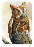
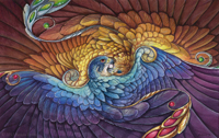
Here are some more quick pen sketches I did to include with calendar orders. These are my favorites out of all of them:
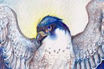
A peregrine with a huge head. Since these were quick sketches, often my bird anatomy gets wonky. They're all fun, though, and great exercises in hatching:

Possibly my favorite out of all of them. A Gray Crowned Crane:

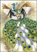
It would make sense that if a burning phoenix landed on a branch, that it would catch fire too!

Anthros are something I haven't had much practice with, but they're pretty fun to draw! This is someone's eagle-anthro character on DeviantART. When they bought a calendar, they requested I draw their character:

After spending some time on ConceptArt.org, I've been really trying to do more figure drawing, and practicing contrast. When I was at SCAD, I took an amazing class taught by professor Shawn Crystal called Drawing for Sequential Art. The class primarily taught constructive figure drawing, and a large portion focused on breaking things down into pure black and white. I've strayed a bit too far from that, and I need to get back into practice. Today, I did some more sketches and decided to try to practice contrast in color.
Color can be extremely tricky if you have difficulty with light and dark. Yellow does not necessarily always equal 'light,' and purple does not always equal 'dark.' Taking a painting into Photoshop and desaturating it can show you just how 'muddled' your tones can get!
Below are three preliminary steps for a piece I'm working on before I even touch color, and then a digital color comp. Thumbnail sketch, tonal study, and then the full pencil drawing (color comp added 12/15/09):


Usually I try to get the composition down in the thumbnail stage, but as I was doing the final pencil drawing I felt there needed to be something in the middleground to the right. I'm also trying to experiment with compositions that fall out of my comfort zone. Instead of placing the subject smack-dab in the middle, what about having a large expanse of sky? The subject still falls within the 'focus' area of the rule of thirds, but I wanted there to be a feeling of vastness. It will definitely be a challenge.

Beautiful work. I really admire the consistancy, shading and form of your feathers. You must be a very patient person.
ReplyDeleteThank you! I'm not sure if I'm so much patient, but maybe a bit obsessive with details. I don't know if it's necessarily a good thing, but at least it has a good result!
ReplyDeleteFor lighting, because they're above the clouds, I would think about adding sun rays that are lighting up the figures into strong planes while bouncing from the back to create a rim of sunlight (especially if this is midday because the sun would be high and they seem to be above the clouds where the light wouldn't be filtered, and therefore creating stronger contrasts). Like this:
ReplyDeletehttp://img.photobucket.com/albums/v89/ladydove7/wip/rider-iolani-paintover.jpg?t=1260891897
All just suggestions of course:) I was feeling painterly today and it's really quick and sloppy so probably not perfect. I added some faint birds here in there too just to see how that might help add interest to the sky.
Figure drawing is one of those things I think all artists who dabble in the human form have to consistently keep practicing (either through constantly drawing figures, sketching, observation, study, etc). It seems a skill that can get rusty even if one has had a fair amount of classes on it!
It's going to be one of my new years resolution to do one sketch session per week of nothing but observation and doodling. (per night, if I can figure it out, but I'm going to be realistic with my resolutions this year).
Tis looking lovely so far! Always great to see Iolani in her element.:)
PS. The crane is definitely my fave too! His pose is so much fun.
Angela:
ReplyDeleteThanks for your suggestions :3 I was a little confused when you said that they're 'above the clouds' - as you can see to the right and in the background, they're standing on the ground (or a cliff) and not above the clouds.
The redirection of light does serve to create an interesting contrast, but I'm not sure I want to go that dark. For this painting, I wanted to push the contrast farther than I usually do, but not too far. Your repaint on the color comp is good for having the light at 'high noon' through-the-clouds position, but I was aiming for a gentler light - maybe afternoon - and illuminating the figures through an open sky.
I do like the birds in the sky, though. Depending on how the painting progresses, I may throw a few birds in there.
As for figure drawing, I've been inquiring around to see if there are any groups in the area, and unfortunately I haven't been able to find any. The biggest hurdle would be finding space where we could set up lighting and have a nude model - not something we could easily do in someone's living room (especially if they had roommates/parents) or the local coffee shop.
wee <_< *sneaking net at her aunt's* Ah! I didn't understand that they were actually standing on something because I assumed the cliff to be in the background and not extending into the middle or foreground. It felt more to me like they were flying beside the cliff (probably because we dont have any direct visual indications that their feet are touching the earth) The movement of her hair also made me think they were in flight (but it could just as easily be windswept without her being in flight). Either way, it's still a high altitude place where the light would be at it's most direct impact on the planes of the figure/gryphon.
ReplyDeleteMmm have you thought of perhaps using a twilight or sunset color theme for this? It might help get the diffused light you're looking for and set a more atmospheric mood than generic daytime, like Iolani getting ready to fly a secret mission into the coming night! (all just suggestions of course, I am sure it will be lovely regardless:) I'm looking forward to seeing how it progresses!
That sucks about the sketch group. But have you thought of just getting clothed models if nude ones bother people? Bodysuits, bathing suits, or just tight clothing might be less shocking than nude, but still helpful. I know there are some universities not too far away. Have you checked those already for sketch sessions? Even if they don't host them, getting into touch with someone at the art dept might also lead to connections with off-campus activities in town. Either way, best of luck! I hope you can get something started, even if it's just a sketch group at a coffee shop. Every chance to draw is a learning experience.