Wednesday, December 23, 2009

To the Sky - Finished painting and progress images

As can be seen in my previous entry, I posted four progress steps for a painting titled "To the Sky." This is the completed painting:


This was primarily an exercise to push contrast. I noticed much of my previous work was lacking in contrast, falling either too light or too dark with not much variation between. While I definitely still see room for improvement, I was able to iron out some difficulties and definitely have ideas on how to improve for next time.

Although I included them in a previous post, I think it's worth posting the progress images here to show the steps leading up to this painting.

Thumbnail sketch:


This is where I figured out my composition and the basic figures. This was not my first thumbnail, as I did quite a few before settling on the composition and poses.

High contrast study:


Before even putting paint to paper, I wanted to determine the areas of light and dark. Anything below 50% is black, and anything above 50% is white. I still need practice on this, but I was able to figure out the basic areas of shadow.

Final pencil drawing:


This is where I fleshed out figures, forms, and details. The full tones will come with watercolor and not with graphite, so this is why this version is so low-contrast. There are many areas where I do not want graphite showing through the watercolor, and some areas where it's desirable.

Color comp:


A bit of digital color over the pencil drawing helps me decide my colors and detail the contrast a bit. For this, I wanted the vibrant blue of the sky to compliment the yellow and orange tones of the gryphon and cloak. These colors aren't meant to be a set in stone, however. Often I deviate slightly from the color comp if I find certain colors work better with the watercolor; digital color never quite works the same as watercolor.

Sunday, December 13, 2009

More pen sketches

12/15/09 Edit - I added a color comp to the gryphon rider images below

Here are some more quick pen sketches I did to include with calendar orders. These are my favorites out of all of them:

A peregrine with a huge head. Since these were quick sketches, often my bird anatomy gets wonky. They're all fun, though, and great exercises in hatching:


Possibly my favorite out of all of them. A Gray Crowned Crane:


It would make sense that if a burning phoenix landed on a branch, that it would catch fire too!


Anthros are something I haven't had much practice with, but they're pretty fun to draw! This is someone's eagle-anthro character on DeviantART. When they bought a calendar, they requested I draw their character:


After spending some time on ConceptArt.org, I've been really trying to do more figure drawing, and practicing contrast. When I was at SCAD, I took an amazing class taught by professor Shawn Crystal called Drawing for Sequential Art. The class primarily taught constructive figure drawing, and a large portion focused on breaking things down into pure black and white. I've strayed a bit too far from that, and I need to get back into practice. Today, I did some more sketches and decided to try to practice contrast in color.

Color can be extremely tricky if you have difficulty with light and dark. Yellow does not necessarily always equal 'light,' and purple does not always equal 'dark.' Taking a painting into Photoshop and desaturating it can show you just how 'muddled' your tones can get!

Below are three preliminary steps for a piece I'm working on before I even touch color, and then a digital color comp. Thumbnail sketch, tonal study, and then the full pencil drawing (color comp added 12/15/09):


Usually I try to get the composition down in the thumbnail stage, but as I was doing the final pencil drawing I felt there needed to be something in the middleground to the right. I'm also trying to experiment with compositions that fall out of my comfort zone. Instead of placing the subject smack-dab in the middle, what about having a large expanse of sky? The subject still falls within the 'focus' area of the rule of thirds, but I wanted there to be a feeling of vastness. It will definitely be a challenge.

Friday, November 20, 2009

Two ink drawings and quick figures

Each year I make a calendar and offer it for sale, and this year my calendar features the paintings I created for my thesis. On my DeviantART account, I posted a calendar sale where if you order a calendar directly through me, I will sign it and include a small pen drawing of your choice. The calendar is also $5 cheaper than if you buy it directly through DeviantART, so it's a better deal all around.

Here are two of the pen drawings that were requested by people who ordered a calendar:

Snow leopard/peregrine falcon gryphon:


Osprey - I was going for an Audubon-esque, moment of suspension pose. If I could do it over, I would have given it more of an angle (and fixed that beak!) but it's serves its purpose as a simple pen sketch, and I'm sure the person it's meant for will like it all the same:


After some anatomical frustration, I decided to just get back to basics and do a night of figure studies and gestures. Here's a page of simple figures, references from stock photos:


Poses referenced from the following stock photographers:
Top left - Chamberstock on DeviantART
Top right, bottom left - Torino Stock on DeviantART
Bottom right - Mjranum Stock on DeviantART

I truly wish I had access to live models; drawing the figure from photographs is never the same as having a real person right there. Luckily, I have a friend who has volunteered to pose, and we're playing with the idea of starting up a figure drawing group.

Thursday, October 29, 2009

Blue Falcon Leather and Feather Mask

After making all these masks, I figured I should wear one for Halloween. Except, the mask I wanted to wear (my Dusklight Raven Mask) was bought by someone else who had the same idea! No matter, I went and made a personal mask all my own:


Hand-tooled and hand-shaped 7-oz leather, painted with acrylics, and adorned with feathers. None of the feathers here are from actual birds of prey - they're all pheasant, chicken, and rooster plumes.

I hope I find a fun excuse to wear it on Halloween!

Monday, October 26, 2009

Autumn's Turn Process

I thought it might be fun to show the progress of a painting, from sketch to ink to finished painting. Here are the process shots, from beginning to end:


And a larger version of the finished piece:

Friday, October 23, 2009

Firebird - Leather and Feather Mask

I've discovered I'm not very good at this 'take progress photos of work' thing. I got caught up in painting and didn't take any pictures until I was finished working.


Here is the finished mask. The long feathers are dyed rooster coque, and I stripped the edges off the other feathers to give them that 'teardrop' shape. You can see the back of the mask here, to show where I put sticky-backed felt to protect the face against friction from rough parts:

Tuesday, October 13, 2009

Firebird Mask - Works in Progress 2

I only got a little work done on the firebird mask today, but here's the progress so far.


Since the mask is primarily going to be painted in yellows and oranges, I dyed it with a yellow dye. Think of it as tinting your canvas - it unifies your colors and makes everything look more natural.


If you look back on the post containing the color sketch, you'll see that there are feathers going around the outer edge of the mask. Originally these were going to be all real feathers, but after contacting the person commissioning the mask, we decided to go with leather feathers. This will end up giving the mask a 'sturdier' look, as well adding more interesting texture and dimensionality to the existing base leather mask. Real feathers (the curving variety) will be added later. As seen in the image above, I cut out feathers from scrap pieces of leather. The lines in the feathers are done with a swivel knife. These feathers are also dyed, and shaped while still wet with the dye. Once dry, they will keep their shape.

Although this was a sheet of 'error' feathers (I drew them curving in the wrong direction by mistake), it shows the first step in creating pieces out of leather. And I never really waste anything - these feathers will find a home in another project. Perhaps I'll make pendants or keypulls out of them?


And one last note - I've finally come to accept that my studio will never, ever remain clean. After every project I clean it, and it always ends up cluttering up again. Oh well.

Monday, October 12, 2009

Firebird Mask - Works in Progress

I thought it may be mildly interesting to show the progress of one of the masks I'm working on. I was commissioned to create a firebird-inspired mask, and decided this would be an excellent opportunity to test out the new, higher-quality leather I was recommended to use.

First some sketches:


As with any commission, I create a number of sketches to get some ideas on the table. Depending on what the person wants, it may take only a few sketches, or a lot. In this case, the person was quite clear on what she wanted, which is good for me - good communication always makes a job easier.


We ended up using a mixture of several sketch designs to come up with one final sketch. Then it was time for color sketches, and after a couple of revisions for those, this was the color scheme chosen.

Again, I am very new at mask making, so I am still ironing out my own methods. I've learned quite a lot from a mask maker whose work is on DeviantART and Etsy, who was kind enough to post a very helpful tutorial on how to make leather masks. In case you're curious, you can find her tutorial here. However, I've done a good number of drawing and painting commissions, so the commission process is pretty much the same even if it's a medium I'm still learning. Once I have the sketch and color sketch done, then it's time to start on the final piece.


I didn't take photos of actually tooling the leather, but at this point in the process, the mask has been tooled, cut, and shaped. Shaping involves wetting the entire mask and molding it around your face until you get the desired shape. Once you have a basic shape, you put it in the oven at around 250 degrees F to let it dry. I take it out multiple times to make sure I get the shape right. I've messed up a few masks mostly due to my own inexperience, but I think I got this one shaped just the way I wanted.

You may also notice the beak is a bit longer than in the sketch. Since I am still learning how to make a 2-D sketch that will match the physics of a 3-D mask, sometimes once I cut out a full-sized paper version of the mask to transfer onto the leather, I spot some things I need to fix. If I had left the beak as it was in the sketch, it would be nothing but a nub! And a graceful firebird needs a much more elegant beak.

More progress shots will come! Coming up will be dyeing the mask, painting it, and then putting the feathers on.

Watercolor surface experimentation

As I work more with a medium, I find I tend to get particular about my tools, surfaces, and pigments. With watercolor, my constant struggle has been with what surface to paint on. I started, back in 2005, with cold-press Strathmore watercolor blocks.


This is what I consider to be my 'first' watercolor paining, titled "Angel of the Oak Forests." I had of course dabbled with watercolor in high school, but walked away from that thinking I 'hated' the medium, and instead turned to colored pencils, acrylic, and markers.

After using the blocks and loose watercolor sheets, I discovered the work of artist Stephanie Pui-Mun Law. She put up some excellent tutorials on her method of watercolor, and I discovered she used a very different surface - Strathmore illustration board. I decided to experiment with the surface, and fell in love with the way the board allowed easy lifting.


It was at this time I wanted to try a series, and I painted my first Birdflower - Daffodil or March, on a piece of Strathmore illustration board. I found it much more forgiving than traditional watercolor paper, which held onto pigment much stronger than illustration board. I wanted to do a lot of lifting, and so this board seemed perfect...at the time.

As my watercolor skills developed, I found myself more and more frustrated with the illustration board I had sworn by. I remember contacting Strathmore telling them how several sheets I'd bought had invisible 'scratches' that only appeared once I put a watercolor wash down. A Strathmore representative replied, informing me that the illustration board was not sized for wet media, and that I could use it for such, but he warned that it may act strangely. In addition to the 'scratch' problem, I started to want richer and deeper colors, and the board seemed to 'deaden' the pigment. I was a bit discouraged.

During the beginning of my second year at SCAD-Atlanta, I wanted to try watercolor paper again after some recent dabbling with a few sheets for minipaintings and liking the vibrancy of the color I got with watercolor paper. This time, I bought one of the best brands - Arches. I bought a sheet each of cold-press and hot-press, stretched them, and fell in love all over again.


I couldn't believe what I'd been missing all this time with illustration board! The vibrancy of color, the texture...I thought for certain I'd found my 'perfect' surface. And indeed, I worked with the cold-press 140 lb surface exclusively. Though in the back of my mind, I still missed the ability to lift. That was one 'drawback' of cold-press Arches - it tends to hold onto pigment and lifting is difficult.

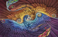
This was on my mind a bit for the past week, and I dug out a sample piece of wet-media Strathmore illustration board. Unlike the board I used before, this was specifically sized for, as it says on the packaging, "light washes up to wet on wet applications." This, so far, is a work in progress of a simple painting for a friend of one of her characters from her stories:


This painting, as should be obvious, isn't done yet, but in my time working with this surface I've felt an indecision I've never experienced with a painting surface before. I don't know if I love or hate this board. Part of me dislikes it since it has that same 'dry on the surface' nature watercolor has on illustration board, but then the crisp lines and incredible opportunity for lifting draws me to it. I suppose I will have to do more work on this surface and come to a conclusion eventually.

Wednesday, October 7, 2009

Falcon With Blue Eyes - Watercolor Painting


Three figures stand before a cracked vision and acknowledge an identity based in the simplest of elements.

The sun
The moon
The wind and forest.
A kingdom of clouds and their gift of rain


And yet they seek simple grains of sand buried beneath piles of gaudy jewels. All they want is to feel the earth again.
----------

Well, this took a bit of a different turn from when I started it. I literally had a moment where I was about to start painting and said, "well this is meant to be a bit of a self portrait, isn't it?" And so it was, and my handling of the colors changed as a result.

Of course, it's not a literal, physical self-portrait. I don't really look like that, but I incorporated portions of my anatomy (hair and eye color, primarily). There's a lot of symbolism in this important to me; the falcon should be the most obvious.

Watercolor and a tiny bit of colored pencil on cold press Arches watercolor paper, 9X12 inches.

Monday, October 5, 2009

Falcon With Blue Eyes - Work in Progress 3

One more work in progress shot before I probably finish it. I'm rather pleased with how this is turning out. I'm using a bit of a different painting technique...and I got a sharp new #4 round.


It feels good to do some watercolor after being stuck in digital land with this client project...

Falcon With Blue Eyes - Work in Progress 2

Here's a work in progress of the painting I'm working on. I finally found a title after it became apparent this was becoming a metaphorical self-portrait.


Per the suggestion of one of my professors at SCAD-Atlanta (Rick), I moved the ear straighter as it looked like it was sliding off her head before. I also need to move it back a bit. I also changed the bird closest to the face to a falcon since it was necessary with the change in meaning of this painting.

Sunday, October 4, 2009

Hawk Woman Painting Progress

Here is a work in progress of a painting I'm working on, which is yet untitled. Usually I don't discover the title until I'm nearing the end of a painting.


I drew this while at DragonCon last month. It's incredible how strong inspiration hits me after seeing all the incredible work in the art show. It's so important for me to experience it every year...it's a recharging of the creative battery, in a way.

Tuesday, September 22, 2009

DragonCon Art Show Report

It's been a couple of weeks since DragonCon, but I've finally started to get settled again (though still working on a breakneck deadline for a project). Here's how the DragonCon art show went in a nutshell.

This year, the art show was held in the other Grand Hall in the Hyatt. In the hall where it has been in past years, they had the Pop and Comic Art gallery, and both were connected, so it was essentially one giant room. The print shop was also in a much bigger area, so people didn't have to bottleneck past the prints as they went through the exit as happened in past years.


This year for the annual art charity auction, the subject was "When Pigs Fly." The charity this year was the Georgia Alzheimer's Association, and we were directed to a specific kind of porcelain pig to decorate for the auction. I made my "I Wanna be a Gryphon Piggy," as seen above, with leather wings, beak, and tail and painted it with acrylics. The tail is 'tied' on with a ribbon, and the beak is 'tied' on with waxed leather cord. I reality, both are securely attached to the porcelain with Incredible Goop, which is about as close to an atomic bond as you can get with glue. It was also awarded 2nd place in the charity pig competition!


This year, sales were very strange. I fully expected to get only a few minimum bids on my smallest pieces, but to my surprise the majority of my sales were at the quick sale price. My 11X14 scratchboard piece, "Breathe," was the first to sell at quick sale. I also sold a mask (the Wind Spirit Mask as seen below), which I was quite happy about. I wasn't sure if any masks would sell, but if it can be used by someone and worn, then I'm happy.


Here are two more masks I finished since my last update:


This is the "Dusklight Raven Mask," sculpted from leather with real feathers.


This is a commissioned mask for a friend of mine in New Hampshire. She has a gorgeous skirt and shirt combination and wanted a mask to complete her costume as a sea fae. So she asked me to make her a mask based on that, which would also match the skirt. This is my first leather mask where I used fabric and real freshwater pearls. I think my favorite part of this mask are the adorable little barnacles on the bottom! They were so easy to make from leather, and I think they really give it a more oceanic feel.

Sunday, August 16, 2009

Masks! And a little scratchboard.

Sorry I've been so quiet lately! I'm preparing for DragonCon, working on a project for a client, and taking care of a sick family member all at the same time. However, here's a peek of what I've been working on lately.

Iridescent Gryphon Leather and Feather Mask:

I've been slowly getting the feel of working with leather. This is my second mask, hand-tooled and shaped from 6 or 7 oz leather. I made a mistake in picking up the wrong weight leather, so it's not as sturdy as an 8-oz mask would be. It's still a good mask, though, and sits comfortably on the face. I painted it to compliment the iridescent feathers.


Dreaming Falcon Leather Mask:

With this mask, I finally got away from my fear of non-earth tones. I admit, I love browns and greens just too much. This mask is loosely based on one of the falcons in my painting, Apparition. There are iridescent and pearlescent painted portions.


Summer Bird Leather Mask:

Here is my most recent mask, made from 8-oz leather. It's definitely a lot stiffer and harder to cut!!! I suppose both weights have their advantages and disadvantages. This was my first attempt at incorporating a stone in with the design. In the center is a green agate cabochon. Originally I was going to paint this bright and flashy, but after putting a glaze of Hooker's Green over the reddish-brown-dyed mask, it demanded more subdued tones with highlights of yellow and green. I think it's better this way.


Masked:

It's been a while since I've used scratchboard, and there's always been a good response to them at fantasy conventions. I created this specially for the DragonCon art show. It's only 5X7 inches, but that's HUGE when you're working with scratchboard! This isn't the paper kind, but the Ampersand brand, which is on masonite with a white clay base.