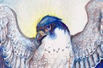
A few people were interested in seeing my acrylic progress when I posted my most recent gryphon portrait a few days ago. This gryphon is one of two I'll be putting in the Dragon Con Art Show this weekend. I wanted to use this as a way to really push my acrylics, and really focus on values.
Neutral Background and Moss Texture:
Values 1:
Values 2:
Values 3:
Feather Markings:
First Glazes:
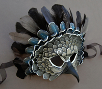
Final Glazes and Detail:
This method is a variation on the Grisaille Technique, where a finished value painting in grays is used as the base for simple glazes. I'd say 85% of this painting was done in shades of gray, with only 15% being glazes and some final details. You can see that I had to add a bit more highlight to the front of the gryphon's head, as well as more shadow to the feet. You always need to go back to add final highlights that get covered by color, such as in the crystals and on the white feathers.
It can be daunting to shade all in gray, as we've all been told, "don't shade with black!" Grays, however, are important. I've noticed my own work becoming oversaturated, primarily because I'm shy to even touch black or gray, and to always use color in my shadows. But with this technique, you glaze the entire painting with color - not only the light tones, but the shadows as well. I went back into the shadows of the feet, for example, with burnt sienna to add some color. I used a mixture of raw umber and burnt sienna to deepen the colors in the wing feathers. The trick to this technique is that the value is already there - no guessing how much dioxazine violet you need to use to push that value down to 70% while not making it too purple.
I'm excited to announce that my book, "Winged Fantasy: Draw and Paint Magical and Mythical Creatures" is available! You can find it bookstores such as Barnes and Noble, as well as in art and craft stores such as Michaels and Jo Ann Fabrics. It's also available through North Light Shop and Amazon, where you can also look at several pages inside the book.
I've also posted a video as a bit of a 'walkthrough', giving a short summary of each chapter and section:
A few questions I've received online and in person about the book:
Q: What age group and skill level is this book intended for?
A: This book is suitable for kids to adults. I've had people tell me that their younger children, who can't quite read the text yet, still love the illustrations and enjoy trying their hand at the step-by-steps. I explain the basics of graphite and ink drawing, and show several techniques for watercolor painting, so even beginner artists can learn from this book. The techniques I cover are designed to teach the reader, regardless of skill level, about how to create believable shading, highlights and a variety of effects with watercolor, so in addition to being able to create a finished painting from the step-by-steps, the reader will also be able to use what they learn to paint their own creations.
Q: I have a lot of trouble drawing wings, will this book help me specifically with wings?
A: I've had a lot of people throughout the years asking me to write a wing-drawing instructional book, and I've finally had the opportunity to include that here! This book has an entire chapter dedicated to wing construction and anatomy. Most of the chapter covers bird and bat wing anatomy, with a small section on insect wing anatomy. The instruction covers feather structure, bones and joints, and general rules of movement and flexibility. Below you can see a sample from the bird section:
Q: I can't find the exact colors or brands of watercolor you use. Can I use different paints?
A: Absolutely! You're not required to use the specific colors or paint brands I use in the book. I personally use several brands, mostly Windsor and Newton, Holbein and Daniel Smith, however there are many different brands of good-quality watercolors out there. There may also be different colors you wish to use. For example, if you dislike Pthalo Blue, you certainly do not have to use it - you may find a different blue suits your style much better. Many readers have paints already at home, and may feel overwhelmed by the wide palette I use - don't be discouraged! Some of the best artists have created incredible paintings using only a few colors. A good painting doesn't rely on how many paints you have or how much they cost, it's how you use them.
Q: All these watercolor surfaces confuse me! Hot press, cold press, illustration board...in the step-by-steps, do I have to use the same surface you used?
A: Not at all. I used a variety of surfaces because certain surfaces handle paint differently, and wanted to show the reader how texture and surface can affect a painting. In "The Winged Wolf" step-by-step, I used cold-pressed watercolor paper, which you can see the texture of in the sky. Cold-press paper is also good if you wish to use colored pencil, because of the tooth of the paper.
Many artists have a preference for a specific type of paper. Experiment with different surfaces to see what works best for you. You may find you dislike hot-press paper, or find one brand too 'slippery' and another brand perfect. Paper sizing (surface treatment and how water is absorbed) differs between brands as well. All papers and boards are a little different, and can give different life to your painting.
Q: Where did you learn so much about birds? And why do you draw and paint so many birds and fantasy avian creatures?
A: Birds have been the earliest passion I can remember (the second earliest passion was to be a Pokemon master...). I remember spending hours in the library, pouring over the paintings of John James Audubon. My favorite book as a child was "The Daywatchers" by Peter Parnall, who was the first artist I ever saw who portrayed naturalistic raptors with a touch of fantasy. When I was 12 years old, I began volunteering at a children's museum at town, where I fed and cleaned raptor enclosures and learned about animals from the resident animal curator, a wonderful man named Brad Case who loved animals and education.
After going to college and then graduate school for illustration, I returned to Connecticut and began volunteering with Horizon Wings, a raptor rehabilitation and education center. There, I gained the sort of observation you can only get from being close to raptors. Learning about birds isn't just about seeing them, it's about observing their mannerisms and characteristics. It's about seeing how a hawk can twist its head around or how the feathers on the back of its head slightly flare up when its alarmed. It's being able to see the tiny baffles in a falcon's nostrils, or the scaling on its feet. It's feeling first hand just how stiff a falcon's flight feathers are compared to the soft, barely tactile primaries of an owl. All this, even the non-visual, translates into art.
I always encourage artists, if possible, to observe their subjects first-hand. Zoos and aviaries are incredible places where you can sit and observe animals. You'll instantly notice anatomical oddities you never knew about, and watching them move will teach you about their behavior, which in turn will enter your art.
As for why I paint birds? I still have the same passion for birds that I did when I was a child. I also find they are the best subject for the emotions and messages I try to portray with my art. Wings are my preferred medium of expression.
I'm an illustrator based in Connecticut with an M.F.A. in illustration from the Savannah College of Art and Design - Atlanta. I love fantasy illustration, watercolor, and combining the two to create things that should exist, but don't!
What's a 'featherseed'? A bird, of course! Feathers grow on birds, therefore birds are seeds for feathers! I also felt it was a fitting name for a journal that shows the process of my work, since birds are so prominent in my art. Each sketch is a seed, in a way.