Sunday, December 1, 2013

Smaug - Sketches and Studies

Lately I have been working on larger canvases and in acrylic - quite a change from my preference of painting small and with watercolor.  After returning from IlluxCon in September, I have decided to try and focus on the basics - better composition, greater value, and a better handle on color.  I also decided to strengthen my portfolio with non-avians, since I love to paint fantasy creatures of all types, but you wouldn't know it from my bird-centric portfolio!

I came across the Harper Collins Smaug Art Competition a month ago and decided it would be a good exercise to add a dragon to my portfolio.  Though I read The Hobbit back in middle school, I wanted the vision of Smaug to be fresh in my mind, so I re-read it before beginning my sketches.

Thumbnail Sketch:
To me, Smaug was his most terrifying when laying on his treasure, just rising to speak with the 'thief' he couldn't see.  Not only massive and powerful, but cunning as well - even the strongest and most clever could fall prey to his 'dragon-spell' if he spoke to them for too long.  I wanted to show him just rising, peering in the direction where he knew Bilbo to be hiding, but even his sharp eyes could not spot the invisible hobbit.

Second Sketch:
There were a few things in the thumbnail sketch I wanted to change, such as the size and placement of Smaug's head, and the position of his forelegs. I scanned the thumbnail sketch in and repositioned and resized things in Photoshop, then printed it out and refined the sketch with pen.  Here I began adding the details, such as a 'crown' of spines and horns.

Transfer:
 Since I will be painting this on a piece of gessoed Masonite, I transfered the final sketch onto the 11X14 primed board with red transfer paper, since the dragon will be mostly red and gold.

Value Study:

 In Photoshop, I painted a grayscale value study over the final sketch to figure out where my shadows and highlights would be.  I wanted the main light source to be the reflective gold he is laying on.  In the book, it seemed to me that there was very little light in the great hall where the gold was, save for from the gold itself.  Obviously gold does not emit its own light, but does reflect light very nicely.  Here, for the sake of the illustration, I made the gold glow more than it would, and made it the main source of light.  There is also a bit of light coming from Smaug's fiery throat, and from his glowing eyes.

Sunday, September 8, 2013

Sizing Matters - Why Paper Manufacturers Changing Watercolor Sizing is a Bad Move

About two years ago, I bought a watercolor sketchbook for field sketches.  I discovered I loved how the paper took my paint, so I decided to buy a pad of the paper it was made from - this paper was Canson Montval Watercolor Paper.  Now, any watercolor artist will tell you that the surface you paint on affects everything.  Illustration board takes paint differently than cold-press watercolor paper, for example, and hot-press takes it differently than rough-press.  Watercolor paper surfaces are treated, and this treatment is known as 'sizing'.  The term 'sizing' has nothing to do with the dimensions of the paper, but rather how it absorbs and accepts paint.  Regular sizing is essential for successful painting, and a poorly-sized paper can destroy a painting.

For the past year, I have been painting with this paper, and recently (after going through the rest of my 15X20 pad during a massive project), purchased another pad.  The pad was identical in markings, appearance and labeling, so naturally I assumed it was the same exact paper.  I transferred my drawing to the paper, and after a few washes discovered it was not acting anything like my beloved Montval paper from before.  In fact, previous washes were coming up.  The surface was closer to a rough-press than a cold-press.  Washes seemed blotchy and rough, and the colors were not blending as they used to.  I was distraught!  I had already started three paintings with this paper and was on a tight deadline - I could not restart them.  I tried to work with the paper as best I could, but the quality was lacking.

The purpose of this post isn't to call out a particular paper manufacturer (though I am quite steamed at this company for selling me what turned out to be, essentially, a bait-and-switch in terms of quality).  It is to ask - or rather plead - with watercolor paper manufacturers to not switch their sizing without warning the consumers.  In what way could they do this?  A simple change in labeling on the cover of the pad or block of paper would suffice.  Something as simple as "new sizing from our 2012 paper" would help artists immensely.  We would know to test the paper first before leaping right into extensive projects that are a terrible waste of time and money if the paper ends up not performing as expected.  For watercolor artists, we rely on our paper to act the same, each time, every time.  We purchase specific paper because we know exactly how our techniques will meld with that paper.  When the paper doesn't perform as expected, that hurts the artist.

Here is a simple test I did to show how three different watercolor papers performed with what I call the "tree bark test".  Each paper is labeled - I used the new pad of Canson Montval Paper (140 lbs, cold-press), a pad of 'student grade' Canson XL Pad Watercolor Paper (140 lbs, cold-press), and Fabriano Artistico Watercolor Paper (140 lbs, hot-press).

Step 1:


The first step is using a concentrated mixture of Indigo and Sepia watercolor with a #2 round to paint in bark details.  The paint is thick in places, so I of course expect a little lifting and bleeding when I put the next layer down.  I let this layer dry completely before the next step


Step 2:


With a #6 round and a light wash of Raw Umber and Colbalt Blue, I painted over each branch.  Here is where you can see the catastrophic failure of the Montval paper.  Although the first layer was completely dry, a simple, gentle wash brought up most of the paint beneath, creating a muddy, dark mess.  Even the 'student grade' Canson XL paper performs better, and the Fabriano performs best with minimal bleeding.

This is not an isolated problem.  Other watercolor artists have experienced sudden changes in watercolor paper sizing, resulting in problems with their paintings.  Of course art supply companies should be free to change their product to create improved products for their customers, but it seems these sizing changes are resulting in a decrease of quality of the paper.  This is unacceptable, and for those of us who make a living by painting, we need to have a steady, quality product.  We cannot spend time and money guessing which paper will work and which will result in a muddy, awful mess.

In closing, I have two requests for watercolor paper manufacturers.  The first is this: if you must change the sizing on your papers, please make it known on your labeling so your customers can be prepared and test the paper appropriately.  Otherwise, you are harming your consumers and we will leave your product for a different one.  The second request is not to change the sizing in your paper unless it has been thoroughly tested as a positive change.  If it is becoming too costly to produce paper with the original quality, it is better to raise the price of your paper than to lower the quality.  I, and many artists, would much rather pay more for the same quality paper we have come to rely on, than to pay the same as before for an unusuable product.


And this product is, in a word, unusuable.

Friday, July 26, 2013

Balance - Watercolor Process

I was commissioned to create a painting featuring a great blue heron and a great egret, with the same twisting, intertwined feel as "Radiance".  With the long, twisting necks of the heron and egret, I had a lot of fun coming up with ideas for composition.  Finally, we settled on the below design.

Final Drawing:
As with Radiance, I drew the first bird, and then mirrored it upside down in Photoshop.  This way, I was able to redraw the image so both birds 'fit' into one another.  However, I left the water on the top and the bottom slightly different, since water flows unstructured and wild.


 First Washes:
With the great egret, I had to be very careful not to go too dark.  Being a white bird, I needed to chose my shadow colors carefully, and apply them in multiple, light layers.  I created a color sketch that I was working off of, and to match the style of the edges of the piece being darker than the center, decided to make the primary and secondary feathers of the egret light brown instead of white.  I also made the crest of the heron a vibrant blue instead of slate gray.  The beaks are a light wash of cadmium yellow.

For the heron, I started with a very light wash of raw umber mixed with naples yellow for the inner wings, with a wash of caput mortuum (a reddish brown) mixed with dioxazine violet.  For the first washes for the water I used washes of ultramarine blue going to pthalo blue, and then to turquoise.  I made sure not to mix them too much, since ultramarine is more of a 'true' blue, whereas pthalo blue is more cyan, and turquoise is a blue-green.  Mixing these blues all together would create a bit of a muddy blue, taking away the vibrancy I wanted to achieve.


Shadows:
Here I began putting in the details of the feathers.  For the primaries and secondaries of the heron, I used a more concentrated mixture of caput mortuum/dioxazine violet, and for the egret I used sepia.  In order to achieve the slight gradient of light to dark in the primaries/secondaries, I carefully wet the paper, then used a flat brush to gently brush a more concentrated layer of the original pigment, dark at the ends of the feathers, carefully lightening until the brush had only water at the base of the feathers.

For the heron, I am using a variety of colors, ranging from raw umber, caput mortuum, sepia and burnt sienna.  The egret was a bit trickier to shade, since even a very light wash could go too dark very quickly.  Most of what I used to shade the white of the egret was naples yellow with a very small amount of ultramarine violet.  The blue of the tiny bits of background is a wash of indigo.

 Feather DetailsL
In this step I painted several layers of feathers.  As with all my watercolor paintings, sometimes it takes me 5 or 6 layers - painting, letting dry, painting, letting dry - until I build up the details enough.  If you go too dark too fast, you risk losing the subtle detail of the feathers.  Caput mortuum is a wonderful color for this heron, since it is a reddish brown with just a hint of purple.  To really bring out the color on its neck, I laid a few washes of rose madder down.  The inner-wing feather detail on the egret is more layers of naples yellow with just a touch of raw umber.  To get a 'milky' appearance that blends well, I mixed it with a little white gouache in the shadows.

For the details of the beak, I used cadmium orange, and some indigo for the darker spots.


 Water Details and Final Feather Details:
Unlike the birds, I did not use a lot of washes for the water.  As you can see in the previous steps, I only laid down one wash until this point.  For the outermost bits of water, I concentrated using a true blue (ultramarine) and used a light wash of quiacridone rose to push it towards purple.  Closer in, I used turquoise and pthalo blue, and for the greenish water I used turquoise for the darker areas and very light washes of green gold.  As with my first wash, I was careful not to cover the white highlights.  For very very fine white spots and lines, I used a white gel pen.

I continued to use the same colors as before to build up the feather detail on the birds: for the heron, caput mortuum, dioxazine violet, burnt sienna and raw umber, and for the egret, naples yellow, raw umber, ultramarine violet, and sepia.


Reflected Blue Light - Final Piece:
The lighter highlights on the primaries/secondaries is just a little white gouache.  I also took a very light wash of white acrylic to soften the shadows on the egret.  I also added reflected blue from the water on the birds.

Adding reflected blue from the water is what makes this piece complete.  You may have been thinking "the water kind of clashes with everything else" when seeing the previous progress shots, because the only blue in the painting was in the water, the heron's crest and the jewels, and it was a very vibrant blue.  At the final stage I did two things - I added very light washes of pthalo blue (the dominant blue in the water) to the birds in places where the blue would 'reflect' off of them, and I added just a tiny bit of van dyk brown (a dark reddish brown) to the deepest shadows of the water.  By adding a dark brown to the blue, it connected the blue in a subtle way with the rest of the piece.  And by adding a blue wash to the rest of the piece, it connected the birds with the water, while still letting them keep their original colors.

Friday, July 19, 2013

Akhraiiu - Gryphon Portrait Process

I'm trying to work more in acrylic, so for the upcoming Dragon Con Art Show, I planned on having a number of acrylic pieces.  Below are three process shots of an 8X10 inch acrylic on board painting of a gryphon portrait.

Underpainting:
Basic values in gray, with a greenish gray background.  At this point I am to find the light and shadow.


Basic Details:
Details, still in grays.  I start to tighten the detail on the feathers and face.


Color:
Here I start putting in glazes of color, going thicker where I want more vibrant color.  Since I already have my shadows established, I can simply concentrate on color.  I also deepen the shadows that went dull with the glazes with more color, for example adding a bit of green and black with the burnt sienna to make a deep, rich shadow for the feathers.  I'm only using a few colors at this point - burnt sienna and green gold for the feathers, with black and white. 


Final Details:
I add a bit of green and raw umber to the background to really make the reds of the gryphon pop.  To make the palette even more interesting, I add just a touch of permanent rose and dioxazine purple to the rearmost feathers.  All in all the colors I used were:

Burnt Sienna
Hooker's Green
Green Gold
Burnt Ochre
Permanent Rose
Dioxazine Purple
Raw Umber
Mars Black
Titanium White
Unbleached Titanium (for some areas where I wanted a less stark white)
Phthalocyanine Green (for the jewel details)
Colbalt Blue (just a touch for the cool gray of the beak)

Wednesday, June 12, 2013

Signal - Sketches

With summer conventions coming up, I'm always inspired by the huge paintings I see in the art shows.  It reminds me that I want to work bigger, instead of squishing all the detail into an 8X10 or 9X12 painting!  I've wanted to paint another large (11X14 for me is large!) acrylic painting for a while, featuring gryphons, so after doing some sketches, I came up with the idea of a gryphon holding a flag as a signal for other gryphons to fly into battle.

Final Sketch:

I am trying to pay closer attention to composition lately.  As I learned long ago, the eye automatically tends to travel from top left to bottom right, so you want to catch the viewer's eye and move it around the composition while breaking that straight 'dive' to the bottom right.  I aimed to create movement from the gryphon in the foreground, to the middleground gryphon, all the way to the group in the background.

For colors, I didn't want to go with the same plain blue sky.  I looked through some photos I took of sunset skies and found some inspiration in the yellows, oranges and deep purples there.  It also gives a yellow glow for the highlights, with cooler blues for the shadows.

Color Sketch:
I may add another brown/red gryphon down below just above the trees so there isn't a large expanse of 'dead' space.  It will also allow me to bring some of the red of the flag and jewels to more of the composition. 

Tuesday, January 29, 2013

Branching Out - Trial and Error with a Leather Archery Arm Guard

I've been working with leather for nearly 4 years now, creating my first leather mask back in 2009.  In the beginning, my leatherwork was primarily masks, and thus were pieces where the majority of the detail was through minimal tooling, but mostly acrylic paint.  In 'leatherworking' terms, my masks weren't what most people would consider a 'traditional' leather craft.  To be honest, all those dyes, oils, lacing, stitching, grommets and rivets kind of scared me!  I saw beautiful, cleanly-tooled leather pieces by professional leatherworkers and doubted I could ever do something so beautiful and functional.  So for years, the extent of my leatherwork remained masks, and a few keychains.  When people requested commissions for other leather items, I declined, since I didn't have the confidence to try.

About a year ago, I started branching out a little, making leather feather pendants and leather wing pendants.  These were still mostly painting and little tooling, but I started discovering that I could make things out of leather aside from just masks.  In October of 2012, I finally bought a new recurve bow after planning and saving up since the beginning of the year.  I've been involved with archery since 2001, but hadn't picked up a bow since 2007 for a variety of reasons.  Getting back into archery inspired me to create my own archery accessories.  My first inspiration was to create the one item I don't have yet, which is a quiver...but that's far too ambitious a project just yet!  I realized I had to practice on something smaller, so I decided to try my hand at an arm guard.

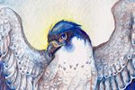
Oak Falcon - Leather Archery Arm Guard (Version 1) - October 2012


This was my first attempt, back in October of 2012.  I created a few sketches for the falcon, settled on this design, and transferred it to my leather.  I had a new ceramic swivel blade (used to cut lines into the surface of the leather), which doesn't go dull like metal swivel blades.  However, the blade I had was a straight blade, meaning it was thick and meant mostly for larger tooled pieces.  I ran into a lot of problems with my small, detailed design, namely the blade 'digging up' my leather around corners.  It was probably 60% user inexperience and 40% 'wrong tool for the job'.

I also did not case the leather correctly.  Casing leather is the process of wetting the leather and letting it sit long enough for the moisture to travel through the leather, while the very top of the leather dries to the point of it returning to its 'dry color.'  The interior of the leather is still slightly damp, however, meaning when you use tools such as stamps, you get a nice beveled edge.  Leather that is too dry throughout will result in the tools not pushing down far enough into the leather.  Leather that is too wet throughout (as I learned) will result in the leather becoming 'mushy' and being too pliable.  Imagine working with clay - if the clay is too firm, it won't shape right.  If it is too wet, it won't keep its shape and simply squish around.  My leather was too wet when I tooled it, so the tooling ended up very sloppy.

Once the tooling was finished, it came time to dye the leather.  I was determined not to fall back on my 'crutch' of acrylic paint!  I wanted to color it almost entirely with leather dyes.  Before even touching the arm guard, I'd experimented on some scrap leather, using resists (Super Shene), seeing how certain colors looked over tooled spots, and testing out my leather antique gels.  All in all, I realized my design was just too detailed and my demands for color were just too extreme for what I was trying to do.  I used brushes to get into small areas, but overall the whole design still looked a bit sloppy.  In addition to that, I tried to shade with the dye, and it didn't look the way I wanted.

When I cut the shape of the arm guard, I made the mistake of using leather shears.  Since I'd never created a straight-edged piece before (leather masks always have curves), I didn't think to use anything else!  Well, being a human, my 'straight cut' ended up a little wavy and irregular, as can be seen in the first image.  I also decided to create straps and use buckles so it could be put on and easily tightened using only one hand.  The straps ended up being very scratchy and 'pinched' when I put it on.

But in the end, I wasn't too upset with the outcome since I wasn't expecting a perfect piece.  This started as a practice piece, and while full of mistakes, I learned what to do and what not to do.  So a few months later, I tried my hand at creating it again.


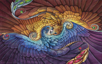
Oak Falcon - Leather Archery Arm Guard (Version 2) - January 2013


This time, I simplified the design a little, to exclude the leaves overlapping the falcon, and some of the feather layers on the breast.  I also wasn't afraid this time to simplify the colors.  The falcon's chest doesn't have to be extremely light, it just has to be lighter than the rest of the body.  Like with the first, I used a layer of resist to prevent the overlaying dye from getting too dark.  The only drawback of this is it can result in a 'blotchy' dye layer, but you can avoid this for the most part by making sure you don't leave any pools of dye.

Instead of the thick straight swivel blade, I used a ceramic angle blade, which gave me more control over detail and curves.  I made sure to case the leather properly, which resulted in a much cleaner tooling.  This time, I used a dark brown antique gel instead of black, which allowed me to go over the entire design without worrying about it looking too dark.  The antique gel, when rubbed onto tooled leather, goes into the lines of your tooling and stays there after it's wiped from the surface.  It also seats itself into the pores of the leather, so it does darken the design slightly.

Perhaps the biggest change with this version was the addition of eyelets and lace instead of straps and buckles.  It's much more comfortable to wear, though it doesn't stay on as tight with just a one-handed knot.  My solution will be to add a cord lock (like those used on hoodies), so it can be tightened with one hand.  The edges are also much straighter, as I used a ruler and a utility knife to cut them instead of shears.

Lastly, as the dye was drying, I curved the arm guard around and kept it in a curve by using elastic bands.  When the dye dried, the arm guard stayed in a curved shape.  The first one was stiff in the wrong places and didn't keep a curved shape well, so this was another improvement.

There are still some improvements I can make to future arm guards, but I'm much more confident in creating more 'traditional' leather work after making these two arm guards.  Perhaps once I've made a few more, I'll find the courage to try making a tooled quiver!


Thursday, January 24, 2013

Sylvan - Work in Progress 1

Part 1: Washes
To preserve the 'gems' on the falcon's feathers, I cover them with masking fluid.  This will allow me to paint washes over them and not have to worry about painting around them, so when it comes time to paint them I have the white of the paper.  Based on the color sketch, I start putting in wet-on-wet washes to make sure they blend well.  The important part here is to make sure you only wet areas that are NOT touching other wet sections...otherwise the colors from the first section will bleed into the other section!  For example, I waited until the falcon's wing was completely dry before wetting the hawk's head and back.

It's important not to go too dark at this stage, and this is more of an underpainting basis for the other layers.


Part 2: Adding Color
 

In the falcon's wing, you can see how I started adding color to individual feathers.  I wanted a bit of a gradient, so I started at the top, with aureolin yellow, then going lower with cadmium orange, then using quinacridone rose and finally Thio violet.  Even here, I made sure to use wet-on-wet to encourage the colors to blend cleanly, while using a brush very heavy with pigment.  When the paper is wet, if your brush doesn't have a lot of pigment, you're going to end up with a very weak wash.

I continued down the wing, combining Thio Violet with cerulean blue.  Right now the whole thing looks very oversaturated, but adding shadows and value in the next step will balance some of the color, and make the colors seem even more brilliant, when contrasted with the dull shadows.  I've also started to add detail to the leaves of the willows.

Saturday, January 19, 2013

Sylvan - Sketch and Color Sketch

I've been so busy with leatherwork lately that I've barely had time to paint!  Thankfully I've made time to work on things between projects, and here is one 'just for me' painting I'm starting.

For this, I'm incorporating two techniques I'm aiming for in my work - larger paper size, and experimenting with different paper proportions.  I tend to work around 8X10 or smaller,  but this piece is 12 inches long.  I also find that working in a more 'slender' paper size helps me pay closer attention to composition.

I also aimed to experiment with different angles.  The viewer is looking up at the falcon, but down at the hawk.  The hawk is also mostly facing away from the viewer, while the falcon is looking at the viewer.  I wanted to have a push-and-pull interaction: looking up and down, being looked at and looking away.


I experimented with different colors before settling on this color sketch.  The previous sketches were too 'rainbow', but I want to have a balance between saturation and dull color - that's what truly makes color pop.  The painting itself will be a bit brighter - I find I work too dark digitally most of the time!

Here, I'm aiming for compliments - the orange and green of the hawk and leaves, with blue and purple next to the yellow and orange of the hawk's plumage.  I'm also working on carrying color around the composition - the brilliant green of the leaves on the falcon carry to the background, and to the hawk's eye, and finally there's a hint of it in the hawk's secondary feathers.

The real test here will be if I can stick mostly to the color sketch...or if my watercolors take me in a whole new direction!