Friday, April 22, 2016

Chrysos - Acrylic Process

I enjoy using scrap matboard as a painting surface. In addition to using up 'scrap' materials that would otherwise be thrown away, the variety of color and texture makes it an excellent acid-free canvas.

This is an acrylic painting on a 5X7 sheet of green matboard.  The colors used were:

Titanium White
Mars Black
Burnt Sienna
Raw Umber
Colbalt Blue
Naples Yellow
Cadmium Yellow (just a tiny bit for the eyes)

Blocking in basic values
 I did scan the sketch, but since the matboard is so dark, my pencil lines didn't show up in the scan.  So this is the earliest scan in the process - basic, grayed values.  Here, I add a little raw umber to my gray mixture.


More value, blocking in rough details
I'm still not getting too detailed - here I'm still using a rather large brush to block in rough details, such as the feather patterns.  I eventually switch to a round for the thinner feather edges. I'm still only using black, white and raw umber.

Painting details, finalizing value
 As I push my values, I start to add subtle colors to the grays, such as a little burnt sienna to where the golden nape feathers are. My values are at about 85% here, since I know when I add my color glazes, I'll lose a little bit of my value and have to go back and touch up my highlights.

Glazes, final painting
From grayed browns, to a full-color eagle!  By glazing a little burnt sienna with naples yellow over the nape, I give the golden eagle its 'golden' title. This eagle is inspired by Chrysos, the golden eagle at Horizon Wings, so named because of her scientific name - Aquila chrysaetos - which literally translates to "golden eagle"  I use raw umber mixed with a tiny bit of colbalt blue in areas where I want a duller brown, and to push the value away from the bright orange-gold of the neck and back of the head.  To make your golds really pop, you need to surround them with duller colors. A completely-golden golden eagle will look a bit boring, just as the surrounding green and white feathers of a ruby-throated hummingbird are what make that vibrant gorget so stunning.

Friday, November 20, 2015

Color Practice - Using a Gamut Mask

Lately I've been reading more of James Gurney's book, Color and Light.  While at IlluXCon, I discussed doing "Gurney Homework" with a friend and fellow artist as a way to better understand color and utilize it in ways that create better work - that is, I suggested we practice with methods mentioned in the book, such as limited palettes and using gamut masks.

Digital "Yurmby" color wheel by Fengl0ng on Deviantart, with a digital 'mask' added by myself

I've long attempted to use less color and try to focus on how to make a few colors work well together.  I'm quite guilty of the 'fruit salad' approach that Mr. Gurney mentions, by using too many pure, full-saturation colors rather than mixing and focusing on a few.  It seems whenever I turn to start a painting, I always go straight for the pure pigment, rarely graying anything down.

I decided to see if I could create a painting based on the limited colors of a gamut mask - that is, taking a color wheel with a 'neutral tint' at the very middle, and 'masking' a section of it to focus on those colors.  In this particular color wheel, the outer colors are full-saturation, with the color gradually losing saturation nearing the center.  By masking a section of this color wheel, you can focus on a small group of colors, and bar yourself from using any colors outside that wheel.

I started by mixing a neutral gray, consisting of the paint I had currently on my palette. I adjusted the gray to be as close to neutral as possible.  This was the 'base' I would add to my colors to push the saturation down. 


I began with a sketch of a red-tailed hawk, referenced from one of my own photos. I desaturated the photo to grayscale so I wouldn't be tempted to go with local color - I wanted to use my color theme and used the photo only for anatomy and value.  For this painting, my goal was to focus on the 'points' of my gamut mask - orange and red-violet would be my main colors, with very little green or blue.


Here I used acrylic washes of my colors mixed with the neutral tint. The main color of the wings is orange (cadmium red + cadmium yellow), with a wash of a cooler red for the tail (Napthol crimson), all mixed with my neutral mixture and a little white.  The dark of the wings is my neutral mixture combined with dioxazine violet.  So far I have used no black - the dark value is purely from the neutral mixture with the dioxazine violet.


Once I have my overall value down, I begin adding some feather details. For the white feather edges on the back and upper wings, I don't use pure white, but mix a little with my orange/neutral mixture.  It looked very dark on the white of my palette paper, but once on the darker orange of the wings, it appeared very light.  This is an example of how colors can look completely different compared to their surroundings.  This is something I have to remind myself when mixing colors, because I tend to go too light or too dark based on how it looks on the white of the palette paper.

Normally, I would approach this painting very differently. Knowing the natural (local) color of a red-tailed hawk, I would have used much more golden brown in the head and upper wings.  I would combine a rich brown, perhaps a raw-umber combined with burnt sienna for the lower wings.  The tail would be a bright crimson with yellow, and I would paint the cere and legs in a sunny ochre.  In text, this sounds quite appealing, but I've found without a neutral gray to tone everything down, adding too many vibrant colors ruins the effect.  The beauty of a hawk is perhaps 70% subdued tones and 30% popping color, but our brains tend to forget to pay attention to the hard-working subdued colors in favor of the fancy, royal bright tones.


To finish the painting, I added details to the feathers (neutral gray + dioxazine violet), and added very light washes of slightly more saturated color over the feet (cadmium yellow with a little bit of cadmium red) and the upper wings (my orange mixture).  If found at this point, a tiny bit of color really made the figure pop. I added a bit of Napathol crimson to the gray, and painted a glaze over the dark primary feathers, which also pushed the color.  But none of the colors in this painting are straight-from-the-tube full-saturation colors, and I think it resulted in a much better painting than my natural habit of using blindingly-bright colors.

The colors are not fully natural/local.  This bird is a bit pinker than a natural red-tail.  Compare to the reference photo below, the colors of which I did not look at, to prevent influence:

I'm actually quite pleased that my red-tail's colors were so different from a natural red-tail's plumage, but the end painting is still recognizable as a natural hawk. I may replicate this experiment using a color theme even farther than natural plumage - perhaps a green and blue-heavy gamut. 

While painting this experiment, I felt my brain working in a different way than it normally does while painting - it was a feeling I haven't experienced in a while - the feeling of actively learning something new while painting. It was a great feeling! It felt a little odd while I was painting, but I had enough faith in my color scheme to know it would turn out in the end if I followed the 'rules' and didn't stray outside my color theme. I'm looking forward to my next bit of 'homework' and hope I learn even more.

(Edit: I have since found an extremely helpful three-part blog entry by James Gurney, further explaining how to use gamut masks with a video of his process. Check it out here - http://gurneyjourney.blogspot.com/2011/09/part-1-gamut-masking-method.html

There is also an immensely useful digital gamut mask tool here - http://www.livepaintinglessons.com/gamutmask.php)


Friday, August 14, 2015

Zephyr - Acrylic Dragon Painting Progress

Lately I've been experimenting with acrylic and working in simpler palettes, instead of using virtually every color in my collection.  This blue and green dragon contains only the following colors:

Titanium White
Mars Black
Phtalo Green
Colbalt Blue
Ultramarine Blue
Cerulean Blue
Naples Yellow
Raw Umber

Sketch:


Transfer to Matboard:
 The transfer paper I used is actually very light, but I used an 8B pencil to darken the lines before painting. I used a sheet of acid-free greenish matboard as a base.


Value:
With grays mixed with a little Pthalo Green, I began painting in the values.


Completed Values:
With the value painting complete, I'm ready to begin adding colors.  Since I already have basic shadows and highlights, I simply need to add colors in glazes.


Glazing:
 I use very thin layers of paint over the lightest areas, and use thicker paint for the shadows. I don't want black or gray shadows, which is why I pay closer attention to adding more layers of color over shadows.  I also start painting in scale details.


Details:
 Since the glazes add a little value of their own, even if transparent washes, it's necessary to darken shadows and lighten highlights after.


Final Painting:
 

Friday, December 12, 2014

Peace on Earth - Holiday Card Process

Every year I paint a watercolor holiday card featuring my winter gryphon, Solstice.  So far 2014 is the seventh year, and thus the seventh painting featuring Solstice, and this year I was looking forward to painting her since I've been doing so much leatherwork and acrylic painting lately.  My watercolors felt neglected!

Sketch and reference
Instead of using photo reference for the various conifers in this painting, I went out and collected a few from my very own winter wonderland. A nearby park had plenty of spruce, cedar and pine boughs for me to take samples of, as well as plenty of acorns on the ground.  Painting from life, even if you're not painting the object exactly, will always help you achieve a more realistic object.  Even having a spruce clipping in front of you will help you get a 'feel' for the plant as you paint.

Painting the Conifers
Having different types of plants in front of you also helps you compare colors between, say, spruce and cedar. The spruce was much more blue than the cedar, which was more of a dull green.  Oxide of Chromium is one of those greens which was collecting dust in my watercolor collection, as I tend to favor more vibrant greens, such as Sap Green and Hooker's Green. Oxide of Chromium is one of those gray greens that doesn't get nearly enough appreciation, but is often just the right compliment to a forest scene.  Mixed with Moonglow (a purplish Daniel Smith color), I was able to achieve shadows that weren't so blue or vibrant to kill the subtle tone of the green.

For the spruce branches on the right of the painting, I used Pthalo Green with Prussian Blue for the shadows. I needed to paint each needle, to avoid ending up with a green sky, which I painted then with Indigo and a wash of Dioxazine Violet.  For the spruces closer to the warm candlelight on the left, I used Hooker's Green for the brightest branches.

Base Shadows
Solstice has rich gold and reddish gold plumage on her outer wings, with soft cream and brown feathers on her belly and inner wings.  For the shadows I used a little Moonglow mixed with Raw Umber on the inner wings and belly.  For her outer wings, I used Moonglow with a little Van Dyke Brown.  Since her back was to be in shadow, I used dark blues such as Prussian Blue, mixed with a little Ultramarine for her neck and head feathers.  From neck to front, I gradually switched from deeper to lighter washes of Moonglow.

Don't be afraid to use blue shadows for orange objects, such as the fox.  If the light/shadow separation is dramatic, such as in a night scene lit by candles, your shadows will be blue or purple. Painting a wash of orange over this will create a naturalistic shadow.

First Washes
After working on the shadows a bit, I started painting in washes. For the slight gradation of the reddish brown feathers, I used a simple wash of Quinacridone Deep Gold (another Daniel Smith mixture) and started at the bottom of each feather, painting up.  Naturally you will begin to lose pigment the more you paint up, so the result was a natural gradation. You can also do this by painting dark pigment at the bottom, then rinsing the paint off your brush, and pulling the wet paint up with a wet brush.  Either method works!

For the buff coloration of the belly and face, I used very light washes of Naples Yellow, with a little Raw Umber.  I used more Naples Yellow closer to the candle.  Candles are a bit tricky to paint, since you naturally want to go darker the farther from the flame you are.  Remember though - the light from the flame travels through the candle and illuminates it a bit, so be sure not to go too dark when painting close to the flame.

Details
Painting feather details is one of my biggest joys!  I added another wash of Quinacridone Deep Gold to darken the feathers, adding a little Yellow Ochre at the top of each feather to add a bit of yellow.  Once dry, I added the bars with a mixture of Van Dyke Brown and Sepia.  The inner feather bars are a light wash of Van Dyke Brown and Raw Umber.  At this point, the painting is nearly done, except for the cardinals, fox, small candles, and the branches over the wing.

Final Painting
As you can see, the blue on the back of the fox and the back wing of the gryphon don't take away from the orange-brown of the fur and feathers.  It creates a sense of deeper warmth on the side being illuminated.  A few very light washes with Cadmium Yellow on the trees surrounding the candles helps brighten up the scene.

Monday, August 25, 2014

Tiabal - Acrylic Gryphon Process

A few people were interested in seeing my acrylic progress when I posted my most recent gryphon portrait a few days ago.  This gryphon is one of two I'll be putting in the Dragon Con Art Show this weekend.  I wanted to use this as a way to really push my acrylics, and really focus on values.

Neutral Background and Moss Texture:


Values 1:


Values 2:


Values 3:


Feather Markings:


First Glazes:


Final Glazes and Detail:


This method is a variation on the Grisaille Technique, where a finished value painting in grays is used as the base for simple glazes.  I'd say 85% of this painting was done in shades of gray, with only 15% being glazes and some final details.  You can see that I had to add a bit more highlight to the front of the gryphon's head, as well as more shadow to the feet.  You always need to go back to add final highlights that get covered by color, such as in the crystals and on the white feathers.

It can be daunting to shade all in gray, as we've all been told, "don't shade with black!"  Grays, however, are important.  I've noticed my own work becoming oversaturated, primarily because I'm shy to even touch black or gray, and to always use color in my shadows.  But with this technique, you glaze the entire painting with color - not only the light tones, but the shadows as well. I went back into the shadows of the feet, for example, with burnt sienna to add some color.  I used a mixture of raw umber and burnt sienna to deepen the colors in the wing feathers.  The trick to this technique is that the value is already there - no guessing how much dioxazine violet you need to use to push that value down to 70% while not making it too purple.

Sunday, August 17, 2014

"Winged Fantasy" Video and Frequently Asked Questions

I'm excited to announce that my book, "Winged Fantasy: Draw and Paint Magical and Mythical Creatures" is available!  You can find it bookstores such as Barnes and Noble, as well as in art and craft stores such as Michaels and Jo Ann Fabrics.  It's also available through North Light Shop and Amazon, where you can also look at several pages inside the book.

I've also posted a video as a bit of a 'walkthrough', giving a short summary of each chapter and section:


A few questions I've received online and in person about the book:

Q: What age group and skill level is this book intended for?
A: This book is suitable for kids to adults.  I've had people tell me that their younger children, who can't quite read the text yet, still love the illustrations and enjoy trying their hand at the step-by-steps.  I explain the basics of graphite and ink drawing, and show several techniques for watercolor painting, so even beginner artists can learn from this book.  The techniques I cover are designed to teach the reader, regardless of skill level, about how to create believable shading, highlights and a variety of effects with watercolor, so in addition to being able to create a finished painting from the step-by-steps, the reader will also be able to use what they learn to paint their own creations.

Q: I have a lot of trouble drawing wings, will this book help me specifically with wings?
A: I've had a lot of people throughout the years asking me to write a wing-drawing instructional book, and I've finally had the opportunity to include that here!  This book has an entire chapter dedicated to wing construction and anatomy.  Most of the chapter covers bird and bat wing anatomy, with a small section on insect wing anatomy.  The instruction covers feather structure, bones and joints, and general rules of movement and flexibility.  Below you can see a sample from the bird section:

Q: I can't find the exact colors or brands of watercolor you use. Can I use different paints?
A: Absolutely! You're not required to use the specific colors or paint brands I use in the book.  I personally use several brands, mostly Windsor and Newton, Holbein and Daniel Smith, however there are many different brands of good-quality watercolors out there. There may also be different colors you wish to use.  For example, if you dislike Pthalo Blue, you certainly do not have to use it - you may find a different blue suits your style much better.  Many readers have paints already at home, and may feel overwhelmed by the wide palette I use - don't be discouraged!  Some of the best artists have created incredible paintings using only a few colors.  A good painting doesn't rely on how many paints you have or how much they cost, it's how you use them.

Q: All these watercolor surfaces confuse me! Hot press, cold press, illustration board...in the step-by-steps, do I have to use the same surface you used?
A: Not at all. I used a variety of surfaces because certain surfaces handle paint differently, and wanted to show the reader how texture and surface can affect a painting.  In "The Winged Wolf" step-by-step, I used cold-pressed watercolor paper, which you can see the texture of in the sky. Cold-press paper is also good if you wish to use colored pencil, because of the tooth of the paper.

Many artists have a preference for a specific type of paper.  Experiment with different surfaces to see what works best for you. You may find you dislike hot-press paper, or find one brand too 'slippery' and another brand perfect.  Paper sizing (surface treatment and how water is absorbed) differs between brands as well.  All papers and boards are a little different, and can give different life to your painting.

Q: Where did you learn so much about birds? And why do you draw and paint so many birds and fantasy avian creatures?
A:  Birds have been the earliest passion I can remember (the second earliest passion was to be a Pokemon master...).  I remember spending hours in the library, pouring over the paintings of John James Audubon.  My favorite book as a child was "The Daywatchers" by Peter Parnall, who was the first artist I ever saw who portrayed naturalistic raptors with a touch of fantasy.  When I was 12 years old, I began volunteering at a children's museum at town, where I fed and cleaned raptor enclosures and learned about animals from the resident animal curator, a wonderful man named Brad Case who loved animals and education.

After going to college and then graduate school for illustration, I returned to Connecticut and began volunteering with Horizon Wings, a raptor rehabilitation and education center. There, I gained the sort of observation you can only get from being close to raptors.  Learning about birds isn't just about seeing them, it's about observing their mannerisms and characteristics.  It's about seeing how a hawk can twist its head around or how the feathers on the back of its head slightly flare up when its alarmed.  It's being able to see the tiny baffles in a falcon's nostrils, or the scaling on its feet.  It's feeling first hand just how stiff a falcon's flight feathers are compared to the soft, barely tactile primaries of an owl.  All this, even the non-visual, translates into art.

I always encourage artists, if possible, to observe their subjects first-hand.  Zoos and aviaries are incredible places where you can sit and observe animals.  You'll instantly notice anatomical oddities you never knew about, and watching them move will teach you about their behavior, which in turn will enter your art.

As for why I paint birds?  I still have the same passion for birds that I did when I was a child.  I also find they are the best subject for the emotions and messages I try to portray with my art.  Wings are my preferred medium of expression.

Saturday, May 24, 2014

"Featherdancer" - Acrylic Painting Process

Lately I've participated in a couple of the Conceptart.org challenges, partially as a way to stretch my creative concept character challenges, and also because the challenges have had to do with Pokemon, and gryphons, both of which I couldn't turn down!

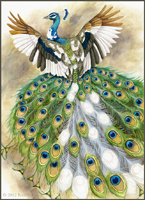
For the latest challenge, titled "Glamorous Griffin", the challenge was to create the fanciest, most handsome, elaborate gryphon.  The goal was to create a gryphon of any bird/mammal combination, with the goal of having the flashiest, most flamboyant plumage.  As I like to explore subjects/techniques I haven't done before with these Creature of the Week challenges, I decided to go with a bird I rarely draw.  Obviously raptors would be out of the question, and typical 'glamorous' birds such as parrots, peacocks and birds of paradise seemed to obvious.  Well then, what better, under-appreciated beautiful bird should I choose?

Sketches

Pigeons, of course!  These 'rats with wings' are often overlooked as city vermin, incorrectly feared for being dirty and full of disease.  In truth, they are no dirtier or diseased than other wild animals, but people seem to hate them because of the mess they leave on cars and sidewalks.  However, if one bothers to take a closer look, their necks shimmer with a variety of greens and purples, and their plumage often features soft lavenders and shades of blue-gray.

Using their subtle colors with touches of iridescence, I decided to enhance these colors and create a marvelous male in breeding plumage.


Color Sketch

I cleaned up the sketch and did a quick color sketch to establish plumage.  I wanted to keep the overall grayed lavender color scheme, but with flashes of saturated iridescent colors to really make it pop.  Though I usually do these challenges digitally, I decided to try this one in acrylic.


Background Wash and Sketch Transfer

I decided to use a piece of 9X12 inch acid-free matboard to paint on, both for the light-green color and for the texture.  With an old, big bristle brush, I mixed a gray-green mixture of White, Black, Sap Green and a little Yellow Ochre, and painted a rough layer.  Once dry, I went back with the same gray-green mixture, also mixing in some Raw Umber and Burnt Sienna.  I didn't want the background to be too saturated, so I made sure to keep adding the gray-green.  When the background was completely dry, I transferred my finished sketch.  To give reason to his dance, I decided to add a bouquet of feathers that would float around him as he twirls.


Underpainting and Values

Still using grayed tones, I began loosely painting in colors.  For the wings, I used a grayed mixture of Dioxazine Violet, and for the blues on the wings a gray mixture of Pthalo Blue.  I aimed to keep my initial palette fairly limited, as I have a bad habit of getting too complex with my colors instead of focusing on how to make a few work well.


Building Value

Acrylics have the opposite problem of watercolors - instead of getting lighter as they dry, they get darker.  I kept having to go back and add more and more white to areas I thought were light enough, as they got darker once dry.  Still using only Dioxazine Violet, Pthalo Blue, and Black and White, I worked on pushing the values (with a little Pthalo Green for the neck). I tend to blend on the surface of the painting, so I often will use a 'dirty' brush to blend.  At this point, I decided I would keep the far wing less contrasted to establish depth.


More Value and Building up Color

 By pushing saturation only in certain areas, you create a more vibrant composition, whereas if everything was bright and vibrant, it wouldn't work as well.  Overall I am pushing the colors only a little, save for highlighted areas.  The tail plume, for example, I want very saturated so I used pure Pthalo Blue closest to the tip, then Dioxazine Violet, Permanent Rose, and finally Alizarin Crimson closest to the base all blended on the surface.  While still wet, I went in with white to get that iridescent blue sheen on the end of the tail tuft.

At this point, I had built up my values to the point where I really only needed to use thin glazes to add color.  Cadmium Yellow, for example, is quite translucent but very bright, so just a little over the primary feathers was enough to saturate them.  I built up the edges of the primary feathers with Pthalo Blue mixed with a little black, then used light layers of Permanent Rose to build up the purple.  At this point, I am building up the last of the value while adding color, as certain pigments are more opaque than others, and need to be mixed with white or black.


Finished Painting

Mixing a bit more of my original gray-green mixture, I used black and Dioxazine Violet for the shadow under the gryphon, blending roughly into the background for texture.  I added a few splashes of Burnt Sienna, Yellow Ochre and Raw Umber to add just a little color to the background, still keeping it mostly gray, and lightened the upper left with a bit of white.  The important part here is to keep the focus and vibrancy on the gryphon - if there's too much color in the background, it will complete with your subject!
The iridescent spots were actually not challenging at all to paint.  I painted the spots with Pthalo Blue mixed with black, let dry completely, then painted over with pure Pthalo Blue.  While still wet, I took a small brush loaded with white and smeared the wet blue, creating a subtle 'shine'.  I went back with a glaze of Green Gold to add a little extra color, and used a very thin layer of Green Gold for the green on the neck.  For the blue, I used a very thin layer of Pthalo Blue, and for the purple, just a hint of Alizarin Crimson mixed with Permanent Rose.  Because I had built the value up before, the glazes had a good foundation and didn't need any additional work to create the illusion of iridescence.
The floating feathers are a mixture of the colors I had already been using.  Here's a complete list of the colors that went into this painting:

Alizarin Crimson
Permanent Rose
Cadmium Yellow
Yellow Ochre
Sap Green
Green Gold
Pthalo Green
Pthalo Blue
Dioxazine Violet
Burnt Sienna
Raw Umber
Mars Black
Titanium White