I've long attempted to use less color and try to focus on how to make a few colors work well together. I'm quite guilty of the 'fruit salad' approach that Mr. Gurney mentions, by using too many pure, full-saturation colors rather than mixing and focusing on a few. It seems whenever I turn to start a painting, I always go straight for the pure pigment, rarely graying anything down.
I decided to see if I could create a painting based on the limited colors of a gamut mask - that is, taking a color wheel with a 'neutral tint' at the very middle, and 'masking' a section of it to focus on those colors. In this particular color wheel, the outer colors are full-saturation, with the color gradually losing saturation nearing the center. By masking a section of this color wheel, you can focus on a small group of colors, and bar yourself from using any colors outside that wheel.
I started by mixing a neutral gray, consisting of the paint I had currently on my palette. I adjusted the gray to be as close to neutral as possible. This was the 'base' I would add to my colors to push the saturation down.


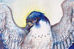
Normally, I would approach this painting very differently. Knowing the natural (local) color of a red-tailed hawk, I would have used much more golden brown in the head and upper wings. I would combine a rich brown, perhaps a raw-umber combined with burnt sienna for the lower wings. The tail would be a bright crimson with yellow, and I would paint the cere and legs in a sunny ochre. In text, this sounds quite appealing, but I've found without a neutral gray to tone everything down, adding too many vibrant colors ruins the effect. The beauty of a hawk is perhaps 70% subdued tones and 30% popping color, but our brains tend to forget to pay attention to the hard-working subdued colors in favor of the fancy, royal bright tones.

To finish the painting, I added details to the feathers (neutral gray + dioxazine violet), and added very light washes of slightly more saturated color over the feet (cadmium yellow with a little bit of cadmium red) and the upper wings (my orange mixture). If found at this point, a tiny bit of color really made the figure pop. I added a bit of Napathol crimson to the gray, and painted a glaze over the dark primary feathers, which also pushed the color. But none of the colors in this painting are straight-from-the-tube full-saturation colors, and I think it resulted in a much better painting than my natural habit of using blindingly-bright colors.
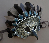
The colors are not fully natural/local. This bird is a bit pinker than a natural red-tail. Compare to the reference photo below, the colors of which I did not look at, to prevent influence:

I'm actually quite pleased that my red-tail's colors were so different from a natural red-tail's plumage, but the end painting is still recognizable as a natural hawk. I may replicate this experiment using a color theme even farther than natural plumage - perhaps a green and blue-heavy gamut.
While painting this experiment, I felt my brain working in a different way than it normally does while painting - it was a feeling I haven't experienced in a while - the feeling of actively learning something new while painting. It was a great feeling! It felt a little odd while I was painting, but I had enough faith in my color scheme to know it would turn out in the end if I followed the 'rules' and didn't stray outside my color theme. I'm looking forward to my next bit of 'homework' and hope I learn even more.
There is also an immensely useful digital gamut mask tool here - http://www.livepaintinglessons.com/gamutmask.php)