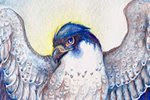
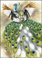
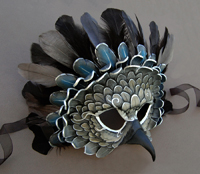
With summer conventions coming up, I'm always inspired by the huge paintings I see in the art shows. It reminds me that I want to work bigger, instead of squishing all the detail into an 8X10 or 9X12 painting! I've wanted to paint another large (11X14 for me is large!) acrylic painting for a while, featuring gryphons, so after doing some sketches, I came up with the idea of a gryphon holding a flag as a signal for other gryphons to fly into battle.
Final Sketch:
I am trying to pay closer attention to composition lately. As I learned long ago, the eye automatically tends to travel from top left to bottom right, so you want to catch the viewer's eye and move it around the composition while breaking that straight 'dive' to the bottom right. I aimed to create movement from the gryphon in the foreground, to the middleground gryphon, all the way to the group in the background.
For colors, I didn't want to go with the same plain blue sky. I looked through some photos I took of sunset skies and found some inspiration in the yellows, oranges and deep purples there. It also gives a yellow glow for the highlights, with cooler blues for the shadows.
Color Sketch:
I may add another brown/red gryphon down below just above the trees so there isn't a large expanse of 'dead' space. It will also allow me to bring some of the red of the flag and jewels to more of the composition.
Showing posts with label sketch. Show all posts
Wednesday, June 12, 2013
Saturday, January 19, 2013
Sylvan - Sketch and Color Sketch
I've been so busy with leatherwork lately that I've barely had time to paint! Thankfully I've made time to work on things between projects, and here is one 'just for me' painting I'm starting.
For this, I'm incorporating two techniques I'm aiming for in my work - larger paper size, and experimenting with different paper proportions. I tend to work around 8X10 or smaller, but this piece is 12 inches long. I also find that working in a more 'slender' paper size helps me pay closer attention to composition.
I also aimed to experiment with different angles. The viewer is looking up at the falcon, but down at the hawk. The hawk is also mostly facing away from the viewer, while the falcon is looking at the viewer. I wanted to have a push-and-pull interaction: looking up and down, being looked at and looking away.
I experimented with different colors before settling on this color sketch. The previous sketches were too 'rainbow', but I want to have a balance between saturation and dull color - that's what truly makes color pop. The painting itself will be a bit brighter - I find I work too dark digitally most of the time!
Here, I'm aiming for compliments - the orange and green of the hawk and leaves, with blue and purple next to the yellow and orange of the hawk's plumage. I'm also working on carrying color around the composition - the brilliant green of the leaves on the falcon carry to the background, and to the hawk's eye, and finally there's a hint of it in the hawk's secondary feathers.
The real test here will be if I can stick mostly to the color sketch...or if my watercolors take me in a whole new direction!
For this, I'm incorporating two techniques I'm aiming for in my work - larger paper size, and experimenting with different paper proportions. I tend to work around 8X10 or smaller, but this piece is 12 inches long. I also find that working in a more 'slender' paper size helps me pay closer attention to composition.
I also aimed to experiment with different angles. The viewer is looking up at the falcon, but down at the hawk. The hawk is also mostly facing away from the viewer, while the falcon is looking at the viewer. I wanted to have a push-and-pull interaction: looking up and down, being looked at and looking away.
I experimented with different colors before settling on this color sketch. The previous sketches were too 'rainbow', but I want to have a balance between saturation and dull color - that's what truly makes color pop. The painting itself will be a bit brighter - I find I work too dark digitally most of the time!
Here, I'm aiming for compliments - the orange and green of the hawk and leaves, with blue and purple next to the yellow and orange of the hawk's plumage. I'm also working on carrying color around the composition - the brilliant green of the leaves on the falcon carry to the background, and to the hawk's eye, and finally there's a hint of it in the hawk's secondary feathers.
The real test here will be if I can stick mostly to the color sketch...or if my watercolors take me in a whole new direction!
Saturday, September 22, 2012
Portrait practice and nature studies
Lately I've been in a mood to practice digital portraits. I adore seeing the color and value artists achieve with skintones digitally, and I suppose the final push was when I got a bunch of brushes from my friend Sam Hogg, whose digital (and traditional) work is incredible. She also pointed out something that should have been obvious to a friend and I that we never knew was possible in Photoshop - brush opacity controlled by pen pressure. I'd long been controlling brush size with pen pressure, but never knew you could control opacity that way as well - I always thought if you wanted your pen to control opacity, you had to use a program such as Corel Painter.
You'll probably think that I've posted these two digital portraits out of order, since the first is much better than the second, but the first portrait is with photo reference, and the second is without. For my second sketch I wanted to see how much I could 'remember' about facial anatomy and color/shadow without consulting a reference.
Referenced from this photo by Faestock on DeviantART:
Primarily I'm trying to improve my facial anatomy. My biggest problem spots are noses - even in this sketch, when I finished, I realized the nose was actually too far to the left (her right) and I had to move it over. Even using a reference, I tend to go 'blind' when it comes to the human face (and body). This is something I hope to improve upon by practice.
No reference (and it shows!)

Even with all its imperfections, I still like this study. Somehow, the roughness and looseness of nature studies seem more forgiving than human anatomy - perhaps because we, as humans, are more familiar with the appearance of our own species than the world around us. Or perhaps it's nothing so complex and there's just something beautiful about loose nature studies!
You'll probably think that I've posted these two digital portraits out of order, since the first is much better than the second, but the first portrait is with photo reference, and the second is without. For my second sketch I wanted to see how much I could 'remember' about facial anatomy and color/shadow without consulting a reference.
Referenced from this photo by Faestock on DeviantART:
Primarily I'm trying to improve my facial anatomy. My biggest problem spots are noses - even in this sketch, when I finished, I realized the nose was actually too far to the left (her right) and I had to move it over. Even using a reference, I tend to go 'blind' when it comes to the human face (and body). This is something I hope to improve upon by practice.
No reference (and it shows!)

Here my weakness with noses is pretty apparent, as well as an all-around unfamiliarity with the human face. You'd think that being a human myself, I'd be pretty familiar with the features, but it's amazingly difficult to 'remember' all the subtleties to a nose, or the flaps of skin around the eye. The colors are also weaker compared to the first.
Today, I decided to have lunch on my favorite rock at a nearby wooded area that surrounds the town reservoir. On my way back, I found a stunning red maple leaf with bright green veins - a leaf that was probably just starting to turn but fell off the tree prematurely. I took it home with the intention to paint it, and noticed that by the time it was in my house, it had already started to darken and dull! It's as if autumn leaves have a built-in 'leave me outside' mechanism.
Autumn Leaf Study (watercolor on paper) :
Labels:
digital,
portrait,
sketch,
study,
watercolor
Tuesday, March 15, 2011
Owl Women - Final Drawing and Shadow Stages
As seen in the previous post, I've completed the color comp, meaning it's time to transfer the drawing and start painting! Below is the drawing transferred to the illustration board, with a few last things fixed:

When adding the shadows, I try to think about what colors will work best when the main color layer is applied. I never shade with gray or black, and always use a color or combination of colors for my shadows. Since this is a night scene, I try to use a lot of blue and violet-dominated shadows.

The shadows on the barn owl's clothing are a mixture of dioxazine violet and van dyk brown, which makes it a warm, yet dark shadow, which will work well with the red of her cloak. The wings of the barred owl have a layer of ultramarine violet, indigo, and just a touch of sepia - I used this very neutral color as her wings are much more of a grayish brown than the more intense brown of the great horned owl's wings.
As feathers are translucent, the 'light gaps' are where the light of the fire will illuminate the feathers. Where the feathers overlap, not as much light gets through. This is a hard concept at first to wrap your mind around when drawing birds' wings, but inclusion of this with back-lit wings results in a much more believable wing.
A note - the pink you see on the moon is not paint, but rather masking fluid. I used masking fluid so I could apply washes freely to the sky without worrying about going over the perfect white and circle of the moon. Once I am ready to paint the branches, I will remove it.

When adding the shadows, I try to think about what colors will work best when the main color layer is applied. I never shade with gray or black, and always use a color or combination of colors for my shadows. Since this is a night scene, I try to use a lot of blue and violet-dominated shadows.

The shadows on the barn owl's clothing are a mixture of dioxazine violet and van dyk brown, which makes it a warm, yet dark shadow, which will work well with the red of her cloak. The wings of the barred owl have a layer of ultramarine violet, indigo, and just a touch of sepia - I used this very neutral color as her wings are much more of a grayish brown than the more intense brown of the great horned owl's wings.
As feathers are translucent, the 'light gaps' are where the light of the fire will illuminate the feathers. Where the feathers overlap, not as much light gets through. This is a hard concept at first to wrap your mind around when drawing birds' wings, but inclusion of this with back-lit wings results in a much more believable wing.
A note - the pink you see on the moon is not paint, but rather masking fluid. I used masking fluid so I could apply washes freely to the sky without worrying about going over the perfect white and circle of the moon. Once I am ready to paint the branches, I will remove it.
Friday, March 11, 2011
Owl Women
I seem to have owls on the brain, lately! Much inspiration is thanks to the live owls I work with at Horizon Wings Raptor Rehabilitation and Education Center, of which I am lucky enough to see up close. You really get a better understanding of birds of prey when you see them in real life. Their movements and mannerisms are simply impossible to discover through photographs alone.
There's something so enjoyable about drawing owls. Perhaps it is because of their incredible softness and roundness. If you enjoy drawing fluffy feathers, then an owl is the perfect subject. I also associate these birds with (no surprise here) the night and the mysteries of the world when the sun goes down and the moon comes up. Owls are creatures that live with a perfect harmony with the night. Their hearing is unlike that of any bird - some owls hunt in practically complete darkness, using their asymmetrical ears to pinpoint a creature's location on the ground. Their wings have a fringe to allow them to fly with complete silence.
Below are sketches for a painting I am about to begin. Three owl women gather around a cauldron of starlight. One holds a sphere of perfect crystal, which reflects all light and allows her to see beyond the dark of night. Another carries a staff, which still grows living oak leaves and acorns.

And the finished sketch. I didn't put in as much detail, here, as I planned to incorporate the values with the color sketch:

As before, with Celebration, I used Corel Painter to create my color sketch:

Painting this will be tricky, as I have two main light sources: the moon above and the fire below. The crystal ball also gives a little light to the face of the barred owl, allowing the eye that would normally be in shadow to have a highlight.
The shadows were easy in Painter, but with a translucent medium like watercolor, it's going to be a bit more challenging. I may end up using colored pencil to really pop the highlights.
There's something so enjoyable about drawing owls. Perhaps it is because of their incredible softness and roundness. If you enjoy drawing fluffy feathers, then an owl is the perfect subject. I also associate these birds with (no surprise here) the night and the mysteries of the world when the sun goes down and the moon comes up. Owls are creatures that live with a perfect harmony with the night. Their hearing is unlike that of any bird - some owls hunt in practically complete darkness, using their asymmetrical ears to pinpoint a creature's location on the ground. Their wings have a fringe to allow them to fly with complete silence.
Below are sketches for a painting I am about to begin. Three owl women gather around a cauldron of starlight. One holds a sphere of perfect crystal, which reflects all light and allows her to see beyond the dark of night. Another carries a staff, which still grows living oak leaves and acorns.
And the finished sketch. I didn't put in as much detail, here, as I planned to incorporate the values with the color sketch:

As before, with Celebration, I used Corel Painter to create my color sketch:

Painting this will be tricky, as I have two main light sources: the moon above and the fire below. The crystal ball also gives a little light to the face of the barred owl, allowing the eye that would normally be in shadow to have a highlight.
The shadows were easy in Painter, but with a translucent medium like watercolor, it's going to be a bit more challenging. I may end up using colored pencil to really pop the highlights.
Sunday, March 6, 2011
Ceremony - works in progress
Many apologies for the long hiatus! It is a bit fitting, in a way, that my first post in a while is to show progress on a work that I had put away for a long while. I reopen a neglected art blog with a neglected painting!
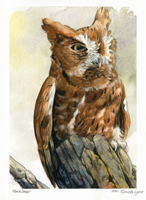
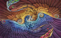
I started this drawing on an 8 X 10 piece of illustration board, late in 2010 when I was struggling with technique and wanted to create a piece to experiment with. Other projects got in the way, and this got tucked away in a drawer 'for later.' Well, later is today, and I pulled it out to finish the drawing, and get started with painting.
Below is a color sketch - I'm usually very bad about doing color sketches, but I think this may help the issues I have of plopping down color on a final piece before thinking it through.

I used Painter IX to put in some color ideas and establish the lighting. The 'smoke' will be a bit more challenging with watercolor, but it will be a good opportunity to experiment with technique...which was the initial purpose of this piece to begin with!

I started this drawing on an 8 X 10 piece of illustration board, late in 2010 when I was struggling with technique and wanted to create a piece to experiment with. Other projects got in the way, and this got tucked away in a drawer 'for later.' Well, later is today, and I pulled it out to finish the drawing, and get started with painting.
Below is a color sketch - I'm usually very bad about doing color sketches, but I think this may help the issues I have of plopping down color on a final piece before thinking it through.

I used Painter IX to put in some color ideas and establish the lighting. The 'smoke' will be a bit more challenging with watercolor, but it will be a good opportunity to experiment with technique...which was the initial purpose of this piece to begin with!
Thursday, May 6, 2010
A Day at the Caprilands
With spring here, I decided to make a trip to the Caprilands Herb Farm in Coventry, Connecticut (their main page is still in progress). It's only a few towns away, and the drive and destination is rather beautiful and relaxing.
I won't bore you with the tons of flower, plant, and tree photos I took, but below is one rather lovely butterfly I found, and two quick drawings and a watercolor study I did to loosen myself up.
A butterfly I have yet to identify:

A sketch of what I believe are irises, not yet blossomed:

Sketch of a tree with some rather interesting, twisty trunks. Also a pair of guinea hens that served as the resident tick control:

Lastly, some painting practice based on a reference photo I took of an unidentified flowering bush. This is watercolor on illustration board:

A lot of what I see here serves as inspiration for my paintings. Once more flowers start growing, I'm sure I will 'discover' some more Nectarbirds...
I won't bore you with the tons of flower, plant, and tree photos I took, but below is one rather lovely butterfly I found, and two quick drawings and a watercolor study I did to loosen myself up.
A butterfly I have yet to identify:

A sketch of what I believe are irises, not yet blossomed:

Sketch of a tree with some rather interesting, twisty trunks. Also a pair of guinea hens that served as the resident tick control:

Lastly, some painting practice based on a reference photo I took of an unidentified flowering bush. This is watercolor on illustration board:

A lot of what I see here serves as inspiration for my paintings. Once more flowers start growing, I'm sure I will 'discover' some more Nectarbirds...
Monday, March 22, 2010
Courtship - WIP
This is a bit of a spontaneous painting. I'm still experimenting a lot with watercolor techniques and wanted to try out mixing white gouache with my watercolors. I've always liked the creamy consistency you get when you mix watercolor with white gouache.

I'm still deciding on what colors I'll paint the gryphons. Perhaps yellows and reds to contrast with the greens. Maybe some dulled purples for the snow leopard part of the gryphon on the right.
Here is the pencil drawing, pre-paint:

I'm still deciding on what colors I'll paint the gryphons. Perhaps yellows and reds to contrast with the greens. Maybe some dulled purples for the snow leopard part of the gryphon on the right.
Here is the pencil drawing, pre-paint:
Labels:
fantasy art,
gryphons,
progress,
sketch,
watercolor
Friday, January 22, 2010
Goshawk in the Pines
Here is the second of the pair of paintings based on an inspiring quote by Helen Macdonald on her blog Fretmarks, which reads- "And then I thought, decidedly, yes. Goshawks are water. Falcons are air and hot stone. Goshawks are water and wood."

Below is the graphite drawing. Rick Lovell, an illustrator and an instructor of mine at SCAD-Atlanta, pointed out a confusing 'connection' of tail with branch which you can see below. I fixed this previous to starting the finished painting.

I'll admit, although falcons are my favorite raptors, I like this painting more. The falcon painting, which can be seen in my previous post, was on hot-press watercolor paper, whereas the goshawk painting is on cold-press. Hot-press is much smoother and thus is wonderful for tight details, but it comes at a price; paint seems to 'slide' on the surface and doesn't soak in as well. Perhaps I simply need more practice using it. Regardless, I like the way I was able to control the pigment in the goshawk painting better.

Below is the graphite drawing. Rick Lovell, an illustrator and an instructor of mine at SCAD-Atlanta, pointed out a confusing 'connection' of tail with branch which you can see below. I fixed this previous to starting the finished painting.

I'll admit, although falcons are my favorite raptors, I like this painting more. The falcon painting, which can be seen in my previous post, was on hot-press watercolor paper, whereas the goshawk painting is on cold-press. Hot-press is much smoother and thus is wonderful for tight details, but it comes at a price; paint seems to 'slide' on the surface and doesn't soak in as well. Perhaps I simply need more practice using it. Regardless, I like the way I was able to control the pigment in the goshawk painting better.
Friday, November 20, 2009
Two ink drawings and quick figures
Each year I make a calendar and offer it for sale, and this year my calendar features the paintings I created for my thesis. On my DeviantART account, I posted a calendar sale where if you order a calendar directly through me, I will sign it and include a small pen drawing of your choice. The calendar is also $5 cheaper than if you buy it directly through DeviantART, so it's a better deal all around.
Here are two of the pen drawings that were requested by people who ordered a calendar:
Snow leopard/peregrine falcon gryphon:

Osprey - I was going for an Audubon-esque, moment of suspension pose. If I could do it over, I would have given it more of an angle (and fixed that beak!) but it's serves its purpose as a simple pen sketch, and I'm sure the person it's meant for will like it all the same:

After some anatomical frustration, I decided to just get back to basics and do a night of figure studies and gestures. Here's a page of simple figures, references from stock photos:

Poses referenced from the following stock photographers:
Top left - Chamberstock on DeviantART
Top right, bottom left - Torino Stock on DeviantART
Bottom right - Mjranum Stock on DeviantART
I truly wish I had access to live models; drawing the figure from photographs is never the same as having a real person right there. Luckily, I have a friend who has volunteered to pose, and we're playing with the idea of starting up a figure drawing group.
Here are two of the pen drawings that were requested by people who ordered a calendar:
Snow leopard/peregrine falcon gryphon:

Osprey - I was going for an Audubon-esque, moment of suspension pose. If I could do it over, I would have given it more of an angle (and fixed that beak!) but it's serves its purpose as a simple pen sketch, and I'm sure the person it's meant for will like it all the same:

After some anatomical frustration, I decided to just get back to basics and do a night of figure studies and gestures. Here's a page of simple figures, references from stock photos:

Poses referenced from the following stock photographers:
Top left - Chamberstock on DeviantART
Top right, bottom left - Torino Stock on DeviantART
Bottom right - Mjranum Stock on DeviantART
I truly wish I had access to live models; drawing the figure from photographs is never the same as having a real person right there. Luckily, I have a friend who has volunteered to pose, and we're playing with the idea of starting up a figure drawing group.
Wednesday, May 27, 2009
Gyrfalcon Sketch
I apologize for not putting up more recent progress shots of the Griffon Vulture and Lanner Falcon, but they're already finished! Since I will be handing in my thesis tomorrow, I will thus be able to start posting the finished paintings here.
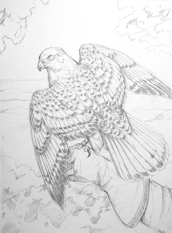
But for now, I'm working on my very last thesis painting, which is the Gyrfalcon as used in European falconry.

In medieval Europe, which bird you were allowed to fly was dependent on your social status. Emperors could fly eagles, whereas peasants were allowed tiny sparrowhawks. In the social ranking of falconry, the gyrfalcon was a noble bird reserved for kings. It is the largest of the falcons, and its plumage can range from gray barring to a striking, nearly pure white. Quite fitting as the bird of kings.
But for now, I'm working on my very last thesis painting, which is the Gyrfalcon as used in European falconry.

In medieval Europe, which bird you were allowed to fly was dependent on your social status. Emperors could fly eagles, whereas peasants were allowed tiny sparrowhawks. In the social ranking of falconry, the gyrfalcon was a noble bird reserved for kings. It is the largest of the falcons, and its plumage can range from gray barring to a striking, nearly pure white. Quite fitting as the bird of kings.
Monday, May 25, 2009
Griffon Vulture Progress and Lanner Falcon Sketch
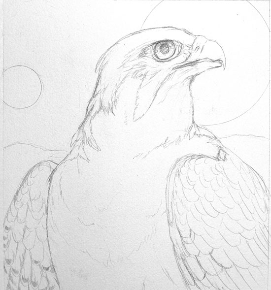
More progress on the Griffon Vulture, plus a sketch of the next painting, which will explore the Lanner Falcon as the Egyptian god Horus.

And the sketch of the Lanner Falcon:

The sun and moon behind the falcon represent the belief that Horus' eyes were the sun and moon. I placed the focus on the Lanner's head since the shape of the Eye of Horus is believed to mirror that of the Lanner Falcon's facial markings.

And the sketch of the Lanner Falcon:

The sun and moon behind the falcon represent the belief that Horus' eyes were the sun and moon. I placed the focus on the Lanner's head since the shape of the Eye of Horus is believed to mirror that of the Lanner Falcon's facial markings.
Labels:
griffon vulture,
horus,
lanner falcon,
sketch,
watercolor
Saturday, May 23, 2009
Griffon Vulture Sketch
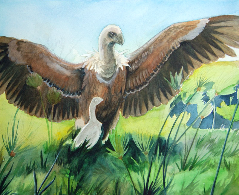
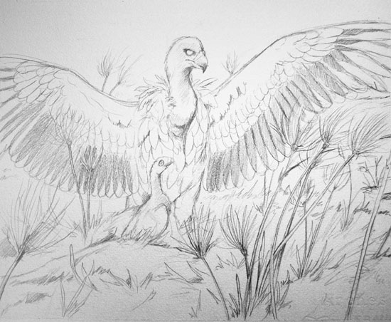
Thesis painting #8 will be the griffon vulture. In Egypt, this bird was the symbol of the goddess Nekhbet. Its head was used on the Upper Crown and its wings were a common decoration for the headdresses of royalty.

It was believed that when the griffon vulture turned its back to the southeast, that it would become fertilized. For this reason among others, it was considered a symbol of fertility.
In this painting, I wanted to show the vulture with its back to the southeast, with the sun streaming through its feathers. All around it are papyrus, a plant that grew on the Nile River.

It was believed that when the griffon vulture turned its back to the southeast, that it would become fertilized. For this reason among others, it was considered a symbol of fertility.
In this painting, I wanted to show the vulture with its back to the southeast, with the sun streaming through its feathers. All around it are papyrus, a plant that grew on the Nile River.
Tuesday, May 19, 2009
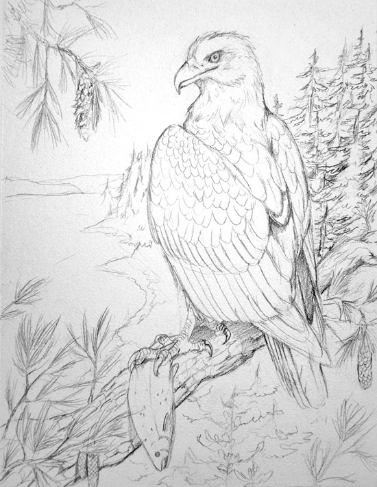
Bald Eagle - Thesis Sketch
Here is the sketch for thesis painting #7, which is the bald eagle. In the Northwest Coast of the United States, the image of the bald eagle was carved on poles, masks, and other items by native tribes. Since fish was a staple food of the people of the coast, they respected the eagle's ability to catch fish.
Here I show the bald eagle overlooking the coast with a salmon, an important fish of the region. Although bald eagles are not one of my favorite raptors (too often portrayed in art, often painfully kitschy), they are quite beautiful. In my painting, it will be perched on a western white pine, a common tree of the area.

The next paintings will be (though perhaps not in this order):
Gyrfalcon in European Falconry
Lanner Falcon as the God Horus
Griffin Vulture as the Goddess Nekhbet
Here I show the bald eagle overlooking the coast with a salmon, an important fish of the region. Although bald eagles are not one of my favorite raptors (too often portrayed in art, often painfully kitschy), they are quite beautiful. In my painting, it will be perched on a western white pine, a common tree of the area.

The next paintings will be (though perhaps not in this order):
Gyrfalcon in European Falconry
Lanner Falcon as the God Horus
Griffin Vulture as the Goddess Nekhbet
Saturday, March 7, 2009
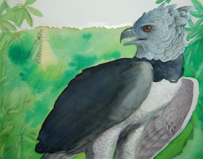
Harpy Eagle Progress and Saker Falcon Studies
I did the first few washes for the harpy eagle painting. I'm not sure how I feel about the challenge of so much jungle green, but I think it will work out nicely. In particular, I'm having fun with the eagle's crest feathers.

My next painting is going to most likely be the saker falcon, looking at its relationship with Middle Eastern falconers. During my research, I found a video of a saker hunting a small (baby?) gazelle (or other small species of deer), which was quite surprising. I never thought a falcon capable of taking down such prey. The video is here if you're interested.
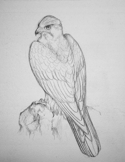
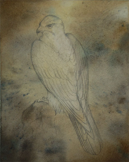
Of course, the inspiration to paint falcons hit, so I decided to do a study on saker markings. They seem to be a varied bunch, especially in the markings on the head. It appears that most have plain brown backs without barring.
The sketch:

The initial background wash:

My next painting is going to most likely be the saker falcon, looking at its relationship with Middle Eastern falconers. During my research, I found a video of a saker hunting a small (baby?) gazelle (or other small species of deer), which was quite surprising. I never thought a falcon capable of taking down such prey. The video is here if you're interested.
Of course, the inspiration to paint falcons hit, so I decided to do a study on saker markings. They seem to be a varied bunch, especially in the markings on the head. It appears that most have plain brown backs without barring.
The sketch:

The initial background wash:
Labels:
eagles,
falcons,
harpy eagle,
saker falcon,
sketch,
study,
thesis,
watercolor
Subscribe to:
Posts (Atom)