Monday, February 22, 2010

Conjure

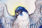
As sometimes happens, I decided on a different title for this painting about halfway through. "Conjure" seemed to fit better for the purpose...


I've been having a bit of an inspiration block, partially due to the inability to find the right paper for watercolor. I know, it sounds odd for someone who has been using watercolor for years to suddenly have a 'paper crisis' but as you evolve as an artist, often your technique calls for different media.

This painting represents my muse in a way. I realize I've probably broken a hundred different 'rules' of color, but this piece was meant to relax and 'reset'. I went from a bundle of nerves to relaxed as soon as paint hit paper with this one. Sometimes it's good to just get all that color frustration out!

Saturday, February 20, 2010

Sun Dreams - WIP

I'm going back to an old method for watercolor. I also decided to do this on some 'lesser quality watercolor paper' (i.e. "not Arches") and was a bit taken aback to find that I was able to use this paper (Windsor and Newton Watercolor Paper) better than the Arches cold-press I usually use. While the Arches is great for holding onto vibrant color, that's also a bit of a drawback - it holds onto pigment and doesn't let go. Ever. I find I work best if I'm lifting up pigment, and it's near impossible to do that with Arches.


More spirit falcons! Yay!

I also got a temporary replacement monitor. It's a 19 inch CRT, but the colors are spot-on. I spent about 3 days off and on adjusting the brightness, contrast, and gamma until it was just right. One of the drawbacks of using a monitor that's dying to the point where you can't adjust it anymore is you get used to poor brightness and inaccurate color. I knew something was off, but I didn't realize how 'monitor blind' I had been until I got this new one! Once I'm able to save up enough, I plan on buying a good LCD monitor. While this CRT is good and accurate, it's a huge electricity hog and the natural refresh flicker (60 Hz) is just noticeable enough to annoy me. Still, it's better than what I had before!

Sunday, January 31, 2010

Wisdom - Sketches and Line

Lately I've been inspired by the lovely ink and watercolor work of a number of artists. Paired with experimenting with anatomy, I've started a painting utilizing ink and watercolor:


And the sketch:


I'm aiming for more control with my watercolors. Previously I was putting watercolor over detailed graphite drawings, but I also like the effect of watercolor over black ink. The line drawing was done with a G-nib and Holbein black ink.

Friday, January 22, 2010

Goshawk in the Pines

Here is the second of the pair of paintings based on an inspiring quote by Helen Macdonald on her blog Fretmarks, which reads- "And then I thought, decidedly, yes. Goshawks are water. Falcons are air and hot stone. Goshawks are water and wood."


Below is the graphite drawing. Rick Lovell, an illustrator and an instructor of mine at SCAD-Atlanta, pointed out a confusing 'connection' of tail with branch which you can see below. I fixed this previous to starting the finished painting.


I'll admit, although falcons are my favorite raptors, I like this painting more. The falcon painting, which can be seen in my previous post, was on hot-press watercolor paper, whereas the goshawk painting is on cold-press. Hot-press is much smoother and thus is wonderful for tight details, but it comes at a price; paint seems to 'slide' on the surface and doesn't soak in as well. Perhaps I simply need more practice using it. Regardless, I like the way I was able to control the pigment in the goshawk painting better.

Sunday, January 3, 2010

Sepia watercolor practice, two watercolor paintings

From most recent to oldest, here are two paintings and a watercolor study I've completed within the past month:

Sky Painter
Watercolor on hot press arches, 4X9 inches


This painting was partially inspired by a quote I read on Helen Macdonald's blog, Fretmarks. The entire blog is quite interesting, though the post linked above, containing the quote, is one of my favorites.

"And then I thought, decidedly, yes. Goshawks are water. Falcons are air and hot stone. Goshawks are water and wood."

The next painting will be the same dimensions, but will feature the goshawk, with water and wood.


Ambition's Flaw
Watercolor and white gouache on cold-press Arches, 8X11 inches


Looking back on the palettes I commonly use, purple and pink are two colors that are definitely lacking. This seemed like as good an excuse as any to experiment with those poor, neglected colors.


Harris and Girl
Sepia watercolor on cold-press arches, about 9X12 inches


Using only one color is a good way to focus on control of the medium and light and dark without having to concentrate on colors. This was an exercise mainly in value in watercolor.

Wednesday, December 23, 2009

To the Sky - Finished painting and progress images

As can be seen in my previous entry, I posted four progress steps for a painting titled "To the Sky." This is the completed painting:


This was primarily an exercise to push contrast. I noticed much of my previous work was lacking in contrast, falling either too light or too dark with not much variation between. While I definitely still see room for improvement, I was able to iron out some difficulties and definitely have ideas on how to improve for next time.

Although I included them in a previous post, I think it's worth posting the progress images here to show the steps leading up to this painting.

Thumbnail sketch:


This is where I figured out my composition and the basic figures. This was not my first thumbnail, as I did quite a few before settling on the composition and poses.

High contrast study:


Before even putting paint to paper, I wanted to determine the areas of light and dark. Anything below 50% is black, and anything above 50% is white. I still need practice on this, but I was able to figure out the basic areas of shadow.

Final pencil drawing:


This is where I fleshed out figures, forms, and details. The full tones will come with watercolor and not with graphite, so this is why this version is so low-contrast. There are many areas where I do not want graphite showing through the watercolor, and some areas where it's desirable.

Color comp:


A bit of digital color over the pencil drawing helps me decide my colors and detail the contrast a bit. For this, I wanted the vibrant blue of the sky to compliment the yellow and orange tones of the gryphon and cloak. These colors aren't meant to be a set in stone, however. Often I deviate slightly from the color comp if I find certain colors work better with the watercolor; digital color never quite works the same as watercolor.

Sunday, December 13, 2009

More pen sketches

12/15/09 Edit - I added a color comp to the gryphon rider images below

Here are some more quick pen sketches I did to include with calendar orders. These are my favorites out of all of them:

A peregrine with a huge head. Since these were quick sketches, often my bird anatomy gets wonky. They're all fun, though, and great exercises in hatching:


Possibly my favorite out of all of them. A Gray Crowned Crane:


It would make sense that if a burning phoenix landed on a branch, that it would catch fire too!


Anthros are something I haven't had much practice with, but they're pretty fun to draw! This is someone's eagle-anthro character on DeviantART. When they bought a calendar, they requested I draw their character:


After spending some time on ConceptArt.org, I've been really trying to do more figure drawing, and practicing contrast. When I was at SCAD, I took an amazing class taught by professor Shawn Crystal called Drawing for Sequential Art. The class primarily taught constructive figure drawing, and a large portion focused on breaking things down into pure black and white. I've strayed a bit too far from that, and I need to get back into practice. Today, I did some more sketches and decided to try to practice contrast in color.

Color can be extremely tricky if you have difficulty with light and dark. Yellow does not necessarily always equal 'light,' and purple does not always equal 'dark.' Taking a painting into Photoshop and desaturating it can show you just how 'muddled' your tones can get!

Below are three preliminary steps for a piece I'm working on before I even touch color, and then a digital color comp. Thumbnail sketch, tonal study, and then the full pencil drawing (color comp added 12/15/09):


Usually I try to get the composition down in the thumbnail stage, but as I was doing the final pencil drawing I felt there needed to be something in the middleground to the right. I'm also trying to experiment with compositions that fall out of my comfort zone. Instead of placing the subject smack-dab in the middle, what about having a large expanse of sky? The subject still falls within the 'focus' area of the rule of thirds, but I wanted there to be a feeling of vastness. It will definitely be a challenge.