Color and Value:

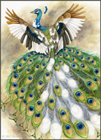
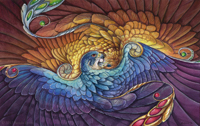
To really bring out the vibrant purples in the falcon's lower wings, I use Quinacridone Rose. This is a vibrant shade of magenta, but when used in light washes, can really make the difference between a cool blue-violet and a warmer red-violet. I used to be very shy of transparent washes, especially if the color I was using as a wash was extremely vibrant. I feared using a little magenta over blue would suddenly turn the whole thing bright pink! However, with transparent mediums, this is not as much a danger, especially when the base layer is so dark.
I did the same in the eagle, using washes of Cadmium Orange. Unlike Quinacridone Rose, Cadmium Orange CAN overpower the layer beneath quite easily. It is a slightly opaque color - not opaque in the acrylic sense where it can be used to completely cover a layer, but opaque in that the pigment can 'cloud' the color beneath. Therefore, I was careful to use little pigment and more water, and simply use more layers to slowly push the feathers towards orange. Once dry, I put a wash of Aureolin Yellow over the entire eagle (except for the bottom-most feathers). Washes like this are important to bring the colors together.
To brighten the blue on the falcon, I alternated between washes of Turquoise and Cerulean Blue. I switched to Colbalt Blue the lower I went, to keep the cyan-blue-violet color flow. At this point, I put more details in the gems and 'gem feathers' on both birds, as well as on the smaller feathers on the heads and neck.
Details:

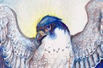
Peregrine falcon plumage is recognizable by the beautiful barred patterns on the feathers. This is where I ran into a bit of a dilemma. If I painted the feather bars, it would ruin the symmetrical effect of falcon and eagle, as golden eagles do not (typically) have barring on the wings. If I left the barring off, I felt the falcon would be lacking in part of its 'plumage identity'. After thinking about it a bit and discussing with a friend and fellow artist, I decided to paint just the hint of bars on the wings, but taking liberties to still keep it 'in sync' with the eagle.
Peregrines also have a lovely effect on the ends of their feathers where the tips are lighter than the rest of the feather. This gives their feathers a lovely layered effect. To achieve this, I used a bit of concentrated white gouache on the longer feathers, and white gel pen on the smaller feathers. Below, you can see how white gel pen can be blended using water. It's almost like white gouache in pen form!

The feathers on the left are pure gel pen, whereas the feathers on the right have been softly blended with a wet brush.
Finished Piece:

Most of the work at this stage was in acrylic washes. One of the advantages of using acrylic is its opacity. This allows me to push the colors even further, and even go lighter in places. An example of this is the Cerulean Blue on the left-most feathers on the falcon. It pushes the value a little lighter, thus creating a brighter blue. To get an even deeper shade of orange, I combined Cadmium Red and Cadmium Yellow acrylic and used a very watered-down wash. One of the risks of using acrylic over watercolor is going too thick, and unlike watercolor, there's no 'lifting'! However, when used in light washes, it's possible to meld the medium with watercolor, without getting an obvious mixed-media effect.
To see the previous two posts on this project, please see Radiance - Work in Progress Part 1 and Part 2

Hey there. You did awesome work. I love falcons since i was a child. On the opposite side of my grandmas house is an old medieval tower. Below the roof in the outer wall is a falcon perch. Tower falcons. I watch them each year because we live just around the corner from there and they fly over our house. I love them
ReplyDelete