
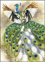
And a note: in this post when I refer to the 'tail', I am referring to the long feathers that grow from a peacock's back, which are often referred to as its 'tail'. For the sake of layman's clarity, I have used the word 'tail', but please note that they are not part of a peacock's true tail!
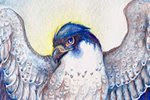
As I was still working on the tail, the client requested the wings have less white and more natural plumage, as seen in the leftmost color sketch as seen in the previous post. This was no problem, as I hadn't started any of the wing detail, and with the feathers that needed color being white, it was an easy addition.
Adding Detail:

I studied quite a bit of piebald peacock reference to figure out how the white feathers of the tail should look. The feathers behind the white ones would be a mixture of natural and white, so I made the area behind the white feathers the same dark brown as behind the natural feathers. Since I will be painting the details with white acrylic, there is no need to paint in the negative space - the white acrylic will be opaque over the watercolor.
At this point, I started to paint in the detail of the peacock's body and wings, bringing shadows to the primary and secondary feathers, and dark edges to the brilliant back feathers peacocks have. The head and neck are of particular focus, since the brilliant blues and greens are part of what makes these birds' plumage so impressive.
Final Details:

With white acrylic, I painted in the feather shafts and the loose vanes for the white feathers. Overlapping and steering away from a uniform direction for the feathers is important here - this 'wispiness' is part of what makes peacock tail feathers so iconic. I also took a bit of artistic liberty with the white feathers. There is no 'ghost' of the eye or other markings that the naturally-colored tail feathers have, but without it, the feathers looked blank and too bright.
I added even more detail to the back feathers, which is what really made them pop. These feathers are not simply green with black, but they have an 'arrow' of blue surrounded by reddish brown. Little details like this are what makes the difference between the feathers looking 'drawn on', and actually being part of the bird. It may be tempting at times to omit certain details, but having patience and painting them in (such as the barred patterns on the tertial and scapular feathers) really helps bring the bird together. When we look at a peacock, we may be tempted to see them just as their beautiful tails, but there's so much more than just the tail that makes a peacock.
At this point I am ready to put in the background, which will be a simple blending of colors. As you can see, the white of the wings and the neck really don't pop with the current white background.
Finished Painting:

I used washes of raw umber, Van Dyk brown, and sepia, with a little phtalo green here and there to bring the whole composition together, then went over the dried washes with a layer of white gouache. Compared to the previous image, you can see how the white of the wings pops out and unifies the figure. All in all, this painting is about 95% watercolor, with the only acrylic used being the white acrylic for the white feather vanes and shafts of the white tail feathers. It's 8 X 11 inches on hot-press Fabriano watercolor paper.
Beautiful! I love all the progress shots and discussion. So vibrant!
ReplyDeleteThank you! By posting my progress, it also helps me collect my thoughts on my own process. Things tend to get jumbled in my mind sometimes!
ReplyDelete