Tuesday, January 17, 2012

Radiance - Final Progress and Finished Piece

At this point, it's mostly details I'm adding to the painting. These are the steps of adding more and more layers, and slowly pushing colors and value.

Color and Value:


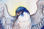
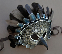
To really bring out the vibrant purples in the falcon's lower wings, I use Quinacridone Rose. This is a vibrant shade of magenta, but when used in light washes, can really make the difference between a cool blue-violet and a warmer red-violet. I used to be very shy of transparent washes, especially if the color I was using as a wash was extremely vibrant. I feared using a little magenta over blue would suddenly turn the whole thing bright pink! However, with transparent mediums, this is not as much a danger, especially when the base layer is so dark.

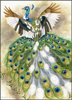
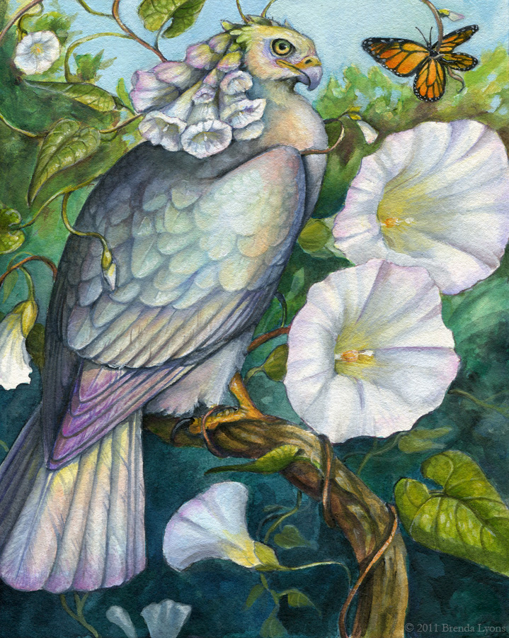
I did the same in the eagle, using washes of Cadmium Orange. Unlike Quinacridone Rose, Cadmium Orange CAN overpower the layer beneath quite easily. It is a slightly opaque color - not opaque in the acrylic sense where it can be used to completely cover a layer, but opaque in that the pigment can 'cloud' the color beneath. Therefore, I was careful to use little pigment and more water, and simply use more layers to slowly push the feathers towards orange. Once dry, I put a wash of Aureolin Yellow over the entire eagle (except for the bottom-most feathers). Washes like this are important to bring the colors together.

To brighten the blue on the falcon, I alternated between washes of Turquoise and Cerulean Blue. I switched to Colbalt Blue the lower I went, to keep the cyan-blue-violet color flow. At this point, I put more details in the gems and 'gem feathers' on both birds, as well as on the smaller feathers on the heads and neck.

Details:


Peregrine falcon plumage is recognizable by the beautiful barred patterns on the feathers. This is where I ran into a bit of a dilemma. If I painted the feather bars, it would ruin the symmetrical effect of falcon and eagle, as golden eagles do not (typically) have barring on the wings. If I left the barring off, I felt the falcon would be lacking in part of its 'plumage identity'. After thinking about it a bit and discussing with a friend and fellow artist, I decided to paint just the hint of bars on the wings, but taking liberties to still keep it 'in sync' with the eagle.

Peregrines also have a lovely effect on the ends of their feathers where the tips are lighter than the rest of the feather. This gives their feathers a lovely layered effect. To achieve this, I used a bit of concentrated white gouache on the longer feathers, and white gel pen on the smaller feathers. Below, you can see how white gel pen can be blended using water. It's almost like white gouache in pen form!


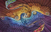
The feathers on the left are pure gel pen, whereas the feathers on the right have been softly blended with a wet brush.

Finished Piece:


Most of the work at this stage was in acrylic washes. One of the advantages of using acrylic is its opacity. This allows me to push the colors even further, and even go lighter in places. An example of this is the Cerulean Blue on the left-most feathers on the falcon. It pushes the value a little lighter, thus creating a brighter blue. To get an even deeper shade of orange, I combined Cadmium Red and Cadmium Yellow acrylic and used a very watered-down wash. One of the risks of using acrylic over watercolor is going too thick, and unlike watercolor, there's no 'lifting'! However, when used in light washes, it's possible to meld the medium with watercolor, without getting an obvious mixed-media effect.

To see the previous two posts on this project, please see Radiance - Work in Progress Part 1 and Part 2

Friday, January 13, 2012

Radiance - Work in Progress Part 2

First Washes:


Using a mixture of Van Dyk Brown and Payne's Gray, I laid a wash for the eagle. For the falcon, I used a wash of Thio Violet (a Quinacridone/Perylene mix) and Payne's Gray. Since everything was so wet, I had to wait before painting anything else (to avoid bleed). The area surrounding the 'gems' were dry, so I put a light wash of Quinacridone Rose for the bottom gems, and Green Gold for the top.


More Washes and Value:


Next I started to work on value. Once the first wash was dry, I layered additional, light washes of Thio Violet+Van Dyk Brown (eagle) and Thio Violet/Payne's Gray (falcon). Using a concentrated mixture of these colors, I went back once the washes were dry and put in the overlap shadows of each feather. Closer to the head of the falcon, I switched to just Payne's gray, since the color shifts from violet-blue at the bottom, to a cyan at the top. I did the same for the eagle, switching to just Van Dyk Brown as I went closer to the head, as the color will shift from shades of red, to yellow.


Color Layers and Value:


With my main shadows in, now I continue with even more layers. Instead of value, however, the purpose of these layers is to build color. Over the falcon, I still use the combination of Thio Violet with Payne's Gray, but with more violet. As I gradually paint the layers, I use a bit of Colbalt Blue, and then a very light mixture of Turquoise Blue and Cerulean Blue as I go up. Using the dark mixture for the shadows, I water it down a bit and start painting in some texture on the feathers.

For the eagle, I build up the color with Thio Violet/Van Dyk Brown, and as I go closer to the head, start using Cadmium Orange, and then Aureolin Yellow. Keep in mind I am painting many, many light layers! It's very hard to go lighter without getting a blotchy mess, so to build up your colors and value, it's important to gradually build up your layers. This results in rich, blended color and value.

Also at this step, I start building up the color in the gems. I may end up using acrylic to really make those gems vibrant. For both birds, I start putting in a bit more feather detail, particularly in the head.


To see the beginning of this project, please see: Radiance - Work in Progress Part 1

Wednesday, January 11, 2012

Radiance - Work in Progress Part 1

Currently I'm working on a large (11 X 14 is 'large' for me!) acrylic painting. I'm just about done with building up the value, and when I'm working on a lengthy project, I have to have something else to do on the side. Otherwise I get restless!

Rough Sketch:


To find a 'side project' idea, I ended up going through my sketchbook for inspiration and found a few thumbnail doodles I'd done, one of which was a spiraling bird design. I solidified the design a bit.


Final Drawing:


After resizing the design, I transferred it to a sheet of 7.6 X 12 inch illustration board, and cleaned up the drawing.

One way I'm trying to improve my work this year is to spend more time in the sketch and planning stages. Looking back, I noticed I tried doing this earlier in 2011, but gradually fell back into my bad habits of immediately jumping into painting! I'm especially happy with how this piece is starting out, so I decided to do some value studies, and a color sketch.


Value Study:


I did two value studies. The first had fairly steady light throughout the piece (and was quite dark), and the second (seen above) features light radiating from the orb in the center.


Color Sketch:


For color, I had the idea to use the two birds' natural plumage as a springboard for more 'fantasy' colors. The peregrine is mostly slate blue and the golden eagle is mostly shades of brown, which I used as a basis for a more colorful palette. The colors will not be as saturated in the final painting - this is simply a color sketch for me to see how the colors will work beside one another.

I'm torn as to whether to paint this mostly in watercolor, or to plan on using the watercolor as an underpainting, and then using glazes of acrylic over it. I love watercolor, but there are limitations, specifically when you want opaque effects. I love using white gouache, but I've started falling in love with the effects you get with acrylic glazes. Any suggestions are welcome!

Tuesday, January 10, 2012

Barred Owl - Omar

After a lengthy gap due to the untimely death of my computer, I am now able to scan and post artwork again! Hurray! The laptop I was using in the meantime had a very poor screen, so it was several months before I could scan any work. Here is a continuation of the previous post, finishing the painting of Omar, the barred owl.

Shadows and Details:


At this point, I really started pushing the shadows, particularly in the left of the image. Unlike with opaque media (acrylic, oils) where you generally work dark to light, with watercolor you work light to dark. Lifting color is possible, but difficult, and you can never go back to the pure white of the paper once the paint is down.

I also put in the detail of the wings with a wash of sepia, and darkened the eyes with a mixture of van dyk brown and payne's gray. At this point, I've only used a handful of colors. If you add too many colors, you tend to get mud, and the painting can fall 'off key'. The colors I've used so far have been sepia, van dyk brown, raw umber, payne's gray, dioxazine violet, ultramarine violet, and naples yellow. White gouache is what I used to pop out some of the feathers in the shadows.

Finished Painting:


A loose wash of sap green, cadmium yellow, and viridian green helps pop the grayish-brown figure out. I used a mixture of van dyk brown and payne's gray for the feather shadows on the wing, with a dab of white gouache for the highlights on the eyes.

Thursday, September 29, 2011

Omar - Barred Owl Work in Progress

I was asked to paint a watercolor portrait of Omar, a barred owl who was a long-time resident of the , and sadly died recently. After receiving several reference photos to capture Omar's personal appearance and a description of the bird to capture his personality, I started work on a portrait of this wonderful bird.

Sketch


Omar was described to always be looking at his handler, or whomever was speaking to him. The client explained that it was strange seeing photos of him from the side, because she usually only saw him from the front. This is why I chose to paint him from the front, to show him in a way everyone was familiar with - looking right at you. Two of Omar's personal characteristics include a diamond shape on his forehead, and the right side of his facial disk is higher than the left.

Basic Shadows


At this phase, I wanted to establish where the light would be coming from. I felt a dramatic light from the side would be much more interesting than a more global light. I used a combination of sepia, payne's gray, and dioxazine violet.

Markings and Deeper Shadow


Barred owls are a bit complex in their markings, although one wouldn't think it compared to barn owls and great horned owls. However, their chest feathers vary from vertical bars to horizontal - these markings are what gave the barred owl its name. In addition, the texture of the belly feathers are different than those on the chest. Painting these correctly are essential to capturing the appearance of the barred owl.

Here, I deepen the shadows and just barely begin the detail on the belly. I also put in a flat shade of brown for the eyes, which I will darken and add highlights to later. Note how the texture of the feathers differ from the tiny feathers beneath the beak, to the long, slender feathers around the beak, to the scalloped feathers on the chest. Feathers change depending on the location of the bird - the tiny feathers around the eyes would look abnormal on the chest, and vice versa. The chest at this point looks unusual because it has the most detail so far - once I begin work on the surrounding areas, the painting will start to come together as a whole.

The next post will show the next steps, and most likely include the finished painting.

Tuesday, August 23, 2011

Swamp Milkweed Nectarbird

As shown in my previous post, I went with a variation of the grisaille technique for my most recent painting. Here is the completed painting, acrylic on cold-press illustration board, 8 X 10 inches:


To start where I left off with the process, I experimented with color in Photoshop to see exactly how things would look before I started putting the glazes over the gray painting.


What I suspected was that the tonal painting was too gray for the glaze technique to be successful, and I was right. The way I was taught to do this technique was to create a tonal painting with a grayed color, meaning not pure gray, but grayed green, for example. As I started putting down glazes, I saw that the gray showing through beneath was not what I wanted for certain sections of the painting, particularly those with higher saturation. Therefore, I had to add a bit more opacity to what were supposed to be glazes.


Although I had to deviate from my original plan with technique, I do not consider this to be a failure of a project. On the contrary, I learned quite a bit on what to do (and what not to do), and ended up with, what I feel, is a good painting. For future paintings using this technique, I will make sure my tonal painting is not so gray. I also found, once I started putting glazes down, that the overall contrast was too dark. I ended up lightening a lot of the composition during the color phase, when it should have been light enough at the tonal stage. All in all, a good learning experience!

Monday, August 22, 2011

Swamp Milkweed Nectarbird - Work in Progress

Back in 2007 I painted a bird with daffodils for plumage, as part of a personal project to create a bird for each month, mirroring the month's birthflower and birthstone. These birds, which I called "Birdflowers," later morphed into "Nectarbirds." Nectarbirds were birds with the plumage of the flowers on which they fed. Whenever I go exploring and find interesting-looking flowers, I try to get good photographs and create a Nectarbird from that, which usually involves me doing some research to try to figure out exactly what flower I've found!

For DragonCon, I try to paint new Nectarbirds each year. Last year was the exception, but this year I will have two new Nectarbirds. One based on the Hedge Bindweed, and one (currently in progress), based on the Swamp Milkweed. For the Hedge Bindweed Nectarbird, I tried a technique of using acrylic on cold-press watercolor paper in a very watered-down way, more like watercolor. I can't say I really enjoyed this technique, and decided for my next Nectarbird, to try a more traditional approach with acrylic. More specifically, a medium tinted canvas, and then introducing darks and lights.


I learned a bit about the grisaille technique at SCAD, where a grayish painting is overlaid by layers of colored glazes. The technique, traditionally used with oils, works exceptionally well with acrylic also. I try to put a bit of color in my gray, but the foreground elements ended up being pure gray in the end. I am excited about adding the glazes, which to me is the most fun part of this technique.