Saturday, January 19, 2013

Sylvan - Sketch and Color Sketch

I've been so busy with leatherwork lately that I've barely had time to paint!  Thankfully I've made time to work on things between projects, and here is one 'just for me' painting I'm starting.

For this, I'm incorporating two techniques I'm aiming for in my work - larger paper size, and experimenting with different paper proportions.  I tend to work around 8X10 or smaller,  but this piece is 12 inches long.  I also find that working in a more 'slender' paper size helps me pay closer attention to composition.

I also aimed to experiment with different angles.  The viewer is looking up at the falcon, but down at the hawk.  The hawk is also mostly facing away from the viewer, while the falcon is looking at the viewer.  I wanted to have a push-and-pull interaction: looking up and down, being looked at and looking away.


I experimented with different colors before settling on this color sketch.  The previous sketches were too 'rainbow', but I want to have a balance between saturation and dull color - that's what truly makes color pop.  The painting itself will be a bit brighter - I find I work too dark digitally most of the time!

Here, I'm aiming for compliments - the orange and green of the hawk and leaves, with blue and purple next to the yellow and orange of the hawk's plumage.  I'm also working on carrying color around the composition - the brilliant green of the leaves on the falcon carry to the background, and to the hawk's eye, and finally there's a hint of it in the hawk's secondary feathers.

The real test here will be if I can stick mostly to the color sketch...or if my watercolors take me in a whole new direction! 

Saturday, September 22, 2012

Portrait practice and nature studies

Lately I've been in a mood to practice digital portraits.  I adore seeing the color and value artists achieve with skintones digitally, and I suppose the final push was when I got a bunch of brushes from my friend Sam Hogg, whose digital (and traditional) work is incredible.  She also pointed out something that should have been obvious to a friend and I that we never knew was possible in Photoshop - brush opacity controlled by pen pressure.  I'd long been controlling brush size with pen pressure, but never knew you could control opacity that way as well - I always thought if you wanted your pen to control opacity, you had to use a program such as Corel Painter.

You'll probably think that I've posted these two digital portraits out of order, since the first is much better than the second, but the first portrait is with photo reference, and the second is without.  For my second sketch I wanted to see how much I could 'remember' about facial anatomy and color/shadow without consulting a reference.


Referenced from this photo by Faestock on DeviantART:

Primarily I'm trying to improve my facial anatomy.  My biggest problem spots are noses - even in this sketch, when I finished, I realized the nose was actually too far to the left (her right) and I had to move it over.  Even using a reference, I tend to go 'blind' when it comes to the human face (and body).  This is something I hope to improve upon by practice.


No reference (and it shows!)


Here my weakness with noses is pretty apparent, as well as an all-around unfamiliarity with the human face.  You'd think that being a human myself, I'd be pretty familiar with the features, but it's amazingly difficult to 'remember' all the subtleties to a nose, or the flaps of skin around the eye.  The colors are also weaker compared to the first.

Today, I decided to have lunch on my favorite rock at a nearby wooded area that surrounds the town reservoir.  On my way back, I found a stunning red maple leaf with bright green veins - a leaf that was probably just starting to turn but fell off the tree prematurely.  I took it home with the intention to paint it, and noticed that by the time it was in my house, it had already started to darken and dull!  It's as if autumn leaves have a built-in 'leave me outside' mechanism.

Autumn Leaf Study (watercolor on paper) :

 Even with all its imperfections, I still like this study.  Somehow, the roughness and looseness of nature studies seem more forgiving than human anatomy - perhaps because we, as humans, are more familiar with the appearance of our own species than the world around us.  Or perhaps it's nothing so complex and there's just something beautiful about loose nature studies!

Saturday, July 21, 2012

Allegiance - Second Half and Finished Painting

I thought I had posted the second half of this progress, but it appears I didn't!  Better late than never, I suppose!

Building up More Color

This stage focuses more on building up the color on the feathers.  Painting with watercolor involves a lot of layers, so while this may seem like an insignificant step, it's actually the result of a number of layers.  If you try to achieve this depth of color in one layer alone, it's not going to look right.  I used a combination of raw umber, sepia, and Van Dyk brown for the upper wings, with some raw sienna for the reddish parts on the secondaries.  For the legs, I used Payne's gray to start painting in the shadows of the fur.


Ground and Pillar Texture
To give the ground and foreground rock texture, I masked everything else with tracing paper, then used an old toothbrush loaded with sepia, Payne's gray, and white gouache of varying amounts to splatter the ground.  The key here is to aim for irregular splatters - big, little, oblong spots, concentrated with pigment, and also watered down.  The result is a believable texture, and not one that looks like paint splatters.

On both the ground and pillars, I painted in cracks to give the place an old, worn feel.  Using a bit of white gouache, I painted along the edges of the cracks to give even more dimension.  I also added more detail to the banners, adding shadow along the top which is being cast by the foliage of the trees they're attached to.  Otherwise, they look like flat shapes of color.


Finished Painting
 Here I add the finishing touches - another layer of raw umber and yellow ochre to the feathers.  I also used a bit of acrylic to glaze even more red on the secondaries, and to deepen the shadows with a very thin layer of black.  This end stage is where I deepen the shadows and intensify the colors, particularly in the grass.  Noticing the banners were still looking flat, I tried to add some waviness and intensify the color.

The foreground pillar was bothering me with how flat it looked, so I added a shadow to the left, which brings more attention to the subject of the painting - the gryphon.

For the first part of this progress post, please see Allegiance Work in Progress Part 1: http://featherseeds.blogspot.com/2012/05/allegiance-work-in-progress-part-1.html

Wednesday, May 9, 2012

Allegiance - Work in Progress Part 1

First Shadows:


With my preliminary sketches complete, I start by painting in the shadows.  I will go back and refine the shadows, but this is a good way for me to establish the figure.  The light source is bright sun, situated high in the sky, but casting its light on the gryphon's back.  I have to keep in mind how each object will cast shadows, such as the banners on the trees, and the wings of the gryphon.

I use a mixture of dioxazine violet and sepia for the feathers, and a mixture of Payne's gray and sepia for the trees and stones.  The shadows of the columns are a combination of ultramarine violet and raw umber, mixed with a little white gouache.  I also put down a light wash to give the grass some shadow, to avoid flatness when I add color later.


First Washes
For the primary and secondary feathers, I mix ultramarine violet, sepia, and just a touch of ultramarine blue.  At this point, my main focus is to get a smooth was over everything - I'll go back later and work on shadows and details.  The grass is a wet-on-wet combination of green gold, sap green and viridian, with ultramarine violet in the shadows. I went back to give the columns some more definition, with a raw umber/white gouache wash, and more ultramarine violet/raw umber/white gouache for the shadows.

White gouache allows me to keep a color smooth and 'milky'.  This is especially helpful for very low-opacity colors, or colors that granulate.  Certain blues, for example, will look blotchy no matter how careful you are, and that's just the nature of the pigment.  For the background, I'm careful to use just a little pigment with white gouache, to keep the illusion of atmospheric perspective.  This is likely as dark as I will go with the background, with just a few details added later.


Building up Color
I notice the shadows are a bit lacking (particularly on the ground under the gryphon) so I begin to build them up.  It's important to keep an eye on your contrast and how dark you're pushing your pigments.  With watercolor, it's always easier to go from light to dark, instead of trying to lighten after you've gone too dark.  You might think that white gouache, for example, can fix that, but white gouache often fails to get a section as light as if you simply used a light watercolor wash!  White gouache will never be as light as the paper.

The shadows on the ground are mostly a combination of ultramarine violet and sepia, with some Payne's gray (a blueish gray) closer to the gryphon's paws.  Since the sun is so bright, the shadows will be darker and sharper closer to the gryphon's limbs, and fade as they go out.

The next post will look at the rest of the process, and include the final painting.

Tuesday, May 1, 2012

Allegiance - Sketches

I was looking through an old sketchbook and found a little sketch I'd done while at my table at DragonCon. DragonCon happens to be the highlight of the year for me, because I get to see friends, and because the art show just floods me with inspiration! I also received a lot of feedback about my work, and made it a goal to try more complex poses and compositions.

Thumbnail:
The sketch just kind of came out. I had an image of a gryphon bowing, and instantly the word 'allegiance' came out with the sketch. Now, several months later, I finally got around to proceeding with doing something with the sketch.

First Sketch:
I scanned the sketch and brought it into Photoshop to figure out the composition.  Eventually I started to put in columns...and banners...and suddenly what was just meant to be a single gryphon turned into scene with perspective!

Perspective Sketch:
Though I cropped it out, I originally extended the canvas far to the left so I could find a vanishing point for the lines.  The image was starting to go in a direction I hadn't planned on, but I went along to see how far I could push the composition.  Finally, I transferred it to my illustration board, and finalized the drawing.

Final Drawing:
I didn't want the gryphon to be indoors - it seems any king or queen a gryphon would pledge his or her allegiance to would be one who doesn't cage themselves inside walls.  Then what would the banners hang on?  Trees, of course.  Wild oaks with twisting, unruly roots.  I found there was a problem with the expanse of negative space in that lower left triangle, so I thought of what should go there.

My thinking process began to mingle with the story that was brewing in my head, eventually pushing the composition to be structured (with the columns and straight edges of the banners), with wildness added.  The winding trees, the woodland designs on the banners...perhaps this is a faean 'hall'?  Even still, a gryphon is a wild creature, not a being of straight lines and carved angles.  The gryphon here is a little out of his element with the columns...bowing down but still with a wary eye.

Color Sketch:
I recently received some feedback from a group of very skilled, professional fantasy artists who pointed out that my skies are consistently too dark.  Reading their comments was like light suddenly flicking on - it was something I couldn't quite figure out on my own until someone pointed it out!  Although in this piece the horizon line is almost off the paper (you can see it just barely in the upper left of the background), I had to keep in mind the background would also need to be of low contrast and low saturation.

I am also trying to use less saturated colors overall, and I plan on painting this mostly with watercolor, and using washes of acrylic to really push the values.  I hope the acrylic will also help me achieve the smoothness I usually lack with watercolor.

Wednesday, April 4, 2012

Piebald Peacock - Process Part 2

If you haven't seen it, you can find part one of this process post here: http://featherseeds.blogspot.com/2012/04/piebald-peacock-process-part-1.html

And a note: in this post when I refer to the 'tail', I am referring to the long feathers that grow from a peacock's back, which are often referred to as its 'tail'. For the sake of layman's clarity, I have used the word 'tail', but please note that they are not part of a peacock's true tail!

As I was still working on the tail, the client requested the wings have less white and more natural plumage, as seen in the leftmost color sketch as seen in the previous post. This was no problem, as I hadn't started any of the wing detail, and with the feathers that needed color being white, it was an easy addition.

Adding Detail:


I studied quite a bit of piebald peacock reference to figure out how the white feathers of the tail should look. The feathers behind the white ones would be a mixture of natural and white, so I made the area behind the white feathers the same dark brown as behind the natural feathers. Since I will be painting the details with white acrylic, there is no need to paint in the negative space - the white acrylic will be opaque over the watercolor.

At this point, I started to paint in the detail of the peacock's body and wings, bringing shadows to the primary and secondary feathers, and dark edges to the brilliant back feathers peacocks have. The head and neck are of particular focus, since the brilliant blues and greens are part of what makes these birds' plumage so impressive.

Final Details:


With white acrylic, I painted in the feather shafts and the loose vanes for the white feathers. Overlapping and steering away from a uniform direction for the feathers is important here - this 'wispiness' is part of what makes peacock tail feathers so iconic. I also took a bit of artistic liberty with the white feathers. There is no 'ghost' of the eye or other markings that the naturally-colored tail feathers have, but without it, the feathers looked blank and too bright.

I added even more detail to the back feathers, which is what really made them pop. These feathers are not simply green with black, but they have an 'arrow' of blue surrounded by reddish brown. Little details like this are what makes the difference between the feathers looking 'drawn on', and actually being part of the bird. It may be tempting at times to omit certain details, but having patience and painting them in (such as the barred patterns on the tertial and scapular feathers) really helps bring the bird together. When we look at a peacock, we may be tempted to see them just as their beautiful tails, but there's so much more than just the tail that makes a peacock.

At this point I am ready to put in the background, which will be a simple blending of colors. As you can see, the white of the wings and the neck really don't pop with the current white background.

Finished Painting:


I used washes of raw umber, Van Dyk brown, and sepia, with a little phtalo green here and there to bring the whole composition together, then went over the dried washes with a layer of white gouache. Compared to the previous image, you can see how the white of the wings pops out and unifies the figure. All in all, this painting is about 95% watercolor, with the only acrylic used being the white acrylic for the white feather vanes and shafts of the white tail feathers. It's 8 X 11 inches on hot-press Fabriano watercolor paper.

Sunday, April 1, 2012

Piebald Peacock - Process Part 1

My favorite commissions are those involving birds I've never painted before. Not only does it present an opportunity to paint a new subject, but it's also a challenge. I was asked to paint a piebald peacock, which is a peacock with both regular coloration, as well as patches of white plumage.

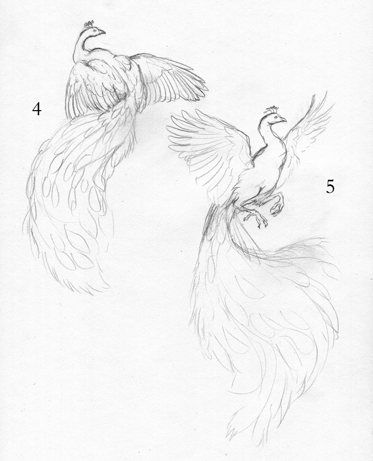
To start, I did a number of sketches for the client, who said she wanted the wings to be spread. Obviously the tail also needed to be a focal point, which meant the poses needed to be from the back.

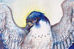
Note: For the sake of biological accuracy, I must point out that a peacock's 'tail' feathers are not actually part of the tail at all! They are very, very long feathers that grow from its back. You can see a peacock's true tail, spread in the back while it displays here: http://www.flickr.com/photos/anulalv/2722509521/

Sketches:


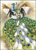
The client chose pose #2, with a partially-spread tail and spread wings. I refined the sketch, and did two color sketches:

Finished Sketch:


Color Sketches:


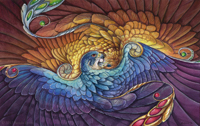
The client was specific in where she wanted the white - a few patches in the primary feathers, and some of the white feathers with regular 'eyes'. Since the colors were so specific, I only had to do two color sketches to determine where to put the white. As a note - the client requested a 'spontaneous watercolor splash' background, but I used a temporary purplish-pink background simply to show the colors in the color sketch. The final painting will not have that background. #2 was chosen for its symmetry, so I started on the painting.

First Washes:


Since the colors are so tricky in this piece, I put down a very simple wash of the base colors, before starting on any shadow or detail. The tail will be especially challenging because of the nature of peacock feathers - the vane is loose and 'flowy'. To show an example of what I'm talking about, look at this fanned peacock tail. Note how you have bright green feather over the dark shadow of the feathers behind. With watercolor, you can't paint thin, light details on top of dark shadow, so I would have to paint in each thin strand of shadow in individually. With watercolor, it's important to focus on both the positive and negative space and plan what you will do with highlights and shadows.

Note how the brilliant blues of the eyes look pretty dull. Although I used a very brilliant shade of Turquoise (Holbein), it looks fairly drab when surrounded by such low-contrast yellows. But take a look at the one eye where I put in the detail of dark brown, and you can see how that blue starts to pop.

Tail Detail (Part 1):


Here you can see a bit of the progress from right to left. On the right, I've only started painting in the feather vane with Pthalo Green. The 'sword' feathers are Turquoise. On the left, you can see how I went in with a dark mixture of Van Dyk Brown and Payne's Gray to paint in the shadows. With acrylic, this would have been much easier - I would have painted a layer of dark brown, and then simply gone over the brown with the lighter green. With watercolor, it's very difficult to go dark back to light, so if you want to preserve a brilliant and bright color, you must paint your darks around it.

The feathers at the base of the tail have a wash of Turquoise, gradually blending to washes of Sap Green as they approach the ends. I will be using white acrylic to paint in the feather vane of the white tail feathers, mostly to achieve the brilliant white and fine detail of those feathers.