
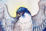
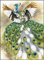
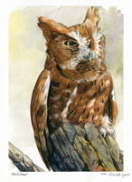
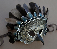
More spirit falcons! Yay!
I also got a temporary replacement monitor. It's a 19 inch CRT, but the colors are spot-on. I spent about 3 days off and on adjusting the brightness, contrast, and gamma until it was just right. One of the drawbacks of using a monitor that's dying to the point where you can't adjust it anymore is you get used to poor brightness and inaccurate color. I knew something was off, but I didn't realize how 'monitor blind' I had been until I got this new one! Once I'm able to save up enough, I plan on buying a good LCD monitor. While this CRT is good and accurate, it's a huge electricity hog and the natural refresh flicker (60 Hz) is just noticeable enough to annoy me. Still, it's better than what I had before!

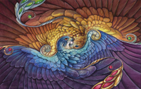
The color on this is looking great so far. Nice transitions from the browns to those purple and blues. Looking forward to seeing it finished!
ReplyDeleteWhat weight of Arches do you use (or have used previously)? Back when I used their paper for my classes, I used to buy the really heavyweight coldpress kind that was so very wonderful for lifting. It was super expensive, though! (I'm talking $10 a sheet or more) I'll have to see if I can dig out my old paintings and see what kind of paper it was on, though I fear I'll find nothing but the Arches logo on them.
ReplyDeleteGlad you found a paper you're comfortable with, though! That's what counts and this looks fab :) I'm thinking of trying some different papers soon myself! The wet media illustration board is great, but it still has some saturation issues I don't quite like.
D. Marciniak - Thank you very much! Part of this exercise is to experiment with the paper and to blend color.
ReplyDeleteAngela - I normally use 140 lb cold press Arches, though I'd imagine the heavier weights would be even harder to lift from. The hot-press allows easy lifting, but the color seems to slide around too much on the surface since it's so slick and not immediately absorbant. It's probably something to do with the sizing.
And I hear you about the illustration board. When I did that experiment (Green Jewel) on the wet-media illustration board, I was delighted with the light tones I was able to achieve and the lifting capabilities, but when it comes to getting deep, vibrant color, it's very difficult. It also seems that once you put enough layers down, it refuses to accept anymore and they just slide off. That's an issue I've always been able to avoid with watercolor papers.
I've had the same problem with Arches too! It just holds on and never lets go! I guess thats why arches has that "aquacover" product.
ReplyDelete