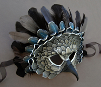
I was recommended by a friend to send an invitation request to the Share One Planet competition. It is an invitation-only digital art competition featuring a number of animals of concern. I am happy to say that I was accepted and given an invitation, and I decided this would be an excellent reason to try more digital art.
There are 5 categories (technically 10, but each category has a digital painting and digital sculpture category within it). The one I chose after doing a few sketches was "Mother's Love." The first set of sketches show ideas in other categories, such as 'portrait' and 'predator and prey.'
Thinking about what a 'mother's love' is in the animal kingdom truly is about protection. Most humans have the luxury of protection by the law and society's standards, but in nature, the only law is that of survival.
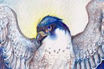
The peregrine falcon is truly a remarkable creature. It is the fastest creature on the planet, yet is relatively small compared to other raptors. Young falcons are especially at risk of predation by larger raptors, particularly by golden eagles. Despite the size difference, parent falcons have been known to attack and kill golden eagles in defense of their young.
In this drawing I am trying to capture the fierce protection of the mother. Leaving the chicks to fly is risky, but the falcon's strength is in the sky...and all she needs is a bit of height and the advantage is hers.
Wednesday, March 23, 2011
Tuesday, March 22, 2011
Owl Women of Vaethiniel
In the deep forests of Vaethiniel there live three women - one very young, one very old, and one between the valleys of age.
Once twenty winters have passed, the greatest and brightest moon rises over the sleeping trees. In this night, the old magic is at its most powerful. It is said the three women, with their ancient gifts, gather around a cauldron that mirrors the sky. In this, the secrets of the next twenty winters are stirred, and the three women peer forth with the wise faces of owls, for only owls can read the words of the moon.
The story was in part inspired by the Perigee Moon we had on March 19th. The moon truly was blindingly bright, and we had the good fortune in Connecticut of having a cloudless night, so the true brilliance of this rare moon was at its peak. I couldn't help but wonder what ancient cultures thought when the moon suddenly appeared bigger and brighter every 18 years.
Monday, March 21, 2011
Owl Women - Progress 2
This painting is taking me much longer than I imagined, which is good! I'm spending more time thinking about color choices before jumping in. Although I have a color comp, I still need to decide how to create the colors I want, and what shadow combinations will be suitable.
Here I have put in another layer of shadow in the foreground wings, and put the first layer down for color. The great horned owl's hood is going to be a rich brown, so I used a layer of yellow ochre as a base layer. Since the barred owl's cloak will be a rich green, I used cadmium yellow. I find layering watercolor creates a tone that blends better than putting down one simple layer of thick mixed color.
Again, I found myself in such concentration I went a long stretch without scanning! Lots of detail in the feathers at this point. For the great horned owl's wing, I created a mask with tracing paper around the entire painting except that wing, then used a toothbrush to splatter white gouache and payne's gray watercolor to get the speckled appearance that great horned owls have on their wings and back.
For the sky, I mixed color with white gouache to make the color more opaque. I find this works well when I want a very rich, smooth color. At this point, I also removed the masking fluid from the moon, and painted in the branches.
Thursday, March 17, 2011
Bridge Study
It was such a beautiful day today that I got the urge to paint outdoors! My field watercolor book is woefully empty, and the last time I even touched it was early summer of 2009. Today, I went to the same place, the Oak Grove Nature Center.
The nature center has a nice pond in the center that is fed by and empties into a creek. I originally planned to paint the pond, but was drawn instead by the covered bridge that goes over the creek.
I didn't aim for completely accurate perspective, and drew the lines freehand instead of using vanishing points. The aim, however, was to practice with watercolor. I find it is much easier for me to discover proper mixtures for shadows when I am painting from life, rather than painting from imagination. It is also easier for me to 'loosen up' and allow natural mixing and flowing paint when I am not aiming for a tight illustration. I would love to be able to capture some of this ease in my tighter, illustrative work.
Also, as I painted, this red-bellied woodpecker decided to come by and see what I was up to. I must not have impressed him, since he didn't stick around for long.
Tuesday, March 15, 2011
Owl Women - Final Drawing and Shadow Stages
As seen in the previous post, I've completed the color comp, meaning it's time to transfer the drawing and start painting! Below is the drawing transferred to the illustration board, with a few last things fixed:
When adding the shadows, I try to think about what colors will work best when the main color layer is applied. I never shade with gray or black, and always use a color or combination of colors for my shadows. Since this is a night scene, I try to use a lot of blue and violet-dominated shadows.
The shadows on the barn owl's clothing are a mixture of dioxazine violet and van dyk brown, which makes it a warm, yet dark shadow, which will work well with the red of her cloak. The wings of the barred owl have a layer of ultramarine violet, indigo, and just a touch of sepia - I used this very neutral color as her wings are much more of a grayish brown than the more intense brown of the great horned owl's wings.
As feathers are translucent, the 'light gaps' are where the light of the fire will illuminate the feathers. Where the feathers overlap, not as much light gets through. This is a hard concept at first to wrap your mind around when drawing birds' wings, but inclusion of this with back-lit wings results in a much more believable wing.
A note - the pink you see on the moon is not paint, but rather masking fluid. I used masking fluid so I could apply washes freely to the sky without worrying about going over the perfect white and circle of the moon. Once I am ready to paint the branches, I will remove it.
Friday, March 11, 2011
Owl Women
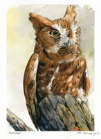
I seem to have owls on the brain, lately! Much inspiration is thanks to the live owls I work with at Horizon Wings Raptor Rehabilitation and Education Center, of which I am lucky enough to see up close. You really get a better understanding of birds of prey when you see them in real life. Their movements and mannerisms are simply impossible to discover through photographs alone.
There's something so enjoyable about drawing owls. Perhaps it is because of their incredible softness and roundness. If you enjoy drawing fluffy feathers, then an owl is the perfect subject. I also associate these birds with (no surprise here) the night and the mysteries of the world when the sun goes down and the moon comes up. Owls are creatures that live with a perfect harmony with the night. Their hearing is unlike that of any bird - some owls hunt in practically complete darkness, using their asymmetrical ears to pinpoint a creature's location on the ground. Their wings have a fringe to allow them to fly with complete silence.
Below are sketches for a painting I am about to begin. Three owl women gather around a cauldron of starlight. One holds a sphere of perfect crystal, which reflects all light and allows her to see beyond the dark of night. Another carries a staff, which still grows living oak leaves and acorns.
And the finished sketch. I didn't put in as much detail, here, as I planned to incorporate the values with the color sketch:
As before, with Celebration, I used Corel Painter to create my color sketch:
Painting this will be tricky, as I have two main light sources: the moon above and the fire below. The crystal ball also gives a little light to the face of the barred owl, allowing the eye that would normally be in shadow to have a highlight.
The shadows were easy in Painter, but with a translucent medium like watercolor, it's going to be a bit more challenging. I may end up using colored pencil to really pop the highlights.
Tuesday, March 8, 2011
Ceremony
I meant to post work in progress scans as I painted this, but I got so caught up I forgot! Here is the finished painting:
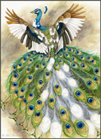
The main difference between this and all my older paintings is the inclusion of two important colors I never used before: Aureolin Yellow and Rose Madder Genuine. After recently reading A Watercolor Artist's Guide to Exceptional Color by Jan Hart, I learned that the yellow I had been using previously - Cadmium Yellow - was closer to a yellow-orange instead of a pure yellow, as Aureolin is. Therefore, my 'yellows' were always darker and redder. I also had never really had a true magenta, which I now have with Rose Madder Genuine. Adding these two colors has expanded my palette immensely and solved many of the color issues I was having before.
I also discovered that Rose Madder smells just like Froot Loops. I am completely serious.
Sunday, March 6, 2011
Ceremony - works in progress
Many apologies for the long hiatus! It is a bit fitting, in a way, that my first post in a while is to show progress on a work that I had put away for a long while. I reopen a neglected art blog with a neglected painting!
I started this drawing on an 8 X 10 piece of illustration board, late in 2010 when I was struggling with technique and wanted to create a piece to experiment with. Other projects got in the way, and this got tucked away in a drawer 'for later.' Well, later is today, and I pulled it out to finish the drawing, and get started with painting.
Below is a color sketch - I'm usually very bad about doing color sketches, but I think this may help the issues I have of plopping down color on a final piece before thinking it through.
I used Painter IX to put in some color ideas and establish the lighting. The 'smoke' will be a bit more challenging with watercolor, but it will be a good opportunity to experiment with technique...which was the initial purpose of this piece to begin with!
Subscribe to:
Posts (Atom)