Friday, March 11, 2011

Owl Women

I seem to have owls on the brain, lately! Much inspiration is thanks to the live owls I work with at Horizon Wings Raptor Rehabilitation and Education Center, of which I am lucky enough to see up close. You really get a better understanding of birds of prey when you see them in real life. Their movements and mannerisms are simply impossible to discover through photographs alone.

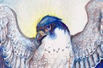
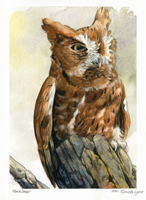
There's something so enjoyable about drawing owls. Perhaps it is because of their incredible softness and roundness. If you enjoy drawing fluffy feathers, then an owl is the perfect subject. I also associate these birds with (no surprise here) the night and the mysteries of the world when the sun goes down and the moon comes up. Owls are creatures that live with a perfect harmony with the night. Their hearing is unlike that of any bird - some owls hunt in practically complete darkness, using their asymmetrical ears to pinpoint a creature's location on the ground. Their wings have a fringe to allow them to fly with complete silence.

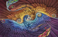
Below are sketches for a painting I am about to begin. Three owl women gather around a cauldron of starlight. One holds a sphere of perfect crystal, which reflects all light and allows her to see beyond the dark of night. Another carries a staff, which still grows living oak leaves and acorns.


And the finished sketch. I didn't put in as much detail, here, as I planned to incorporate the values with the color sketch:


As before, with Celebration, I used Corel Painter to create my color sketch:


Painting this will be tricky, as I have two main light sources: the moon above and the fire below. The crystal ball also gives a little light to the face of the barred owl, allowing the eye that would normally be in shadow to have a highlight.

The shadows were easy in Painter, but with a translucent medium like watercolor, it's going to be a bit more challenging. I may end up using colored pencil to really pop the highlights.

Tuesday, March 8, 2011

Ceremony

I meant to post work in progress scans as I painted this, but I got so caught up I forgot! Here is the finished painting:


The main difference between this and all my older paintings is the inclusion of two important colors I never used before: Aureolin Yellow and Rose Madder Genuine. After recently reading A Watercolor Artist's Guide to Exceptional Color by Jan Hart, I learned that the yellow I had been using previously - Cadmium Yellow - was closer to a yellow-orange instead of a pure yellow, as Aureolin is. Therefore, my 'yellows' were always darker and redder. I also had never really had a true magenta, which I now have with Rose Madder Genuine. Adding these two colors has expanded my palette immensely and solved many of the color issues I was having before.

I also discovered that Rose Madder smells just like Froot Loops. I am completely serious.

Sunday, March 6, 2011

Ceremony - works in progress

Many apologies for the long hiatus! It is a bit fitting, in a way, that my first post in a while is to show progress on a work that I had put away for a long while. I reopen a neglected art blog with a neglected painting!


I started this drawing on an 8 X 10 piece of illustration board, late in 2010 when I was struggling with technique and wanted to create a piece to experiment with. Other projects got in the way, and this got tucked away in a drawer 'for later.' Well, later is today, and I pulled it out to finish the drawing, and get started with painting.

Below is a color sketch - I'm usually very bad about doing color sketches, but I think this may help the issues I have of plopping down color on a final piece before thinking it through.


I used Painter IX to put in some color ideas and establish the lighting. The 'smoke' will be a bit more challenging with watercolor, but it will be a good opportunity to experiment with technique...which was the initial purpose of this piece to begin with!

Tuesday, August 17, 2010

Simple Eye Masks - Progress

I've taken a number of simple eyemask commissions. These are fashioned to be a simple, solid color mask with a design on one side. These are three examples:


The commissions I received were for a magpie, a snowy owl, and a rat design. After doing a number of sketches and having the client's approval, I started work on the masks. Here they are at the tooled stage:


...and shaped...


...and dyed.


I try to choose a dye color that will be closest to the color I will be painting the mask. In this case, the magpie will be dark and the background will be very dark blue. For the rats, the background will be black and the rats themselves will be light blue. Sometimes I will use a complimentary color for the dye, such as with leaf masks. I feel having a reddish-brown base gives a better and more natural green.

I will post final photos of these masks once they are painted. Painting them is the best part!

Tuesday, May 18, 2010

Lieutenant progress and masks

Edit 5/24/2010: This entry contains a revision of a painting, based on some helpful suggestions by Linda, who commented on some anatomical issues. Thanks!

I am going to put more effort to be active in my blog. There's lots going on artistically and I haven't been posting any of it!

As many of you know, I paint mostly birds, or winged creatures. My 'people drawing skills' are at a different level (lower) than my avian abilities, which I waffle between "ughhh I need to practice more figure drawing!" and "ughhh I don't care I'll just crawl into my safe cave and keep painting birds." Of course, we all know the second choice is not acceptable! My problem, I believe, is one with perception. I'm not quite sure why, but I just have the hardest time understanding the human form, despite years of figure drawing.

I've read books on bone and muscle structure, drawn nude models, studied references, but when it comes time to put pencil to paper, it's all warped - out of proportion. I know the 'rules' but it's difficult for me to actually put it on paper. That is of course no excuse to simply give up! And so I am trying to work more with the human form, even if it feels like pulling teeth sometimes.

Below is a progress image of my latest painting, Lieutenant. Consider the giant gryphon a support mechanism for the trauma that came with drawing a human! (I kid, I kid...sort of):


And the final image (revised per a suggestion from Linda):


I am well aware that there are still some 'distortions' with the figure, though I think it's a step forward compared to my previous work. You would think Connecticut would be full of figure drawing opportunities, though a search left me with very few, with the closest being about 50 miles away! Hopefully I will find some so I can get back to practice.

I have also been working on more leather masks. This one is another 'tribute' mask to a tree species that fell due to an introduced disease. The American Chestnut used to be one of the most plentiful trees in the eastern United States. By the 1940s, they had been virtually wiped out by a blight introduced earlier in the century. Now, the only American Chestnuts that exist are in the western United States, and efforts to introduce blight-resistant chestnuts to the eastern part of the country are underway.


My most recently created mask was based on a painting I did for Hayley Lavik (which you can see in her banner), of a mask based on a celebration in her story. Below you can see the original painting (set with a stone) that I completed several months back, and the completed, 3-dimensional mask, set with a sodalite cabochon, and adorned with rice pearls:


It was a challenge to translate a 2-dimensional image into a 3-dimensional mask. I had to change a few elements, such as the thin curls (as they would have been near impossible to create in thick leather), but I think it retains the feeling of the original design.

Thursday, May 6, 2010

A Day at the Caprilands

With spring here, I decided to make a trip to the Caprilands Herb Farm in Coventry, Connecticut (their main page is still in progress). It's only a few towns away, and the drive and destination is rather beautiful and relaxing.

I won't bore you with the tons of flower, plant, and tree photos I took, but below is one rather lovely butterfly I found, and two quick drawings and a watercolor study I did to loosen myself up.

A butterfly I have yet to identify:


A sketch of what I believe are irises, not yet blossomed:


Sketch of a tree with some rather interesting, twisty trunks. Also a pair of guinea hens that served as the resident tick control:


Lastly, some painting practice based on a reference photo I took of an unidentified flowering bush. This is watercolor on illustration board:


A lot of what I see here serves as inspiration for my paintings. Once more flowers start growing, I'm sure I will 'discover' some more Nectarbirds...

Monday, March 22, 2010

Courtship - WIP

This is a bit of a spontaneous painting. I'm still experimenting a lot with watercolor techniques and wanted to try out mixing white gouache with my watercolors. I've always liked the creamy consistency you get when you mix watercolor with white gouache.


I'm still deciding on what colors I'll paint the gryphons. Perhaps yellows and reds to contrast with the greens. Maybe some dulled purples for the snow leopard part of the gryphon on the right.

Here is the pencil drawing, pre-paint: